For our first Building Beauty studio project, we had four weeks to create an ornament or personal object for our home. Ornaments, by architect Christopher Alexander’s definition, are neither superfluous nor unnecessary but deeply functional – “a building needs them as much as it needs doors and windows.” (A Pattern Language, p. 1148)
Ornaments often show up at/as boundaires, in places of transition. They join two spaces, surfaces, materials, and unify them into a greater whole. Where wall meets floor, baseboards ease the transition between the vertical and horizonal planes. Additional shoe molding further eases that transition, and also has the very practical purpose of covering up slight gaps between the baseboards and floor (because no floor in the real world is ever perfectly level).
Another example: rugs. Rugs are ornaments that soften, literally, the transition between a hard floor and the airspace above it – the activity that happens in the room.
A main intention of this project was to get started working with our hands, and make something beautiful with minimal utility – more beautiful for its own sake.
1. Identifying the Place
There were a couple of different ways into this project; for me it involved first identifying a spot that needed healing – and that could be healed with an ornament. One spot that came to mind is in our backyard:
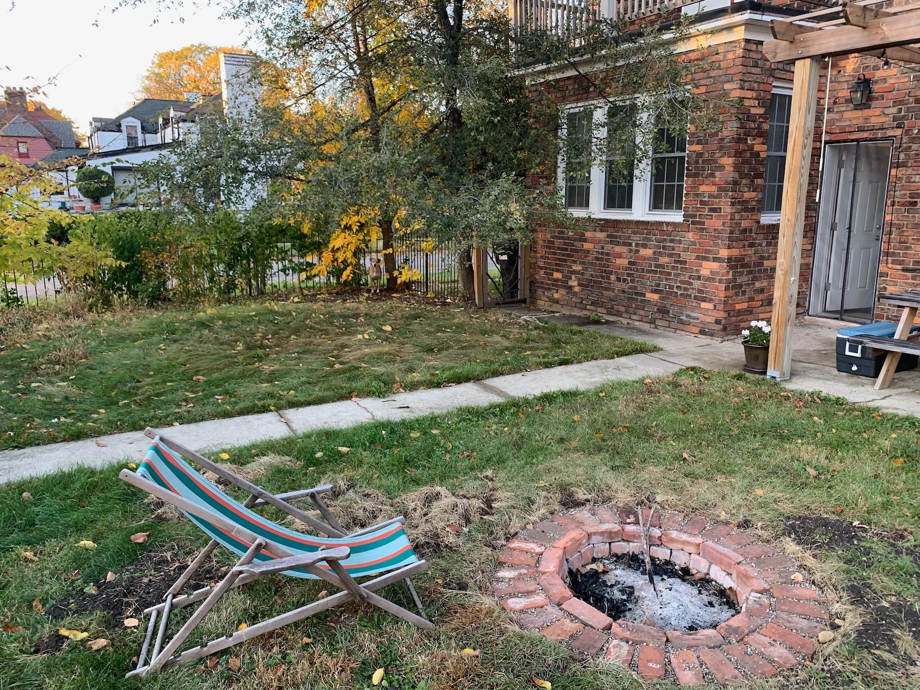
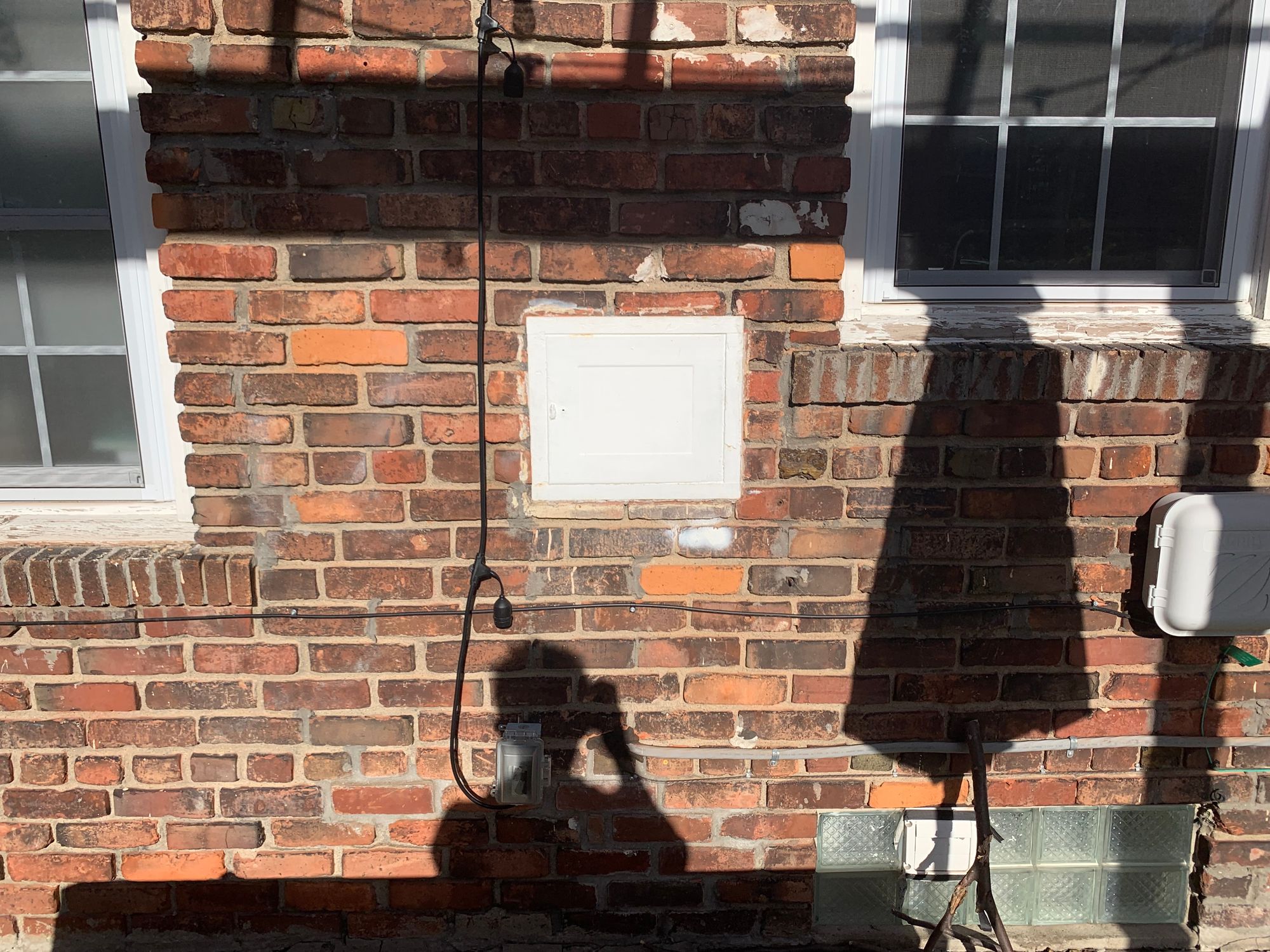
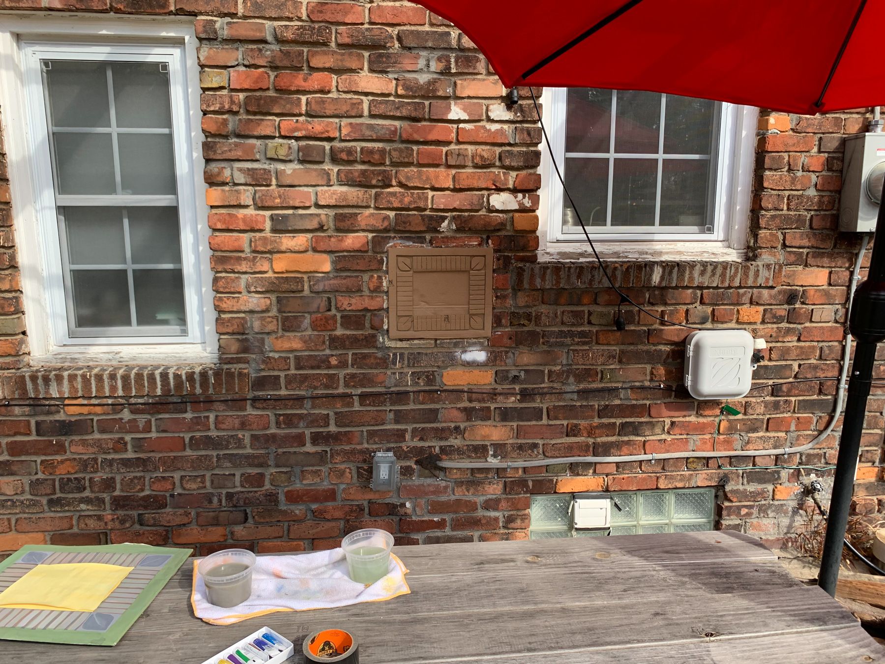
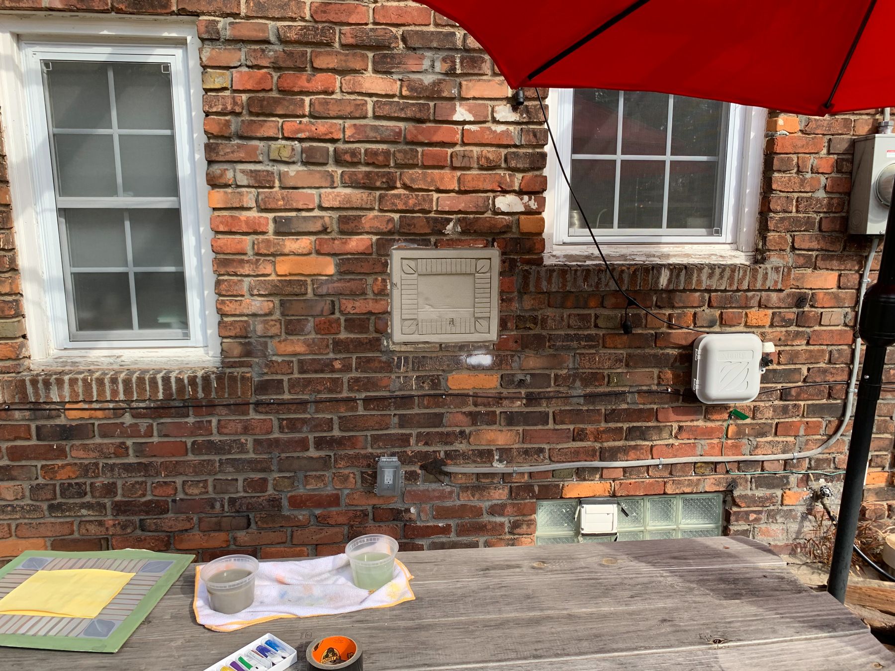
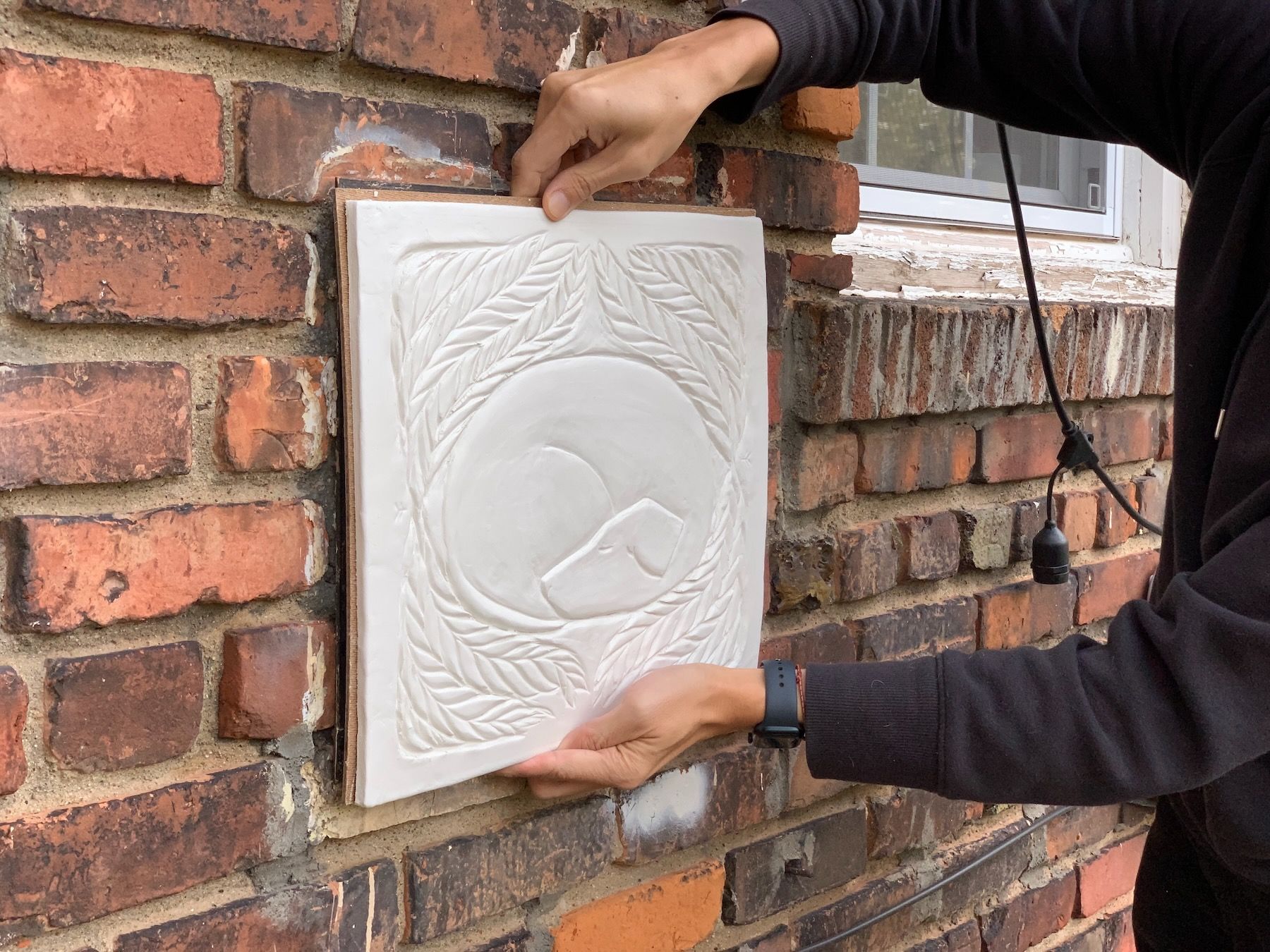
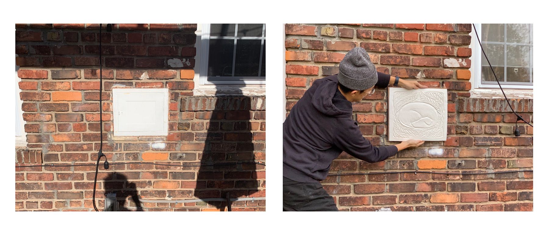
There, that white rectangle. It’s an old milk door, or at least that’s what I suspected – a door to a compartment where milk deliverymen in past centuries would deposit fresh bottles of milk. I pried it open to confirm:
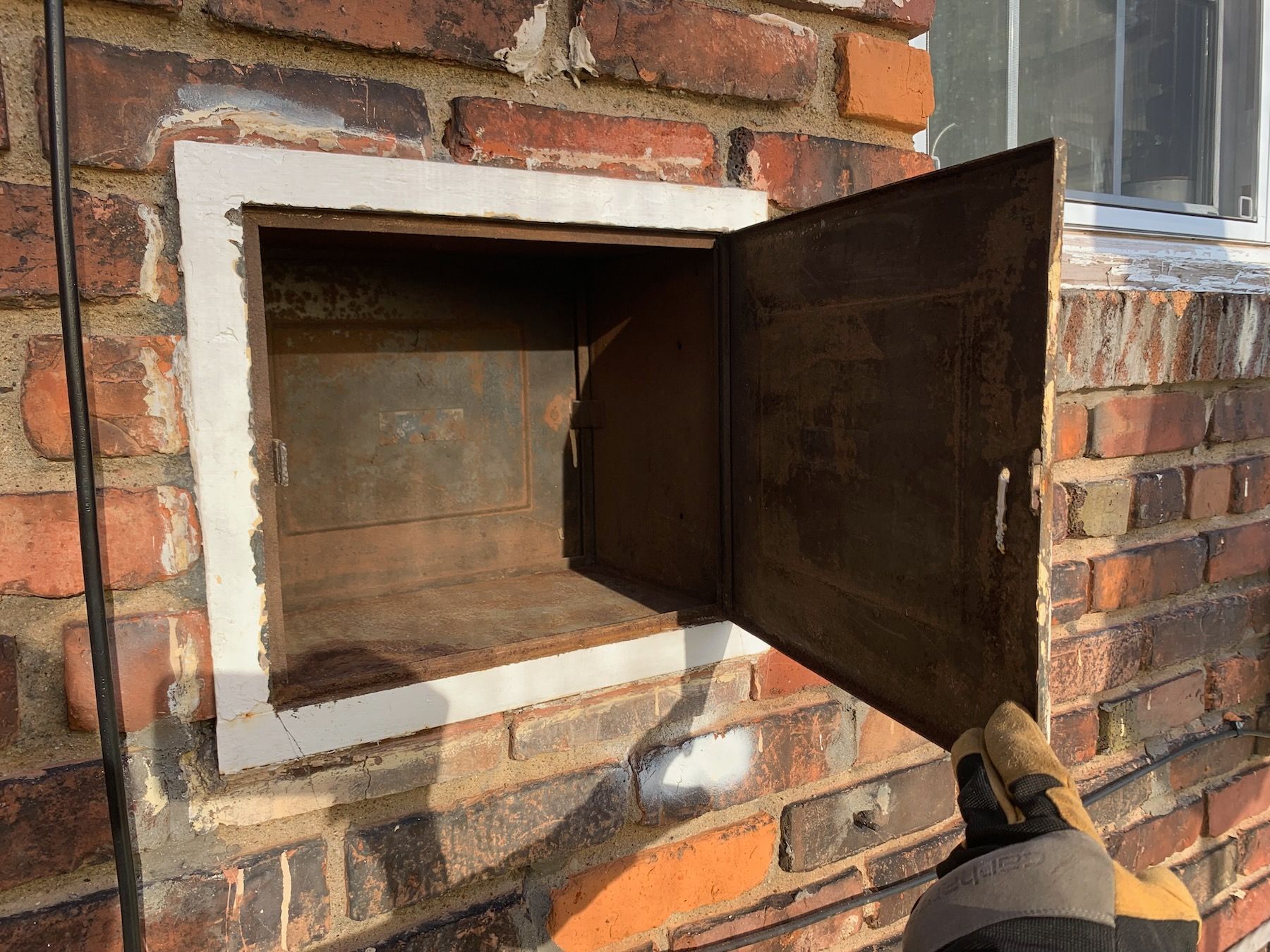
Yes indeed. It looked like there was a second door for the inside of the house, but unfortunately that interior opening been cemented over and sealed. Opening it up again wasn’t an option, as it would cut into the banquette I built for our kitchen this summer.
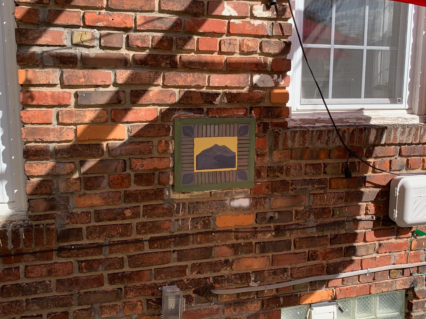
The outside door, though – it nags at me every time I see it. It’s a glaring white panel that the construction crew painted, most likely, using leftover window trim paint during our initial renovation. To use the language from our book-learning classes, the rectangle disturbs the wholeness of the solid brick wall.
At first I thought about tiling the inside and removing the door to make a little niche, that we could set candles and flowers and a small picture frame in when we had people over for a barbecue or bonfire. Maybe I could handmake and glaze a ceramic panel for the niche’s back inside wall.
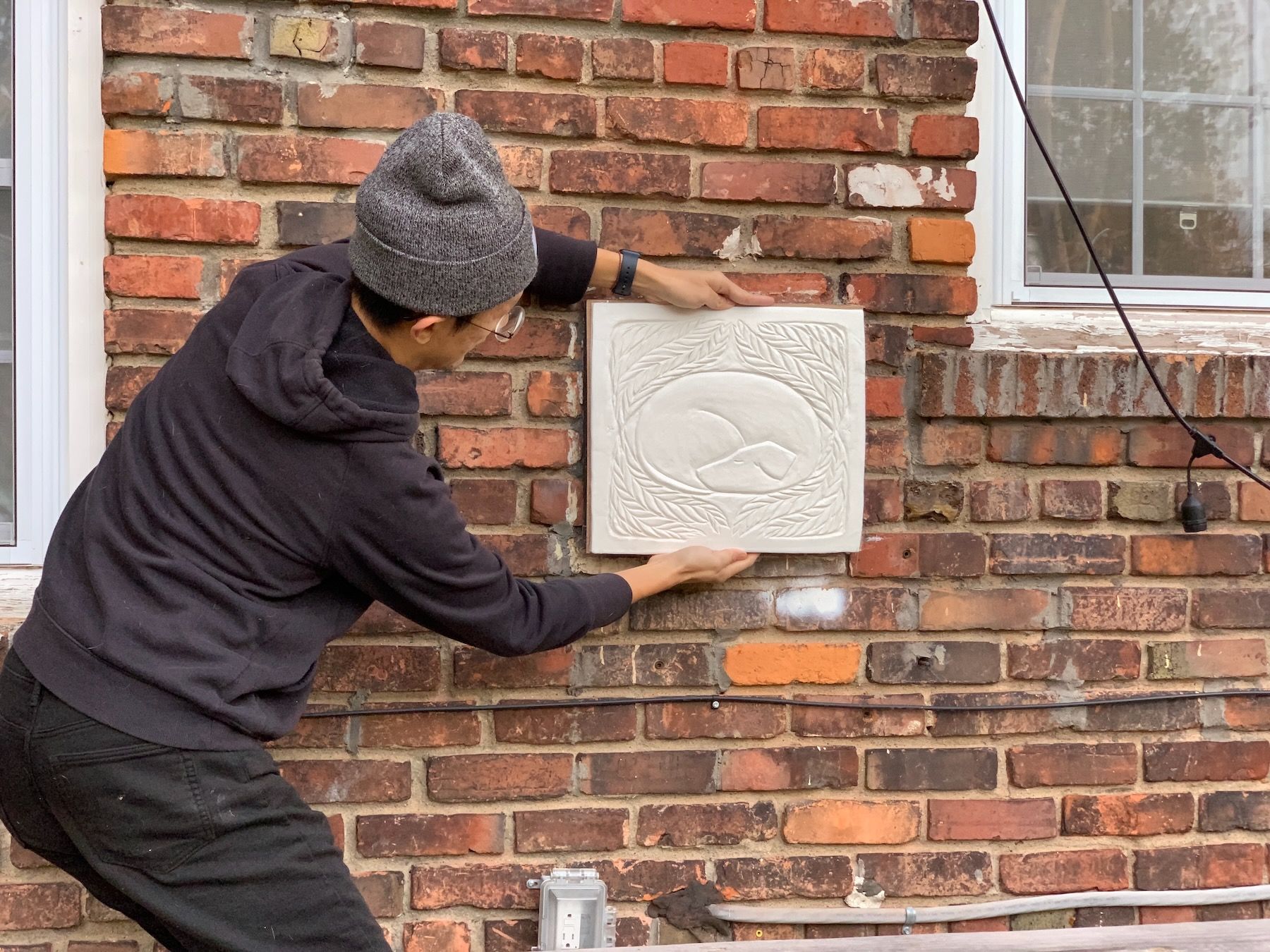
But given the amount of time we had for the project (and the first week was almost over at this point), I decided to focus on creating a panel to cover or replace the door. Something that would both be its own center – its own focal point – while at the same time reinforcing the solidness of the brick wall.
2. Sketches
I went through several phases of sketching, trying to find a drawing that, as our instructors encouraged, “had feeling to it.” This was harder than expected! In part because of the lack of functional requirements. I’ve worked as a product designer, and I’m used to having functionality dictate the constraints of what a thing looks like. Here the functionality was less formal – closer to a blank canvas. It did have to work in the context of the wall, but even so, there were a bunch of different directions I could take it. Too many, almost.
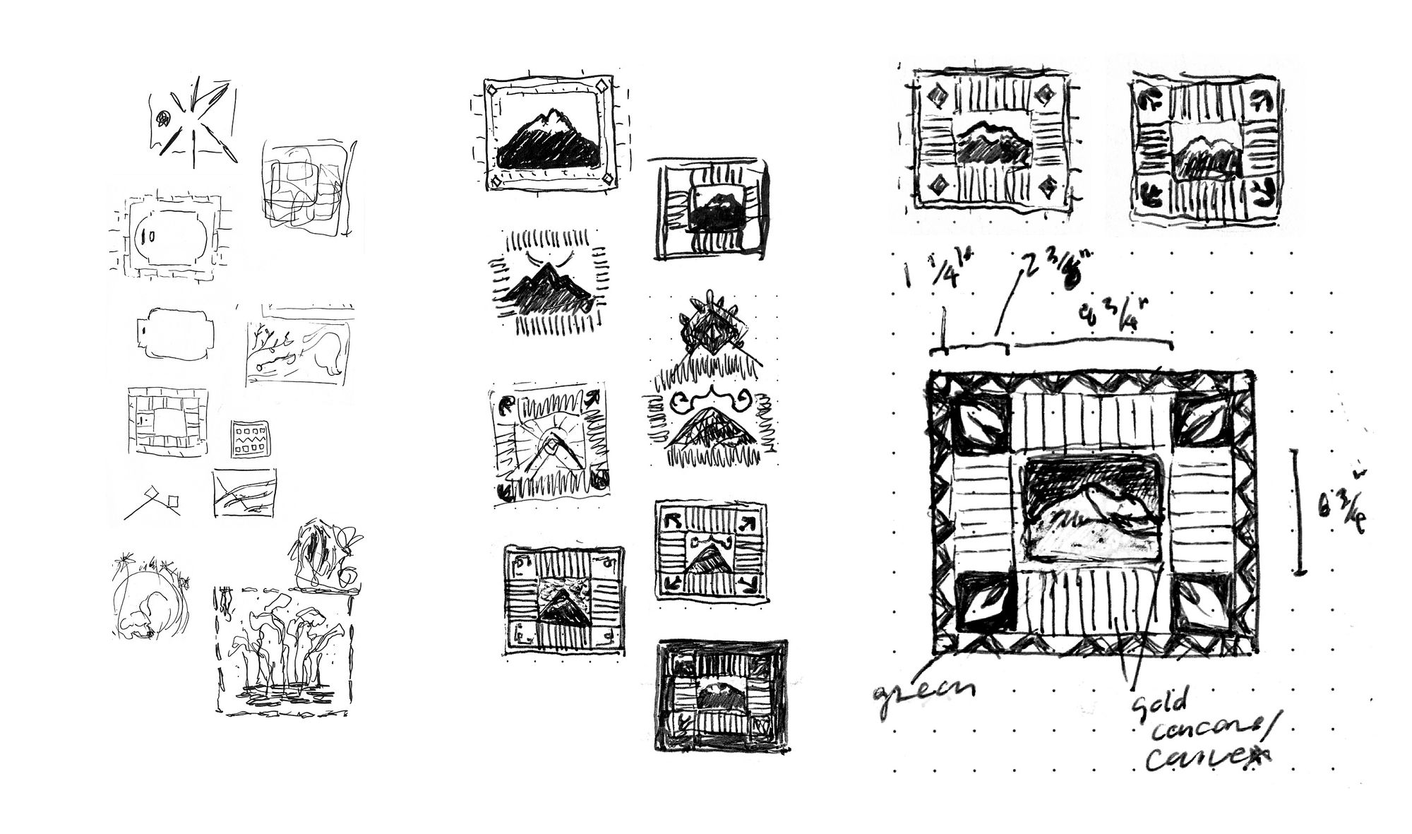
I ended up zeroing in on an image of a mountain. Mountains have had a special place in my life – in particular the one depicted, Annapurna II. I can trace my now owning this house in Detroit directly back to seeing that mountain in Nepal. I associate it with home.
I was encouraged in class to abstract it in a way that you’d get the feeling – even without knowing the backstory. That thirty years from now, someone could see that panel and feel what I felt. This is the earlier-mentioned “feeling” that we were aiming for in our sketches, that Chris Alexander is aiming for in architecture. Instead of small-p personal/idiosyncratic, it’s big-P Personal/universal.
I liken this to the way that a writer might translate a real event into fiction. Sticking too closely to what actually happened might turn out to be completely wrong for the story. The inspired scene or moment has to integrate with the story as a whole. Or to use another analogy: the way a songwriter might turn a breakup into a ballad. Into music.
Once I’d settled on some version of a mountain, my instinct was to do it in clay, glazed and fired. It’d be a good opportunity to reconnect with the pottery classes I’d taken when I first moved back to Detroit. But by now we were already two weeks in (of four total), and I didn’t have enough time for that process. So I thought I’d paint a wooden panel, or maybe paint directly on the metal (once I’d stripped all the white off). Either way, I needed to start working mocking up in context, at full scale.
3. Mockups
I cut out a piece of cardboard the size of the panel, wrapped it with paper (I have one of those big rolls of kids’ activity paper from IKEA), and stuck it on the milk door with duct tape. I started playing around with gouache paint.
It was my first time using gouache, which was fun to experiment with. But thinking about the original goal – something that acts as its own center but also enhances the wholeness of the brick – I had a bigger problem: the panel was too flat. It had neither the dimensionality of the wall nor its roughness (no matter how much I tried to simulate that with rougher brush strokes).
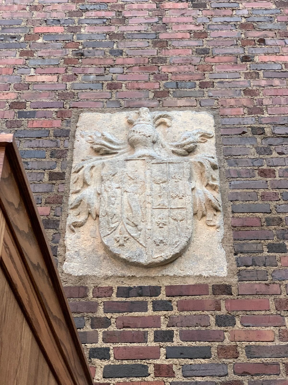
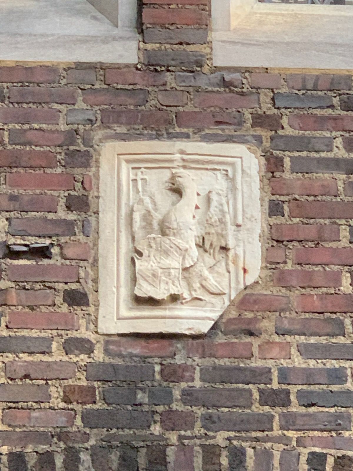
It was at this time that I happened to go to one of my favorite places in the city, Kresge Court inside the DIA, for a different class assignment. I ate a sandwich and sat admiring the carved stone panels and medallions embedded in the solid brick walls.
When I got home I started looking for reference images of similar brick-embedded panels and friezes, and came across the lions’ mouths in Venice, receptacles for secret denouncements of various crimes:
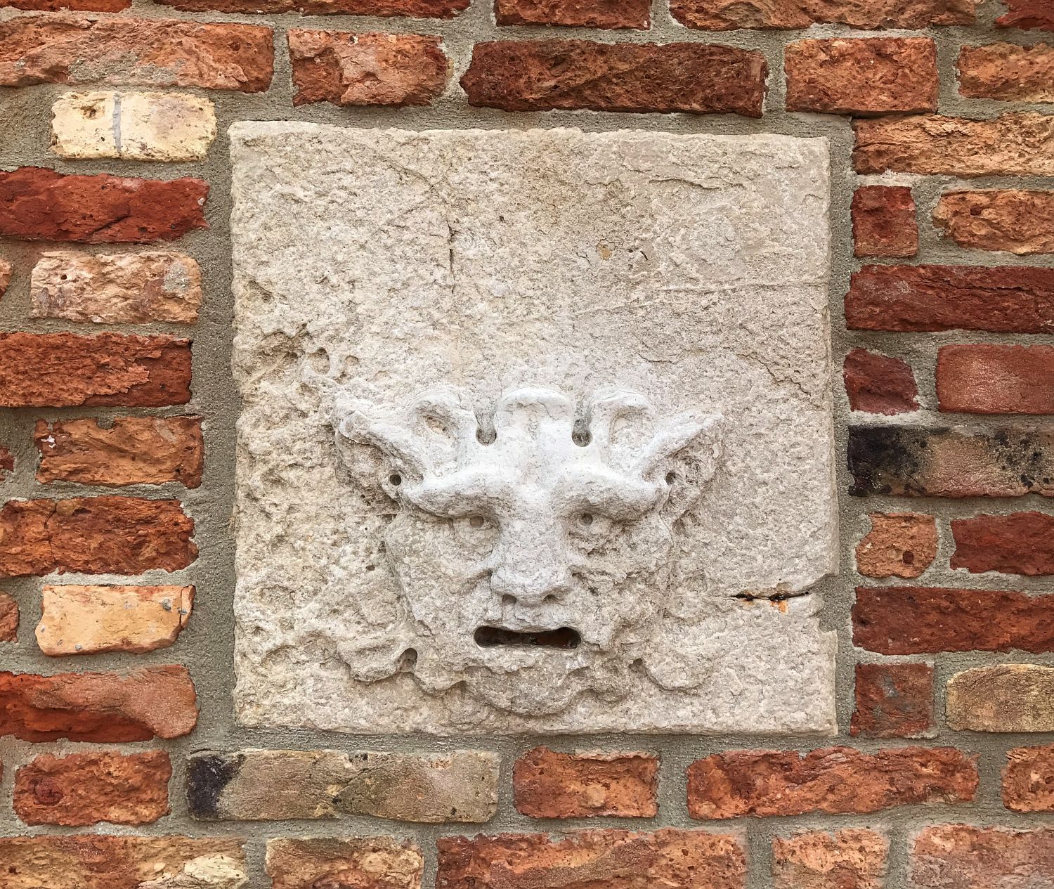
A slot for complaints! A neat idea, that I ultimately dismissed because the only thing such a slot in our patio wall would fill up with is wasps. Still, I liked the feeling of stone. I cut and glued together a cardboard mockup with some depth to it:
Then threw it into Photoshop to simulate stone:
At this point I started looking into how to do accomplish this using concrete (since I didn’t have time to learn how to carve stone) and discovered a video of someone casting concrete in wet sand. It seemed within my abilities – I could make a model of it out of modeling clay and use that to make the impression.
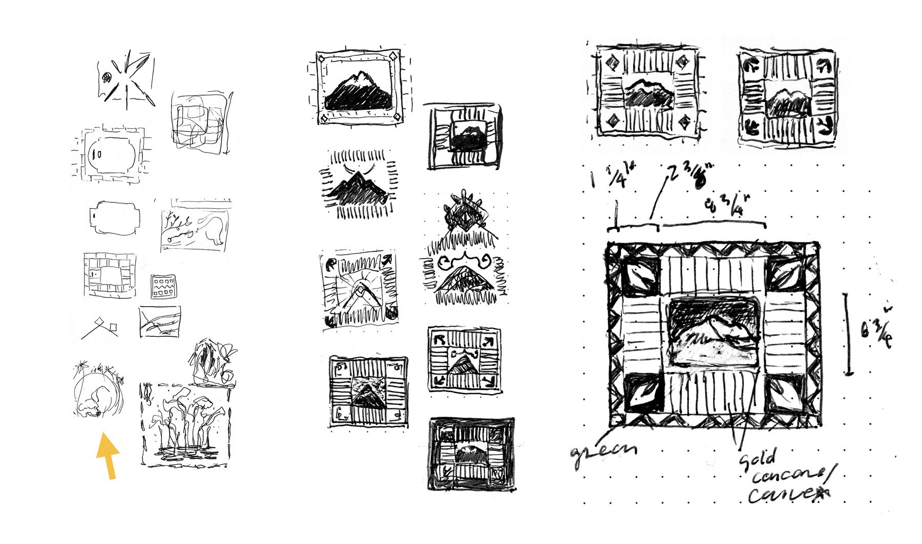
So I went back to my sketchbook. At this point I’d abandoned the mountain in the middle because it wasn’t giving me that strong of a feeling:
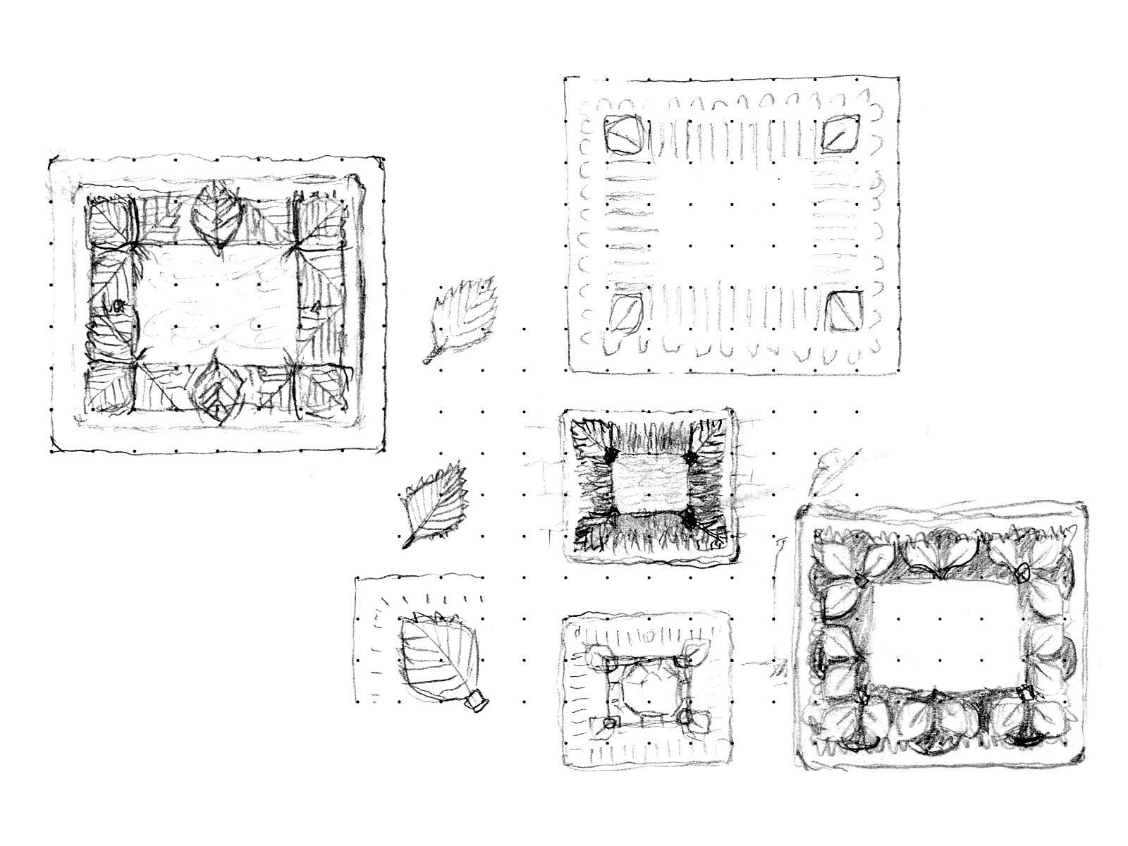
Then I started playing around with air-dry modeling clay, at 1/4 scale:
But none of these seemed quite right. One of my instructors asked me what I felt in the moment when I saw the original mountain – what it represented to me. Without thinking I blurted out: clarity, groundedness, home. That’s what this panel had to capture. When I went back to my sketchbook the next day I drew this:
For context:
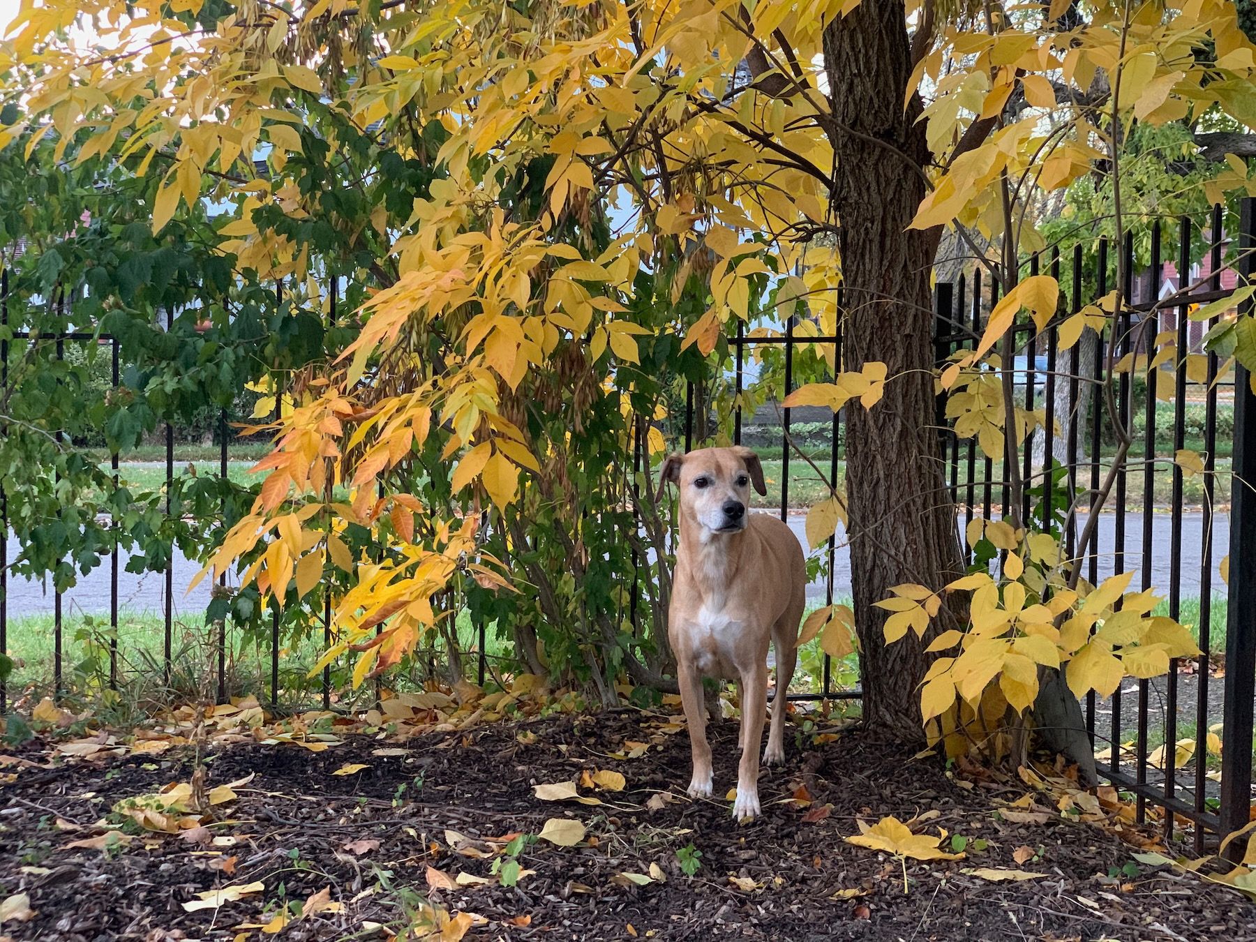
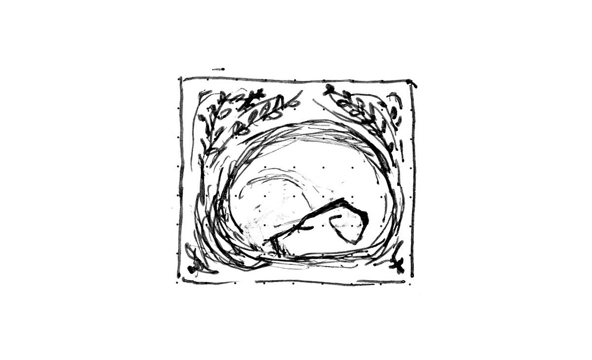
The backyard is our pup Matisse’s domain. Our little gargoyle. He’s very much been a part of my journey from mountain to house. (All these are, by the way, ways I’m rationalizing why an image of him came to my mind.) There was a sense of inevitability to it: Yes, of course it has to be Matisse on that panel.
Only later, when I was scanning my sketches for our class presentations, did I realize that it had also been one of the first ideas I’d sketched:
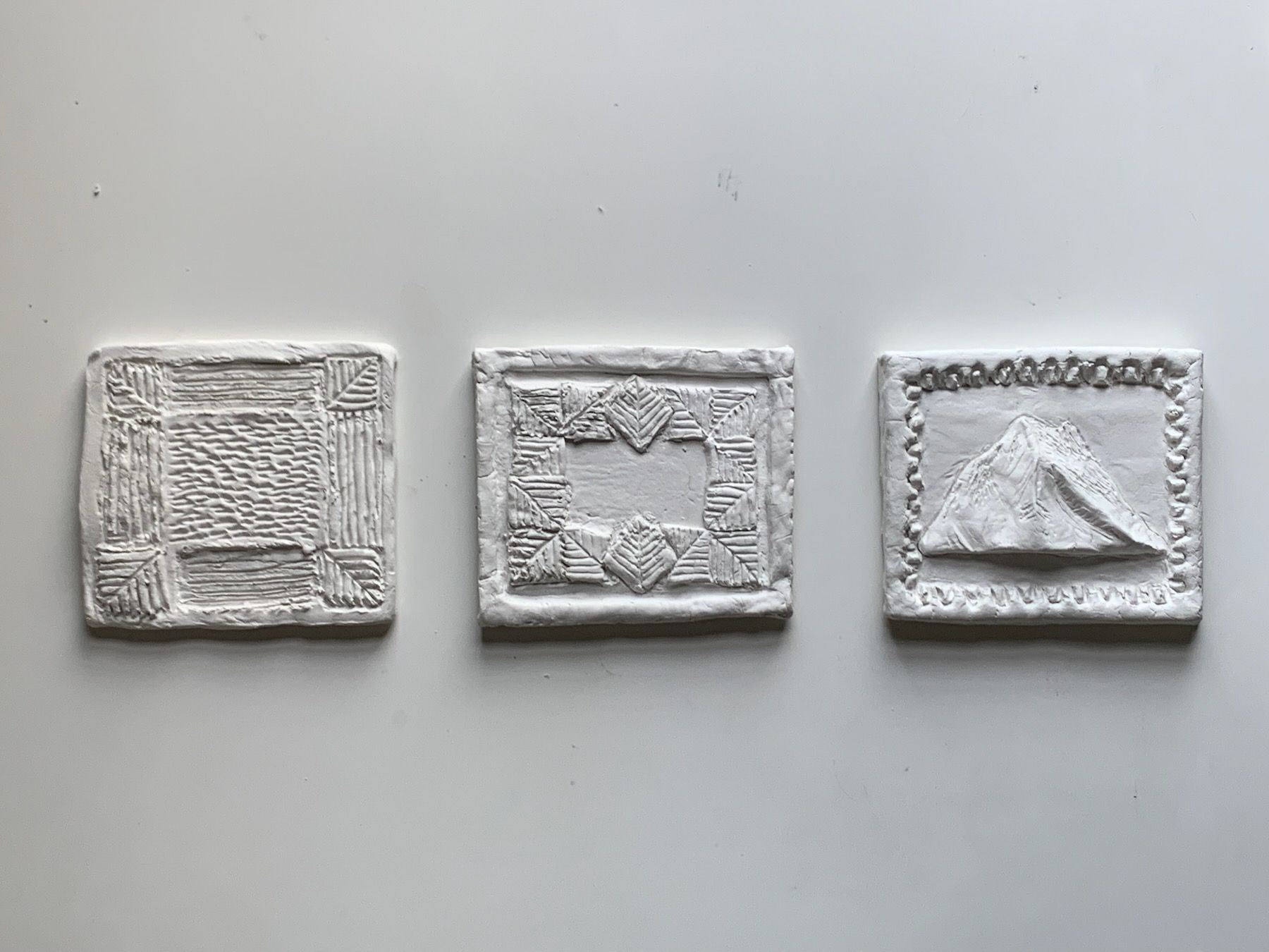
I made a 1/4-scale mockup in modeling clay:
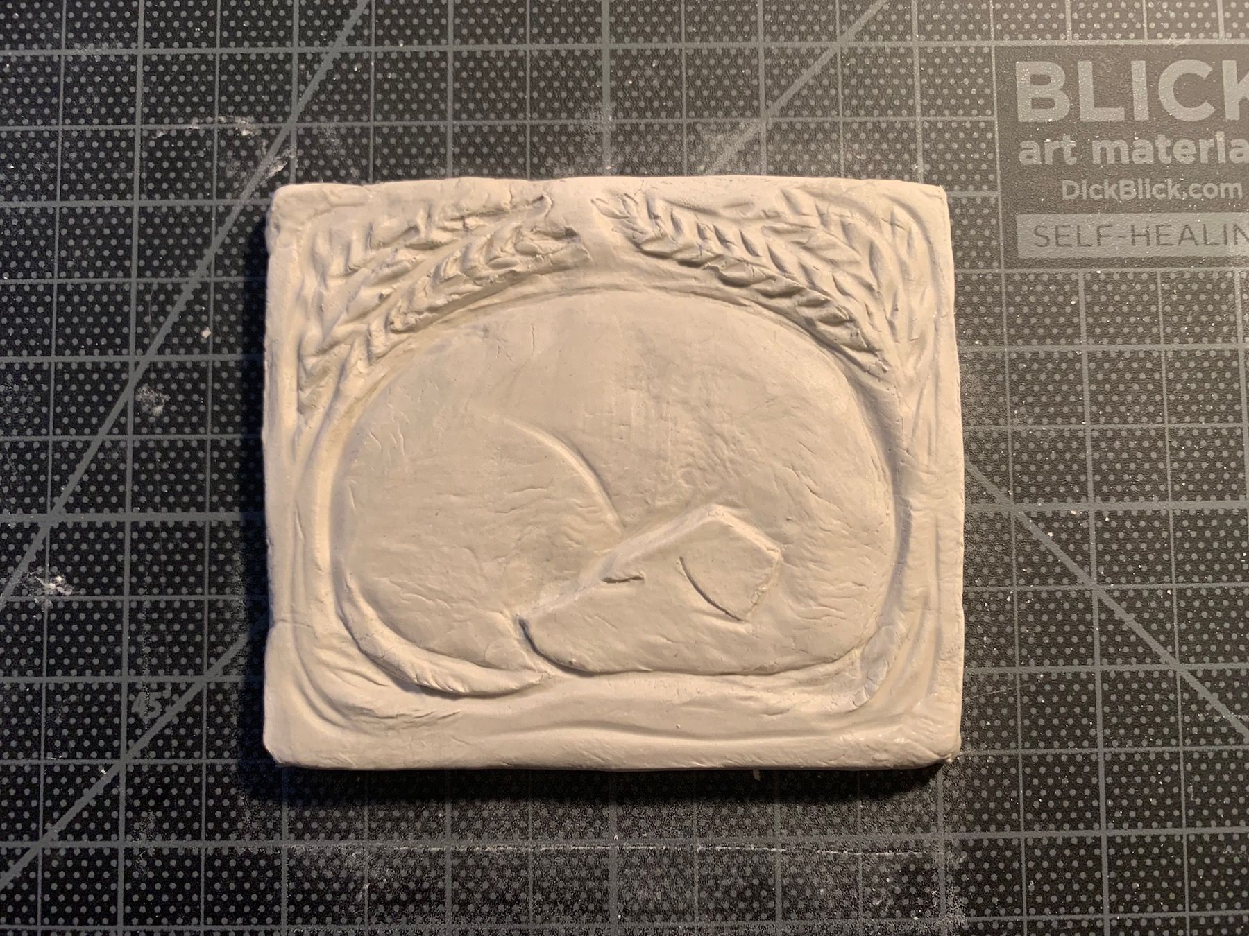
Then got feedback in class to try thickening the leafy border. I made more small mockups:
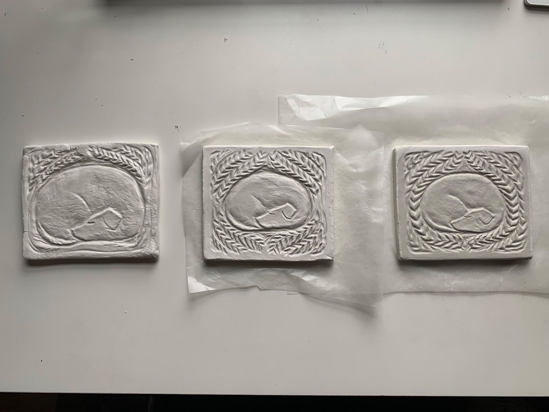
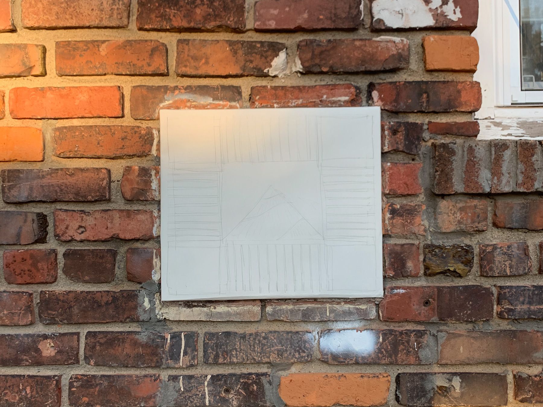
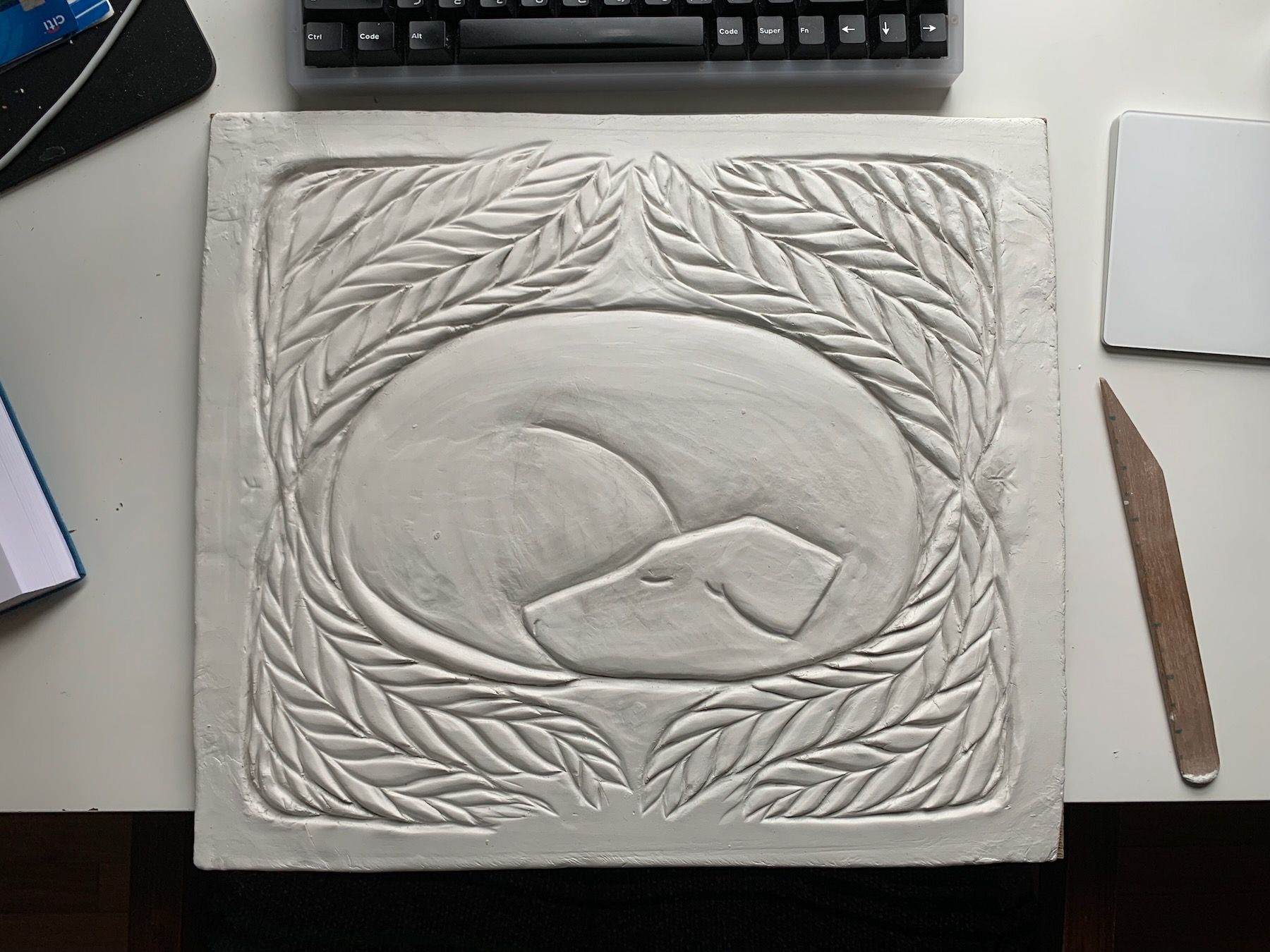
And decided to build the one in the middle at full scale.
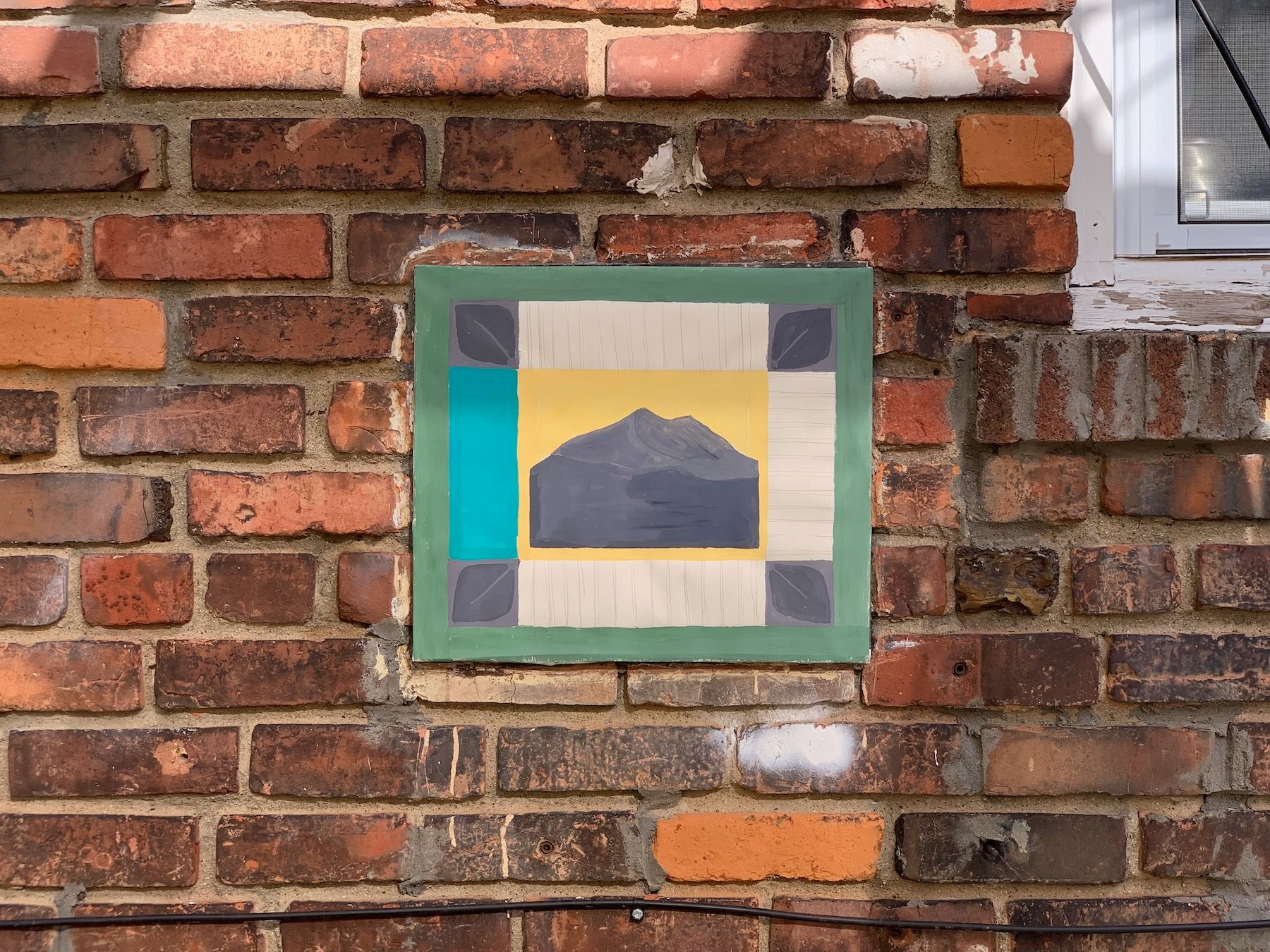
4. The Result
Even though I kept trying to limit scope of the project, I still ended up short on time and wasn’t able to get to casting in concrete. For presentation day, I just focused on finishing the full-scale clay model.
5. Lessons and Next Steps
I’m still planning to sand cast it in concrete in my own time, and will update this post once I do. Otherwise here are some lessons from these four busy weeks:
- There’s a difference between personal and Personal. Between the idiosyncratic and universally felt. The latter can come from the former, but often requires translation. Turning a memory into a story, or a song.
- Every change in medium is a learning experience. Paint and clay have different tools, processes, requirements. This seems obvious but it still surprised me along the way. I’m sure the same will be true when I start working with concrete.
- Every change in scale is also a learning experience. In the physical world, you can’t just drag-to-scale like you can with software. It’s not just a matter of recreating the same thing only bigger. Jumping from a 1/4-scale model to the full-size clay panel required larger carving tools, different hand movements. You have to adjust the full-size version to retain the feeling of the model.
- Sometimes the inevitable answer isn’t invented but discovered, found. It may be a sketch you dismissed or didn’t think much about. It may be a vision or fantasy you had before you started the project. Even prior to my first drawing of our curled-up pup, I’d seen the image, in my mind’s eye, as a tattoo.
This post wouldn’t be complete without a before-and-after:
Next up: a furniture project.