Our third project for Building Beauty was to design a small (roughly 600 sq. foot) dream house, “a place where you will feel a deep sense of belonging; a real home for your body, your heart, and your soul.”
1. Project Jewels
We started with a visualization exercise, led by one of our instructors – almost like a guided meditation. We closed our eyes and imagined a day in the life of our dream home, our home in paradise or (an earthly) heaven. Afterwards, we wrote down we saw, identifying 5–7 “Project Jewels” – particularly striking aspects of said home.
A jewel could have any level of scale. It could be a piece of furniture, or a nook in a room. It could be a room itself, or some quality of the home itself. So long as it sparked something in you, pinpointed some meaningful quality that would be a part of your dream home. One of my classmates, for instance, had “Warm Floors Everywhere” as one of their jewels. If you’re familiar with A Pattern Language, jewels are like the most important patterns for your specific house.
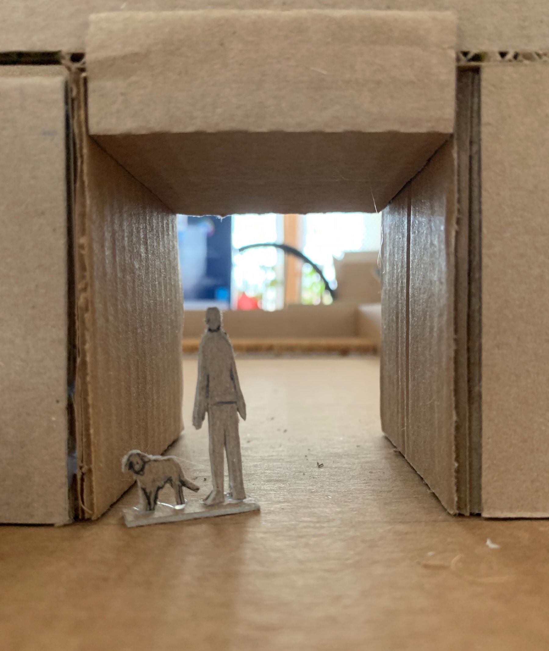
When I first, in my mind’s eye, entered my house in paradise, I was greeted by ... myself. A version of me poking his head out from the kitchen, wearing a flour-dusted apron, about to stick a pizza into the brick oven. This became a jewel titled Radiant Kitchen Hearth.
Here are the seven I ended up with, along with titles, descriptions, and sketches that we refined over the first weeks, trying capture the deep feeling they evoked in us:
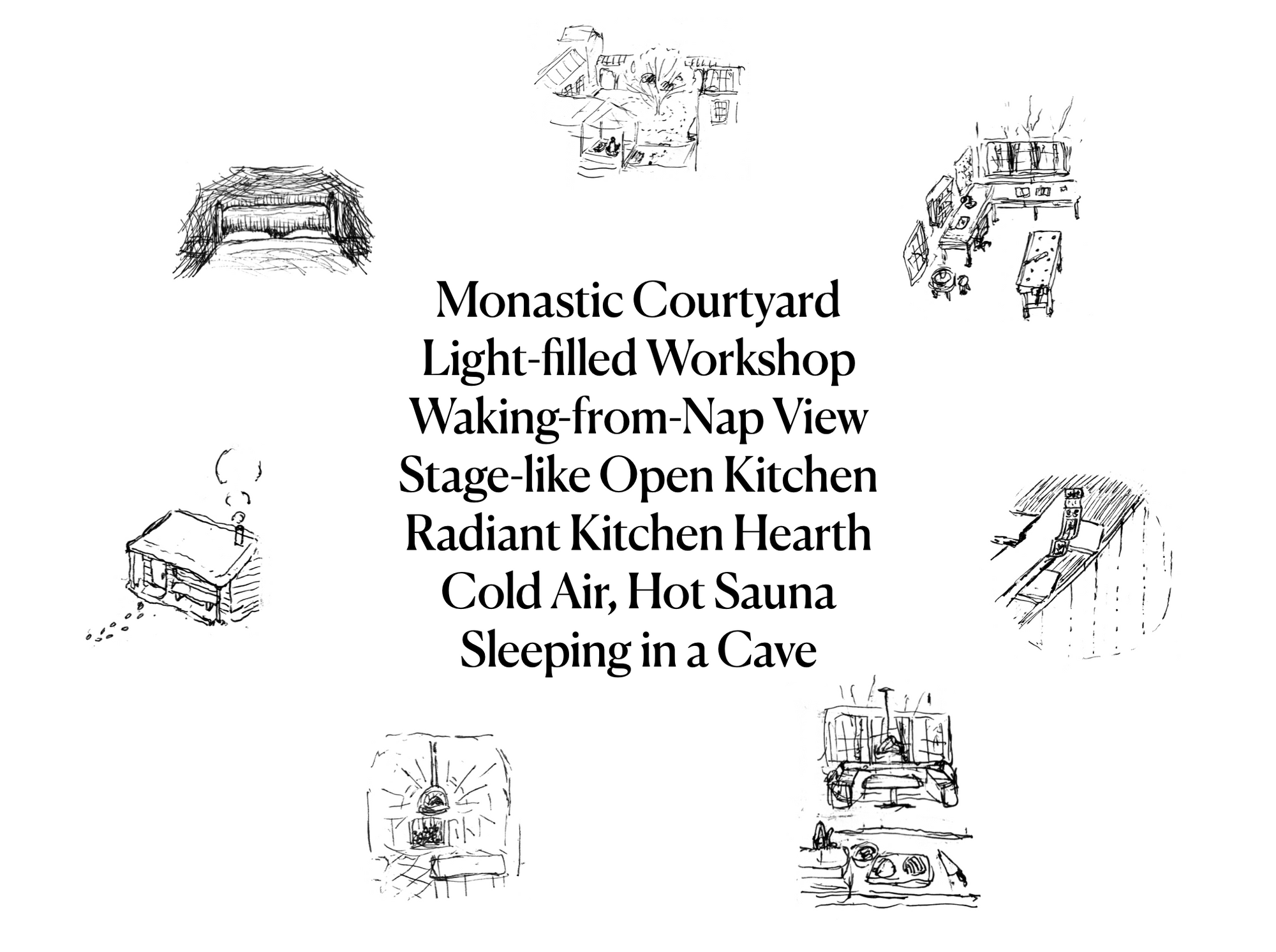
Monastic Courtyard – An outdoor space welcoming contemplation, with a tree or two to mark time’s passage. A sheltered spot to meditate year-round, and covered paths and arcades for walking meditation.
Stage-like Open Kitchen – Food prep with view of seating, so one can cook and entertain guests. Or watch over a child at the table, coloring in a book. The best kind of multitasking.
Radiant Kitchen Hearth – A brick oven at the heart of the kitchen and house. For pizza, bread, aroma, and warmth. Glazed ceramic tiles placed around, to catch the dancing light.
Cold Air, Hot Sauna – A place to unwind on winter nights, with partners, friends, or by oneself. A porch or perch for breaks between sweats. A walk back in the crisp night air, before crawling into bed.
Light-filled Workshop – A place for craftwork, in its many forms. A dedicated space, connected to the outside, with natural light and doors left open on pleasant days.
Waking-from-nap View – A carved ornament or low-hanging eave—something to catch the eye upon waking from rest. A bridge between dreams and reality.
Sleeping in a Cave – Dark, quiet, sheltered, and still. Just enough room, for sleep and little else. Waking naturally to daylight at the foot of the bed.
2. Site Selection and Analysis
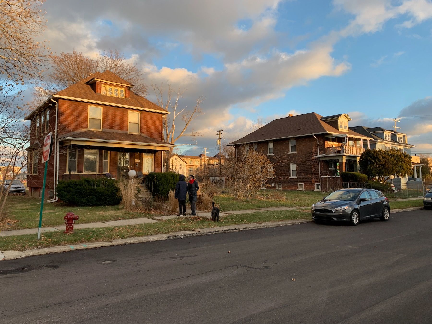
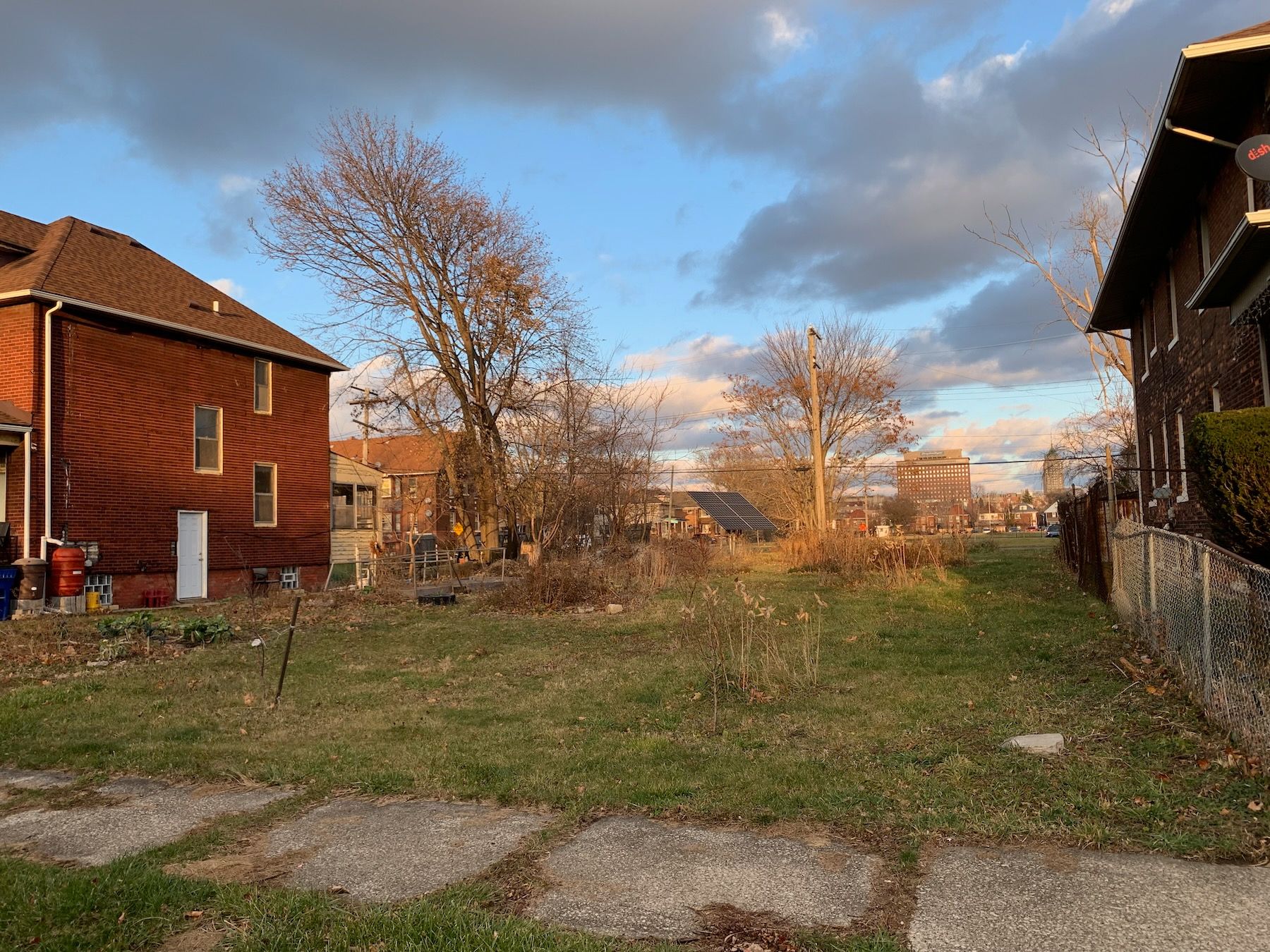
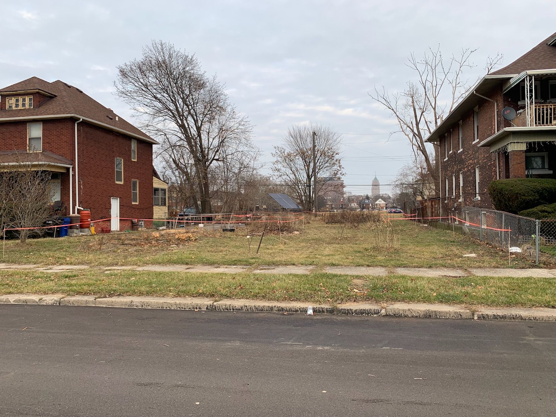
Every real-life house has an actual physical place. So we had to find, for even this hypothetical dream home, a real-life site we had access to; no designing in a vacuum. Some of my classmates in denser urban areas than Detroit chose parts of public parks for their sites. Mine was a vacant side lot that some friends own next to their house.
I want to emphasize, though, that we did the visioning jewels exercise before/independent of picking an actual site for our house. This is important because we want to start with an ideal state – the qualities that make for our home in paradise – versus choosing the site first and then figuring out what we can fit in there. It doesn’t mean we ignore the characteristics of the site itself; the thought is more that creativity emerges from trying to make the ideal work with the actual. If you give MacGyver dental floss and a band-aid, he might not do much with it. But if you give him dental floss and a band-aid and an objective, that’s where he gets inventive.
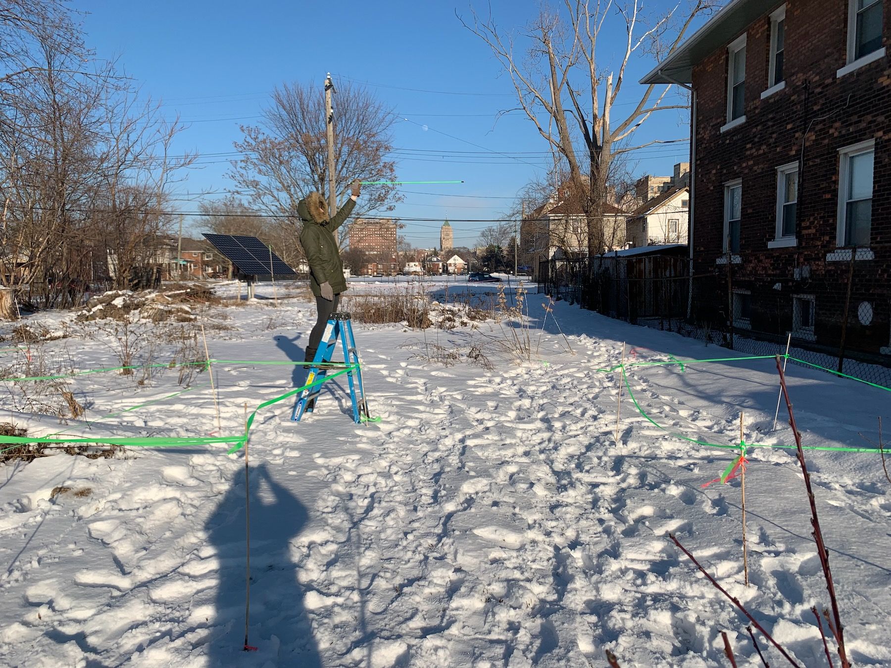
End digression. After visiting the site and taking lots of photos of the views and nearby streets, buildings, and areas of interest (and measuring distances both in person and using Google Maps), I drew a map of the surrounding context at about 1:200 scale (where 1/16″ = one real-world foot):
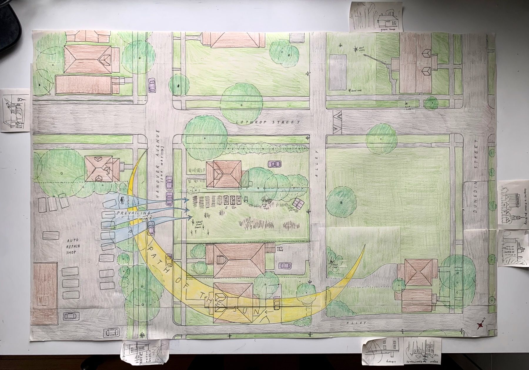
In architecture-speak, this is called a “site analysis.” Building Beauty takes it one step further; we also did a Field of Centers analysis:
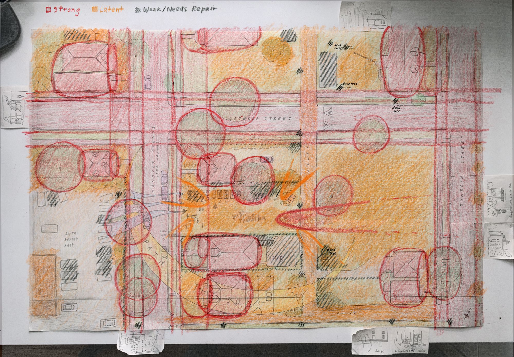
The Field of Centers analysis is a way of mapping out what has a strong presence on the site (large trees, nice houses and views, the volumes of connected street and front yard space), what’s more latent or has potential to become strong, and what is weak and needs repair. In other words, the spots that feel good and the ones that don’t feel so good.
I want to focus your attention on a few centers in particular:
The most striking thing about the lot was the unobstructed view of two tall buildings in the distance: Henry Ford Hospital and, taller but further away, the Fisher Building, an art deco skyscraper in the New Center neighborhood. Both pleasantly lit at night.
Other strong centers were a cluster of tall trees along the fence line to my friends’ home, and the volume of front yard spaces – specifically the row of front porches. If you were on a porch, you had a galley view of all the porches down multiple blocks.
Whatever dream house I built on this site had to preserve and enhance these existing centers.
3. Garden Stakeout and 1:200 Model
On a different day, I went back to the site staked out the outdoor areas. Despite the sunny photos, it was the middle of winter and I had to work around the weather. In the typical modern way of building, the garden (in the more general sense of “relevant outdoor space”) is an afterthought. But the outdoor space is one of the most impactful – if not the most impactful – thing on the interior, in terms of light, views … in terms of the overall feeling.
Christopher Alexander talks about another common mistake in the Site Repair (104) pattern in A Pattern Language:
What usually happens when someone thinks of building on a piece of land? He looks for the best site—where the grass is most beautiful, the trees most healthy, the slope of the land most even, the view most lovely, the soil most fertile—and that is just where he decides to put his house [… F]or a person who lacks a total view of the ecology of the land, it seems the most obvious and sensible thing to do […]
But think now of the three-quarters of the available land which are not quite so nice. Since people always build on the one-quarter which is healthiest, the other three-quarters, already less healthy ecologically, become neglected. Gradually, they become less and less healthy […] Not only that. When we build on teh best parts of the land, those beauties which are athere already—the crocuses that break through the lawn each spring, the sunny pile of stones where lizards sun themselves, the favorite gravel path, which we love walking on—it is always these things which get lost in the shuffle. When the construction starts on parts of the land which are already healthy, innumerable beauties are wiped out with every act of building.
In this alternative process, we figure out the most comfortable beautiful and comfortable areas of the site first and build around them, strengthening them and repairing the spots that need repair.
It helped me to focus on comfort here, using my own body as a gauge. I got a bunch of wooden dowels from my local home store (because of the season they didn’t have bamboo garden stakes or I would’ve used those instead) and marked the areas that felt comfortable to be in:
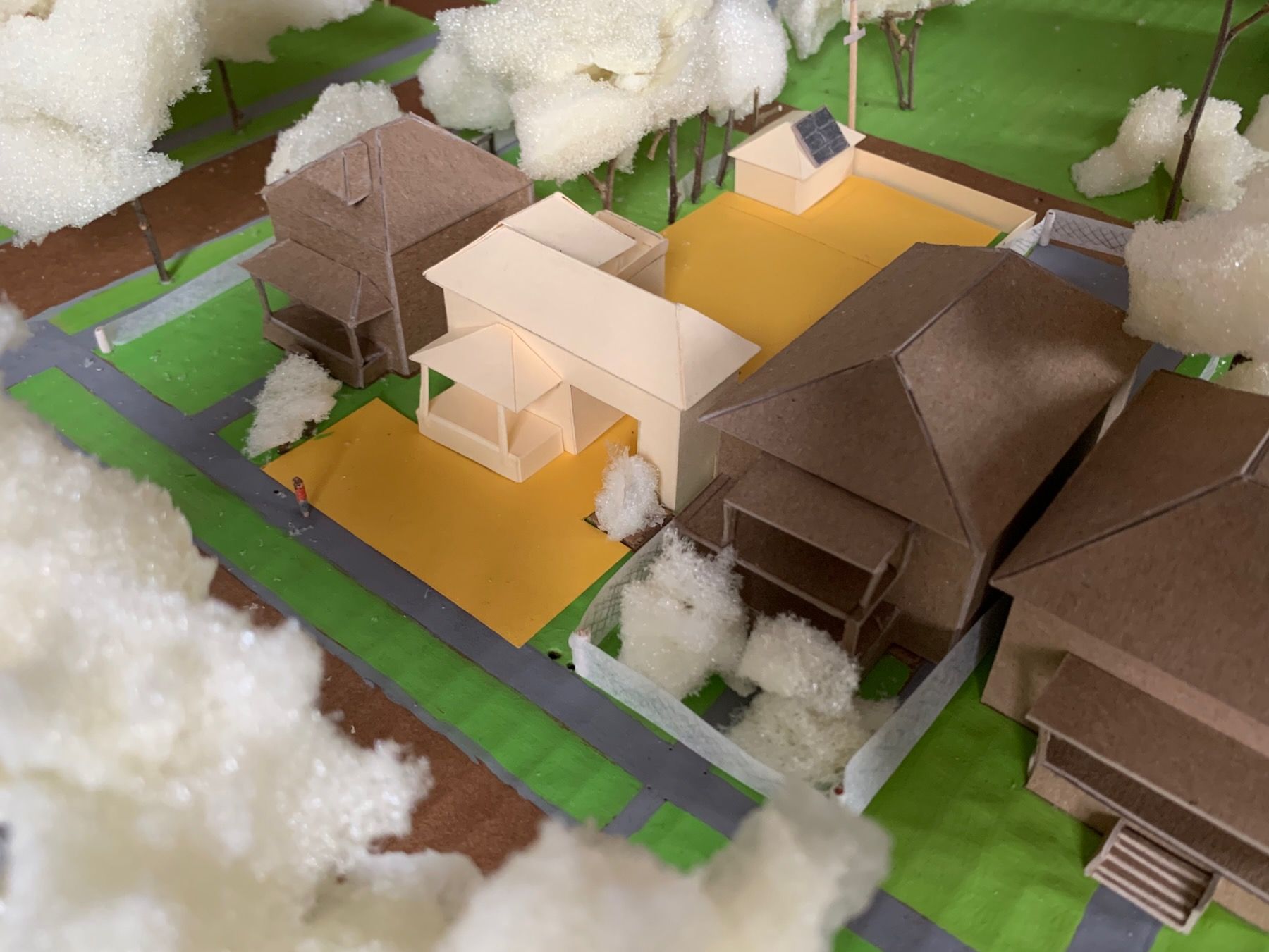
You can see it more clearly here in gold construction paper on my 1:200 model, which I started concurrently after finishing the site map. The houses here are chipboard, the base painted cardboard, and I used twigs and leftover packing foam for trees and bushes:
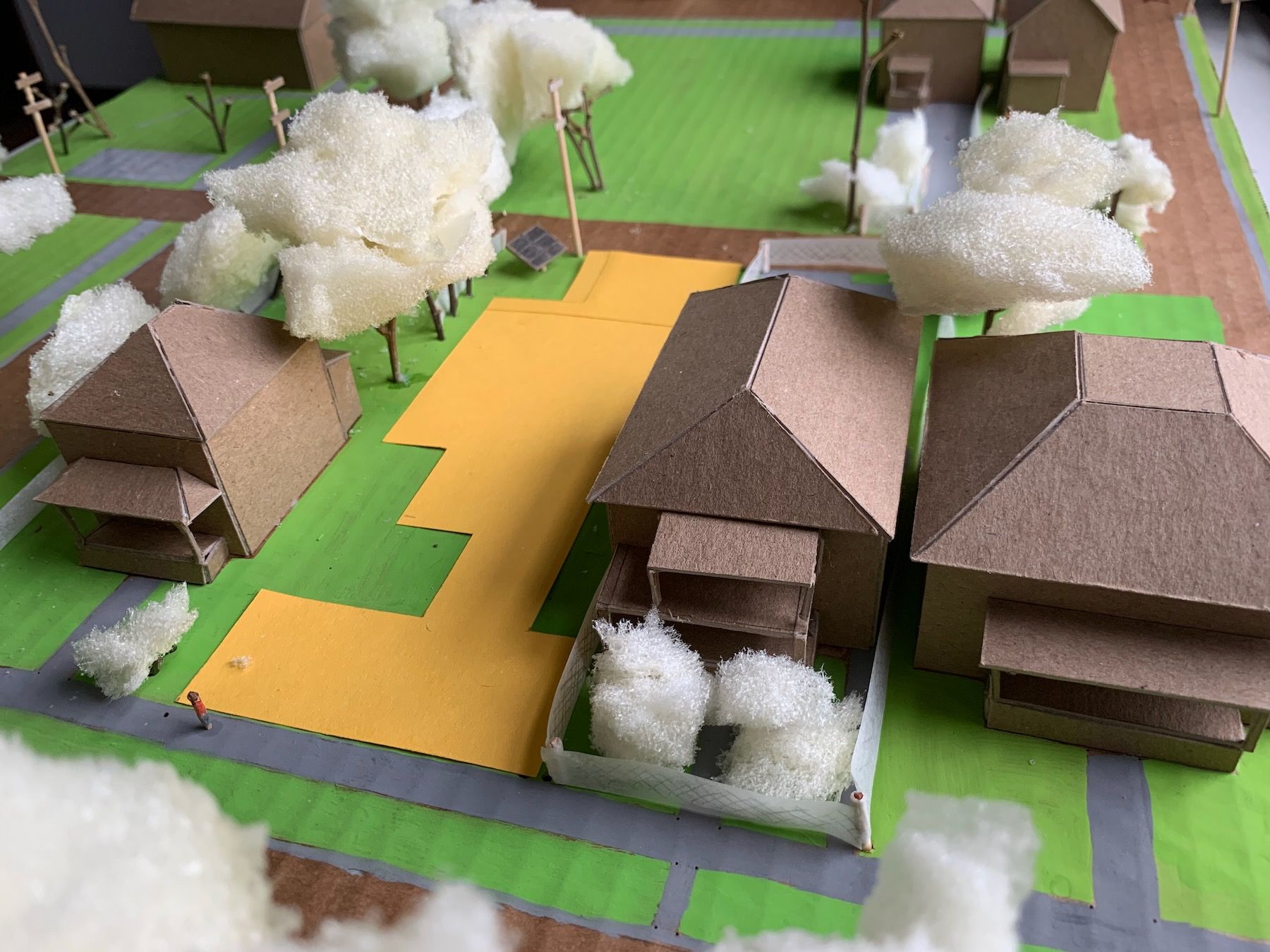
Why the odd cutouts into the gold? Those were the areas that felt too close to the neighboring houses. The cutout on the right, which you can see from the south-eastern light in the model, was in shadow for most of the afternoon. And why the thinner yellow neck connecting the front and back yards? That was the line of sight to the tall buildings in the distance. Here’s a short video showing what I mean:
It was really hard to not think about the house as I was staking out the garden. The first time I did it I misunderstood the instructions and thought we were supposed to stake out the house. Artists and graphic designers might relate to the feeling of having to learn, over time, to see the negative space as positive. The stakes, once linked with bright surveyor’s tape, helped a lot with visualizing these different volumes of space, these outdoor rooms.
4. House Volume Variations
From here, I played with variations of the house volume on my 1:200 model. Here’s a first attempt, using manilla folder stock, which is quicker and easier to cut and glue and experiment with than the chipboard:
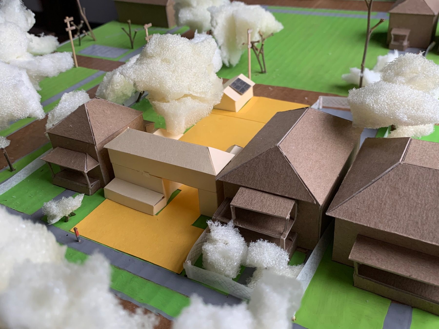
The idea is to crank these out quickly; you can’t be too precious. Sometimes I’d work on them at my desk in class while other students were presenting. Another discovery in this part of the process was that it felt important to preserve and strengthen the two-story roofline and the hipped roofs of the other houses on the block – the exiting form language (in Building Beauty terms).
Here are some more variations, which I tested by comparing them against each other and asking which felt the most alive, felt like the best mirror of my self:
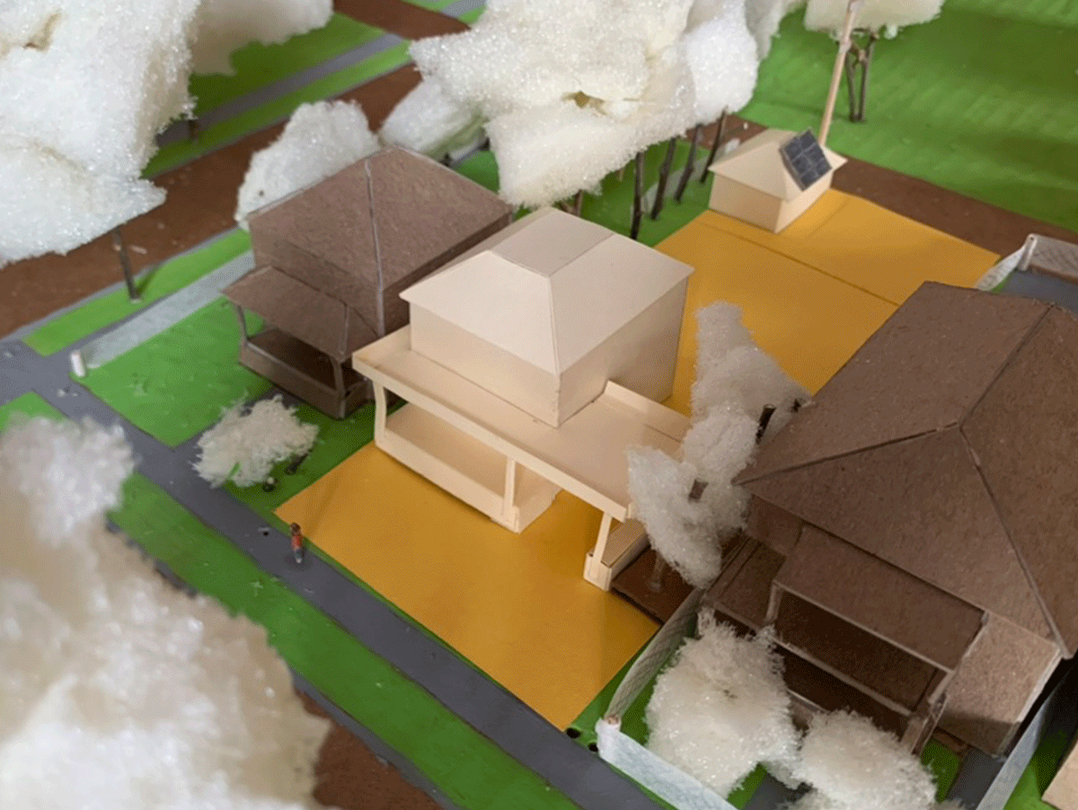
I eliminated some of the options that were clearly too large (I was supposed to be sticking close to 600 square feet). I settled on a general direction not far off from where I started, with the view-preserving breezeway to the backyard:
Next up: placing the front entrance and the first jewel.
I want to pause first, though, and remark on how atypical some parts of this process has been. Aside from the rough, almost-gestural drawings for my jewels, I haven’t done a single drawing of the house itself. Instead, we focused on the larger contexts first, like what kind of shape of house would fill in the missing roof and porch lines along the block, or how the shape of the outdoor space would define the house volume. Even for those, I went straight to physical models, because these models will give simply give you more information than a drawing or computer model. It’s like being in a room with someone versus being on Zoom with them.
Architectural drawings and computer models also, just by their forced precision, cause you to make decisions you can’t really make at this stage without taking complete stabs in the dark. This is why Chris Alexander advocates only making the crudest of sketches when you have to do them. As a result of the class I’ve come to think of detailed architectural drawings and virtual models more as transcription tools – for when you need to get approval for permits or subcontractors – than design tools.
5. Placing the Entrance and the First Jewel
For this part of the project, I drew my first floor plan, by measuring my stakeouts from the previous step. Placing the entrance was relatively straightforward. I had a front porch. I didn’t want to divide the seating area of the porch. I also wanted there to be a small entrance room/area so that the front door didn’t just open into the main room. The logical place for that was toward the right side of the ‘L’.
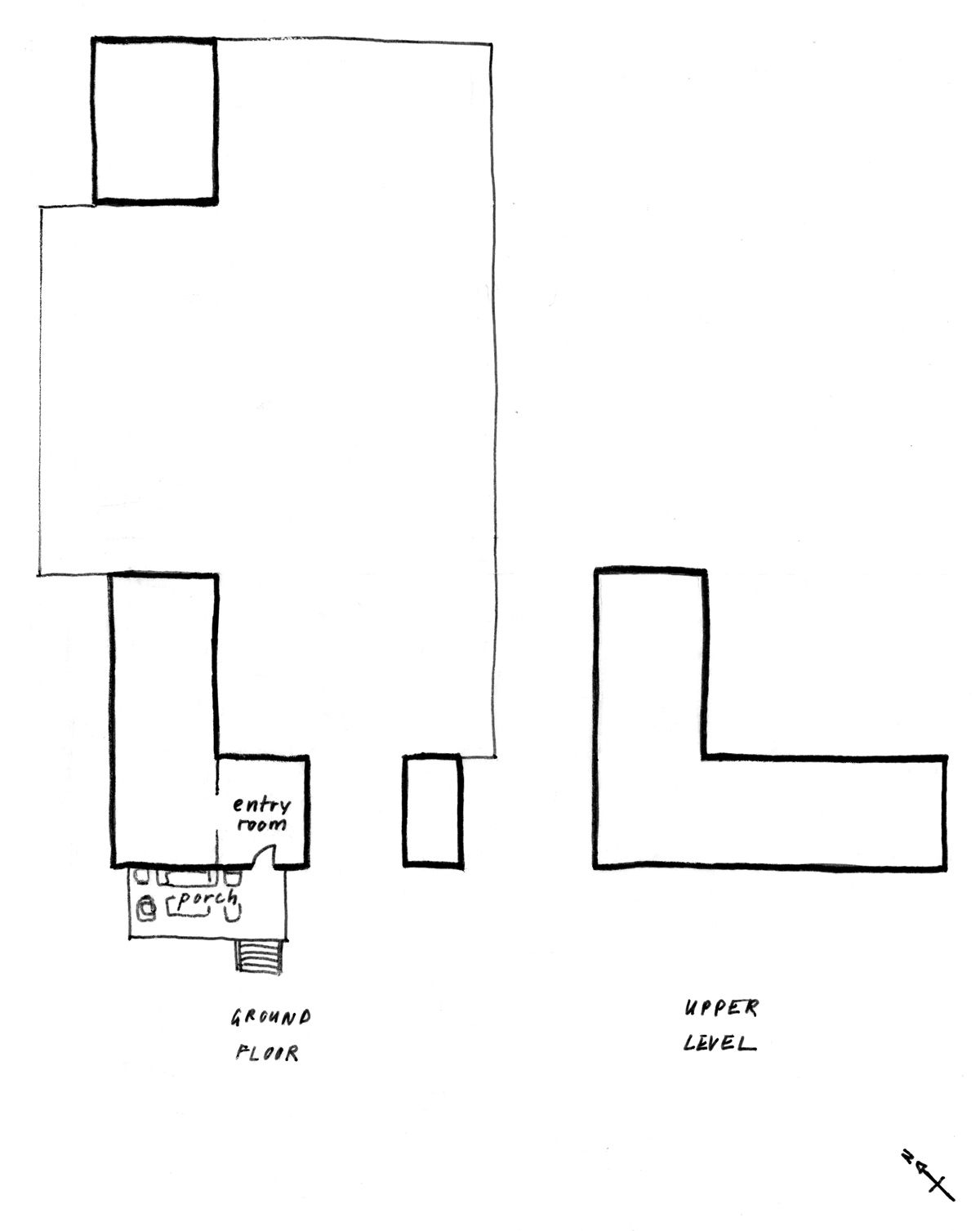
The most important room in the house was my Stage-like Open Kitchen, along with its Radiant Kitchen Hearth. So I placed that room, not wanting it to be too long.
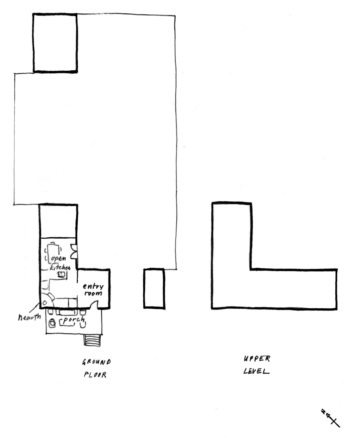
Here’s where I ended up (sans windows), with the area to the right of the breezeway for storage and the outbuilding as a detached garage (a common pattern in the neighborhood).
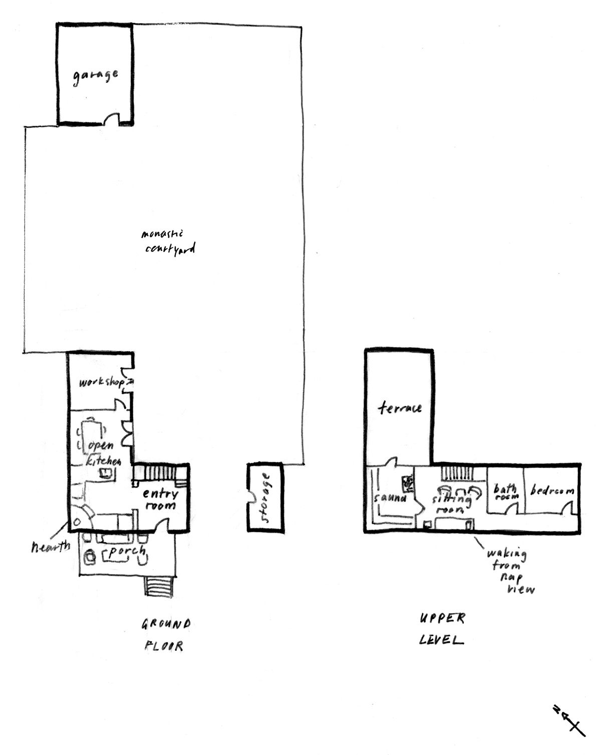
The upstairs sitting room would have a daybed for naps, and you could hang out there if you needed a break from the sauna. Per my Hot Air, Cold Sauna jewel, you could also step out onto the terrace if you needed to cool off. I showed this in class and the biggest piece of feedback was that the kitchen probably wouldn’t get enough light. Even if I had large windows on the wall shared with the porch, the light would be dimmer due to the roof over the porch. And we want the most important room to have the best light.
It feels like a no-brainer but it’s another one of those things often neglected. In many American houses – like the one I grew up in – you’ll find a formal living room meant for entertaining guests that gets the best light in the house … and no one uses it. Everyone spends their time in either the kitchen or a den or “family room.”
At our class review, one of my instructors suggested moving the kitchen to the upper level. Yes, I’d have to carry groceries upstairs, but it was a minor inconvenience given what I would gain in terms of light and feeling. I quickly doodled another floor plan, not worrying too much about being overly precise:
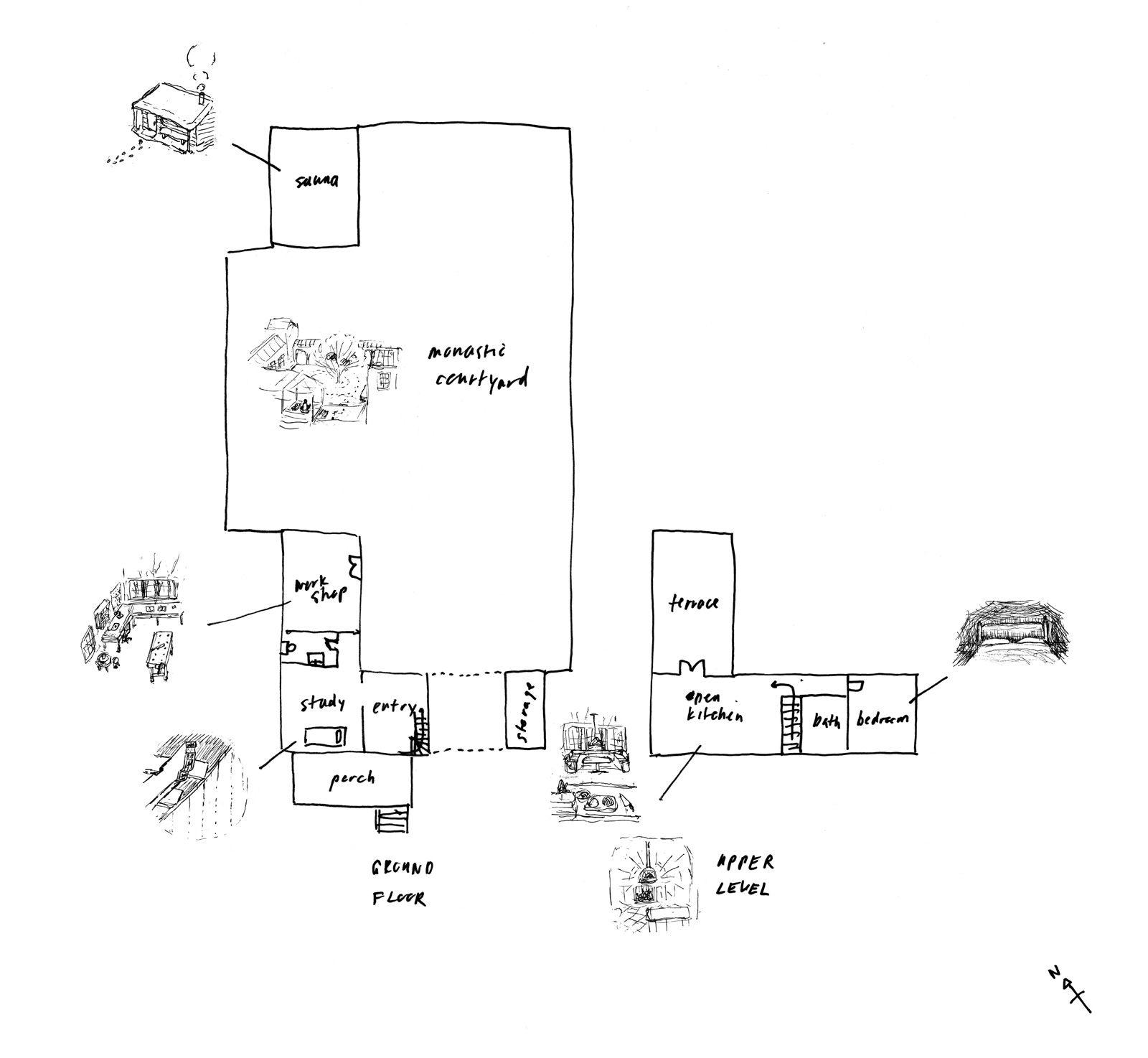
This is pretty close to the final plan, except the sauna and workshop are switched, and the upstairs staircase and hallway are mirrored vertically, because the best views – of those distant tall buildings – are to the northeast. I originally thought it’d be neat to see those in passing, as you were on your way between the kitchen and bedroom, but my instructor made a strong case for keeping those more precious views for places you’d actually be sitting.
There’d be more time to test this out once we got to making the larger 1:50 scale (1/4″ equals 1′) model. But before that, we had to design the outdoor space.
6. Designing the Courtyard
Next up: the Monastic Courtyard. In the visioning exercise, I saw myself sitting outside in the mornings, meditating to a view of mountains. There aren’t any mountains in Detroit (at least not any real ones). But the tall buildings in the distance are mountain-like, in a way – visible, grounding, orienting. The point of visualizing those jewels in Step 1 is not to recreate exactly what you see, but to try to bring the feeling behind them to your real-world site.
My first instinct design-wise was connect the outbuilding to main building via a covered walkway or colonnade. That way it’s comfortable to go back and forth in the rain or snow. It seemed like an obvious thing to do – low hanging fruit.
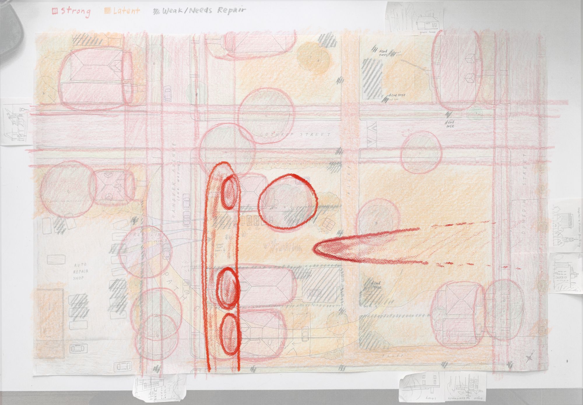
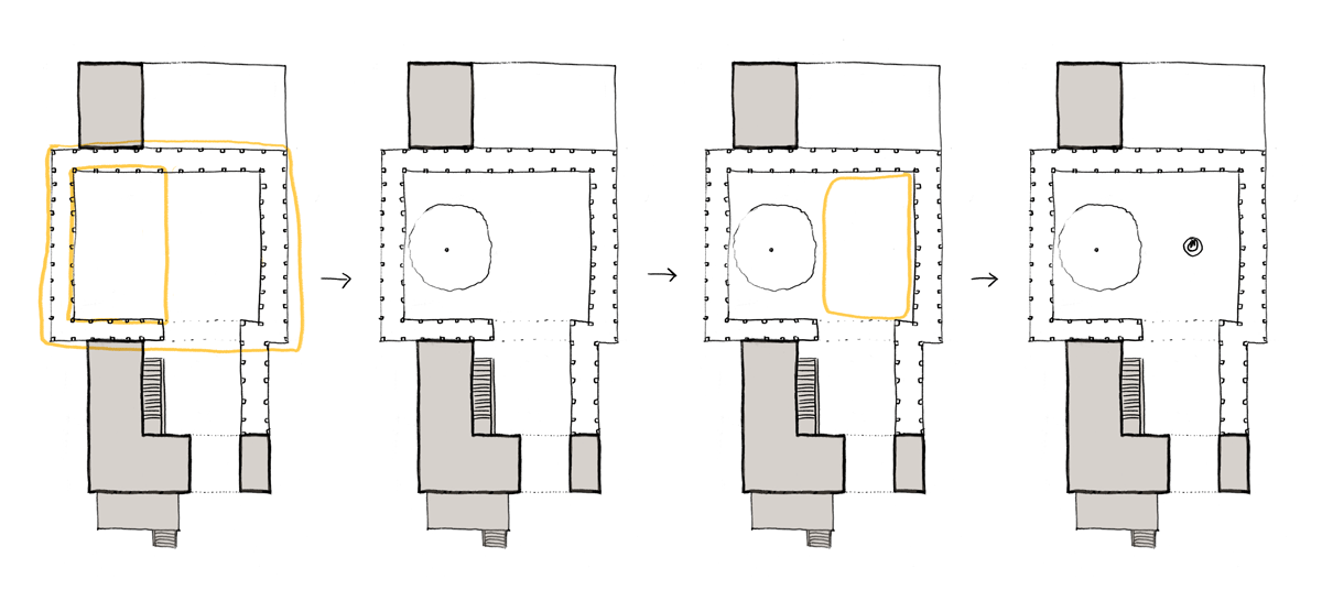
But this is exactly the kind of move discouraged by our alternative design process. Because I made it without real consideration to the existing centers. To demonstrate, here’s a diagram of the latent centers. I’ve drawn them separately for clarity’s sake but they’re all there, hiding within the larger Tetris-shaped empty space.
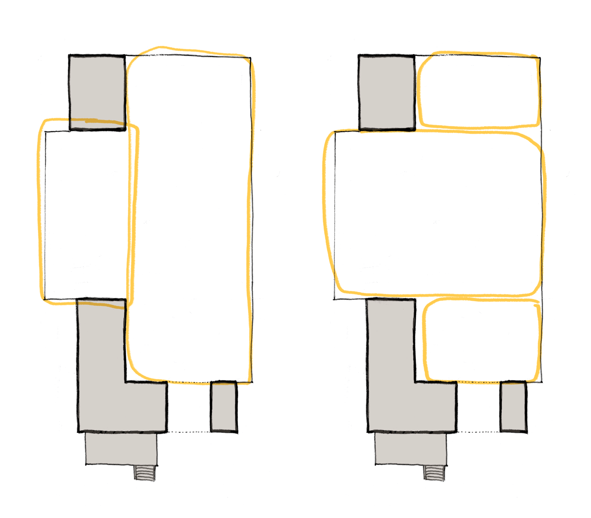
As we go about defining these centers, we want them to have good shape. The two vertical centers on the left feel too long and narrow, whereas the three horizontal ones are better-proportioned. If you think of these as outdoor rooms, the three on the right would probably feel more comfortable to be in.
Again, all these are latent possibilities; they’re hints of what could emerge. To use a musical analogy, they’re possible next notes or chords, suggested by what’s already there. But when I make a move like adding that colonnade from the main house to the outbuilding …
The overall space shifts toward the taller configuration of centers. We also end up with a new, awkwardly narrow and tall center to the left of the colonnade. That’s not to say we can’t solve for those, subdivide the taller spaces to make them more pleasant. My point is more that an “obvious” low-hanging-fruit decision made at the start cascades into the rest of the design. It can have huge implications for how your design unfolds.
You can think of it like a script or algorithm that generates a particular flavor of outcome, and the algorithm here is one of roughly: Do the next thing easy thing. It’s an algorithm of convenience, maybe the algorithm of modernity.
What would be a better algorithm? Alexander argues that it’s Do the next right thing. What determines rightness? Whether or not it serves to strengthen the existing centers and the overall whole. Whether it enhances the existing life of a place.
In a living process, what is always happening is that every step (large or small, whether it comes late or early) is done in such a way to as to increase the beauty – the life – of the whole. The process starts with a vision of a possible whole that comes out of the circumstances, that is felt as something which grows out of the form of the world. (The Process of Creating Life, p. 266)
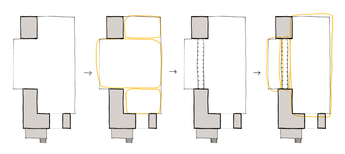
In practice, if the horizontal arrangement of latent centers feels better, one thing I can do to strengthen the largest, middle center is to give it a boundary. I could take that colonnade, and wrap it around the outside:
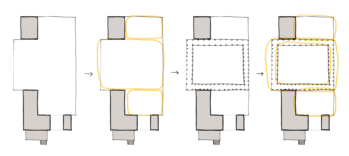
This makes it more of a cloister – very much in spirit with my Monastic Courtyard jewel. It also makes the smaller centers above and below more apparent, and a new latent center emerges in the open space within the larger cloister. Alexander would call this “structure-preserving” (or structure-enhancing).
That’s not to say that “do what’s convenient” can’t yield similar results. You might make changes later on in that process and end up in roughly the same place. But the promise, to me, of “do what’s right/life-enhancing” is that it helps ground you when you’re faced with too many design choices and possibilities, too many moving pieces all contingent on each other. It’s more natural and organic – not in the sense of blobby shapes but organic in process. Where each step is respectful of and attentive to what’s already there.
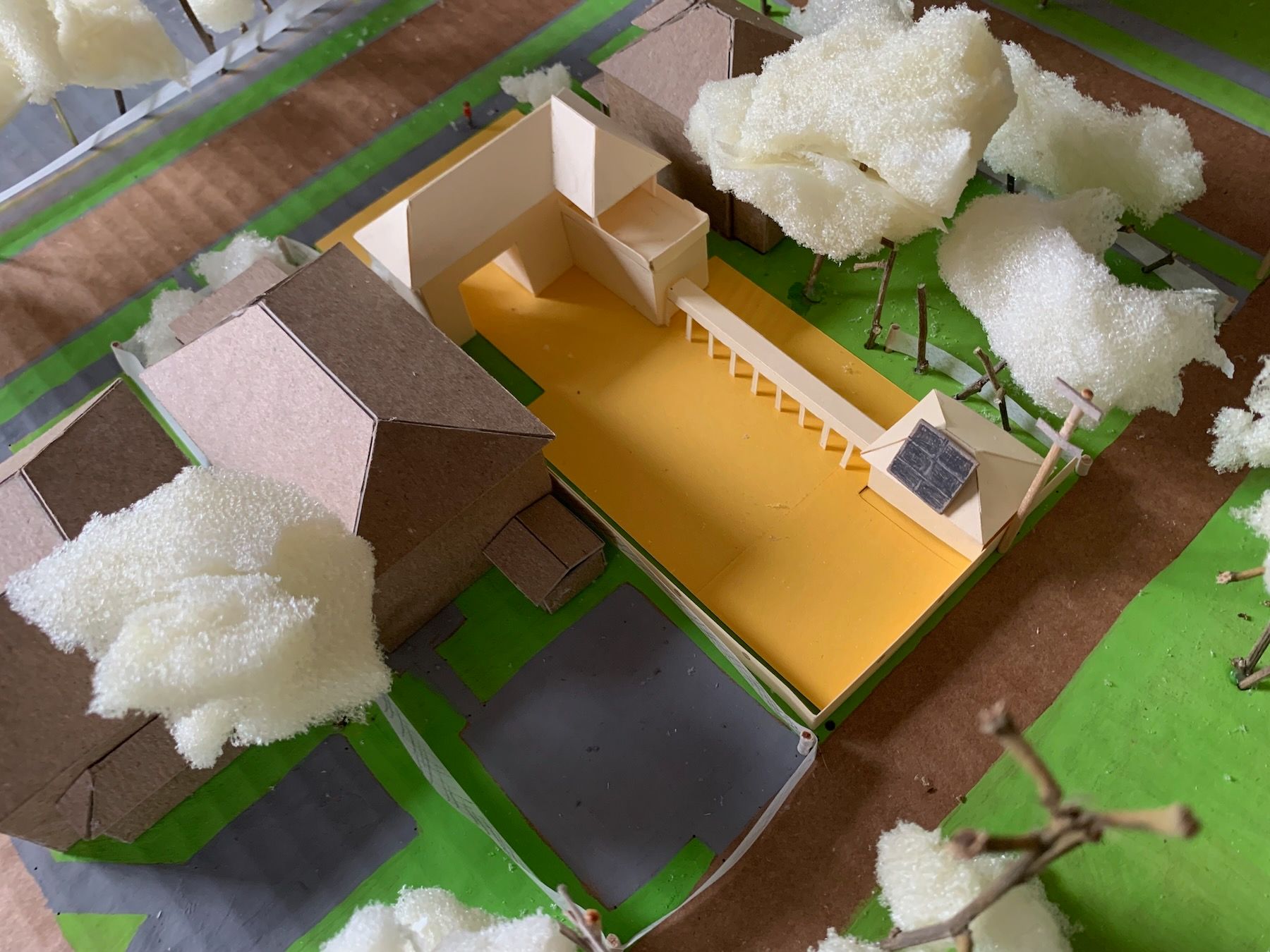
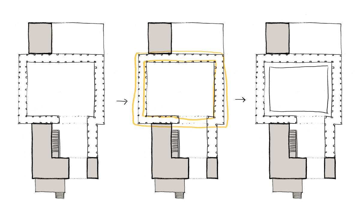
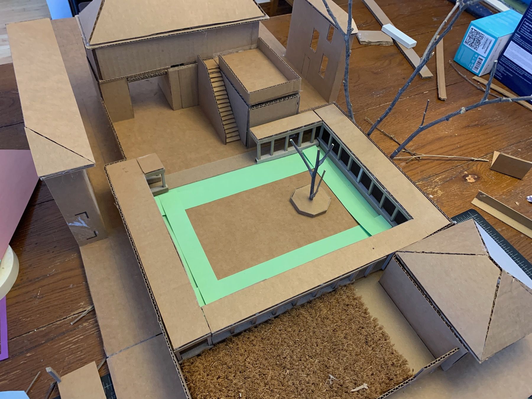
I modeled these changes, along with walls at the sides of the lot to cover up or replace the existing chain link fences. Then I started defining which areas of the yard were grass/plants (green construction paper) and which had harder ground cover (pink). I plopped in a small tree (more on this later) and simplified the main roof so it was no longer an L-shape:
I was also considering a key center that wasn’t visible in the top-down drawings above: the view of the tall buildings through the breezeway:
I got worried, looking at this especially, that the colonnade was too strong, that it would block or visually overpower the sight of the tall buildings. So I tried different widths and other ways of softening it, while still framing the courtyard space:
The above pavilions were too imposing, and bit into the courtyard center in not the best way. My tutor at one of our weekly tutoring sessions suggested adding an exterior staircase, and I thought a roof lantern to bring more light to the room under the terrace (at the time, the workshop):
The smaller pavilions were still too fussy. I just got rid of them. The roof lantern cut into the usable terrace space, so that was no good either. Maybe I could try moving the outdoor stairs next to the terrace, and if I moved the workshop into the outbuilding and the sauna under the terrace, I wouldn’t need as much light there (I prefer saunaing in the near-dark).
There was still a lot of work to do, but I was far along enough that I could start doing it on a larger-scale model.
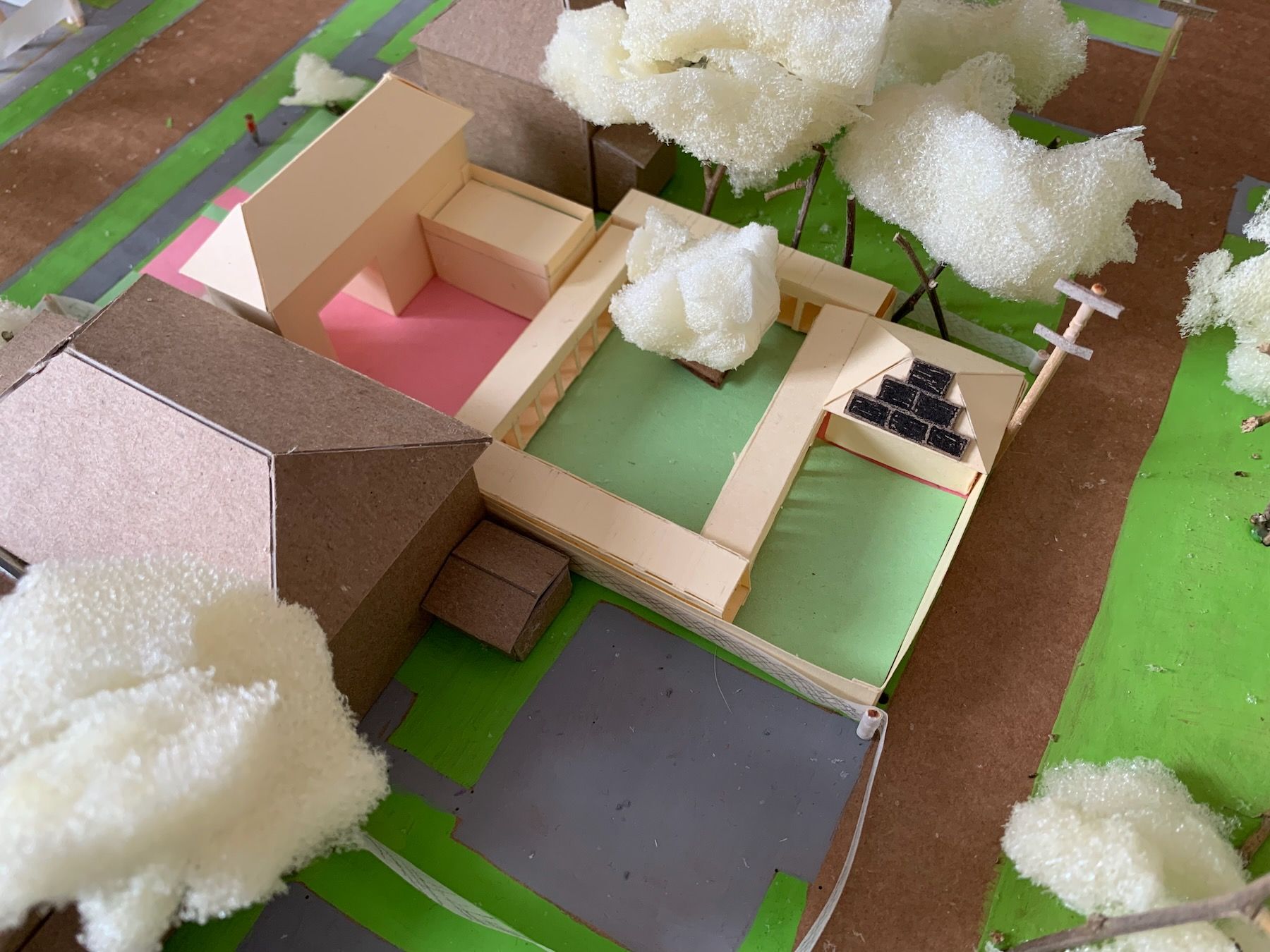
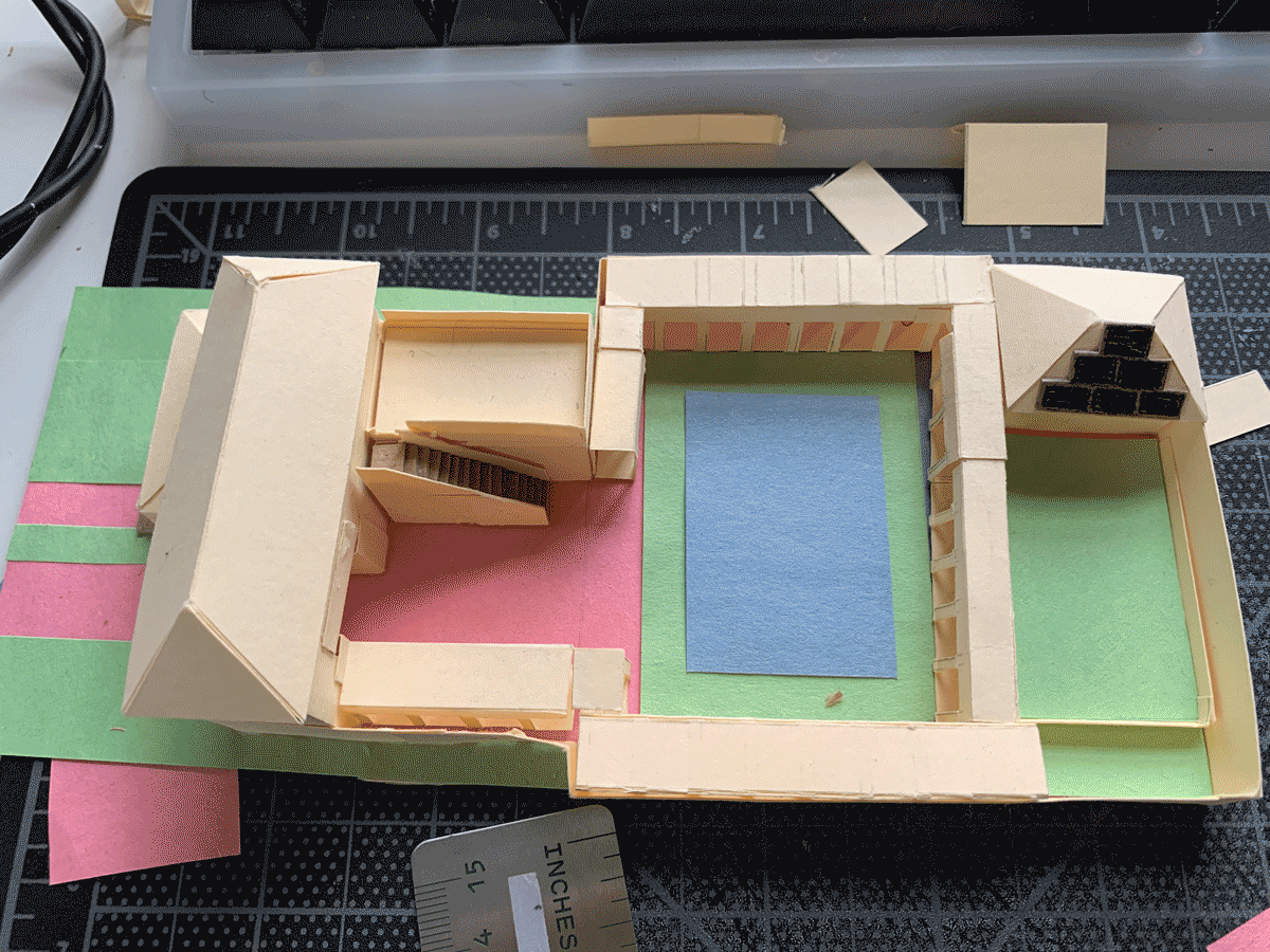
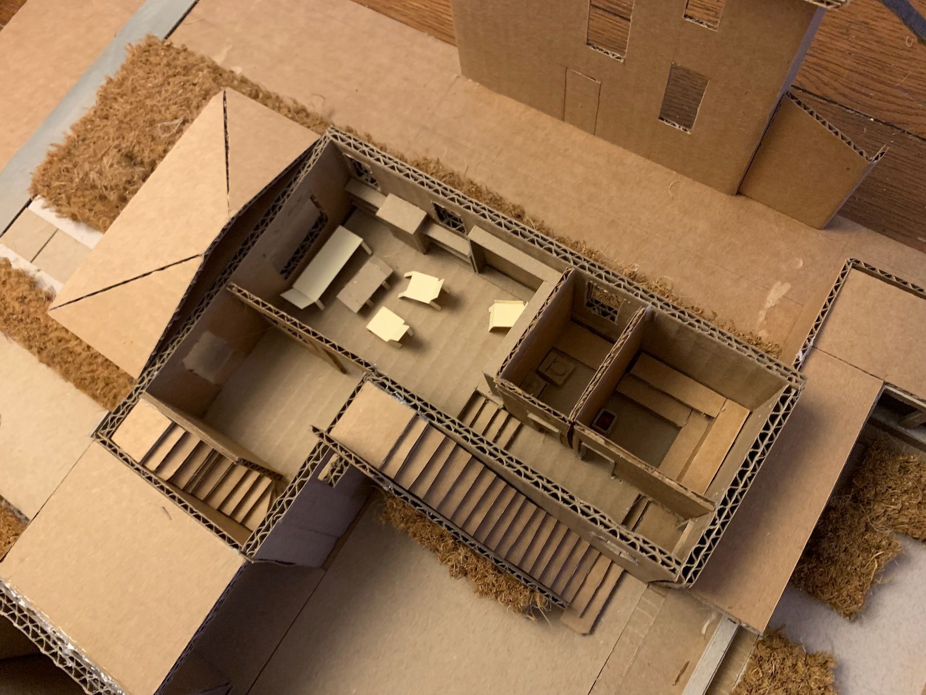
7. The 1:50 (1/4″ equals 1′) Working Model
Materials-wise, I switched to cardboard and hot glue. This is a working model (meant to be ripped apart and experimented with) as opposed to a presentation model (meant to wow clients). I have to fight my perfectionism here because the goal is not to be super-precise, but precise enough that you’re accurately showing the relationships between things. The model should also be large enough to include some surrounding context (Always Be Contexting!).
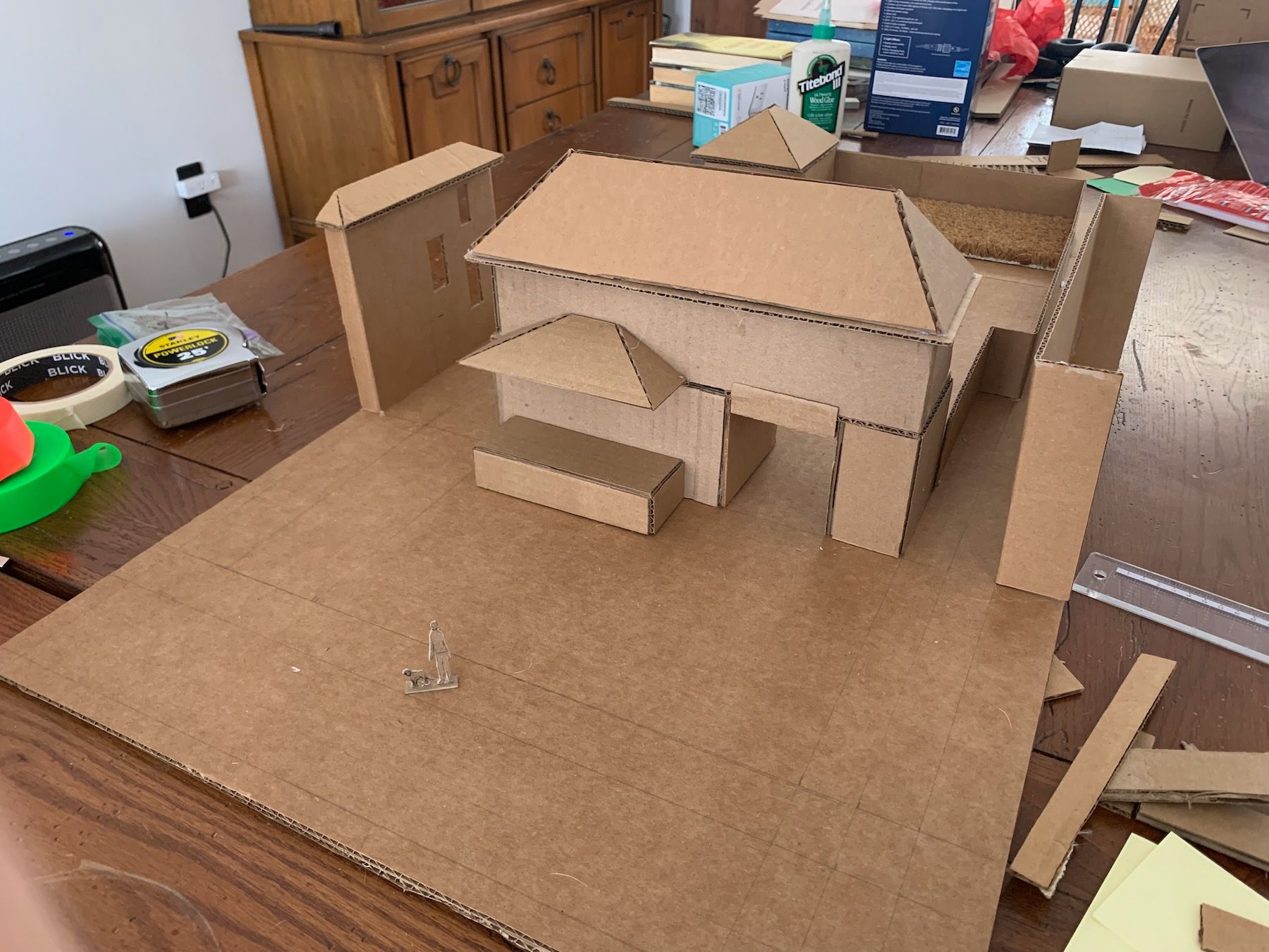
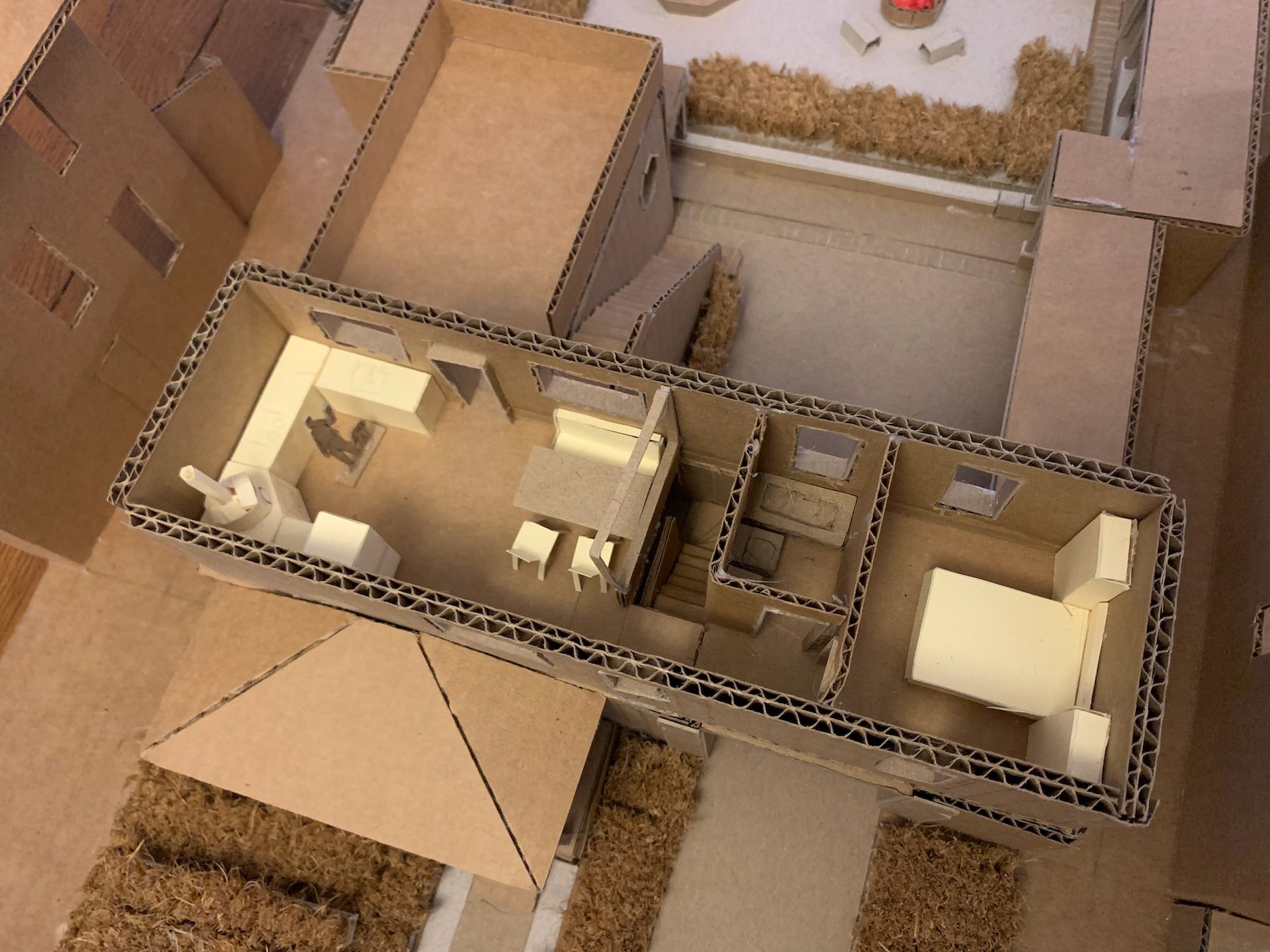
The native prairie plantings I imagined next to the workshop outbuilding is cut from an IKEA coir door mat, a tip I got from a great YouTube video. At this larger scale, I can more easily model the insides of the rooms as well, so I built the house in a way that I could remove the roof and separate the upper floor – like a dollhouse:
A rule of thumb: the scale of models and mockups should match the scale of your design decisions. If you’re trying out a lot of wildly different ideas, small models and quick napkin doodles are great. If your main building shape is set and you’re honing in on room sizes and proportions but only hinting at details, then a larger model like this is better. If you’re working out the final, to-the-half-inch dimensions, then you might do one-to-one scale cardboard mockups, like in my furniture project. The crudeness of these physical models – very much related to their materiality – force you to stay on the appropriate level of decision-making. Another great advantage, in my mind, over virtual models.
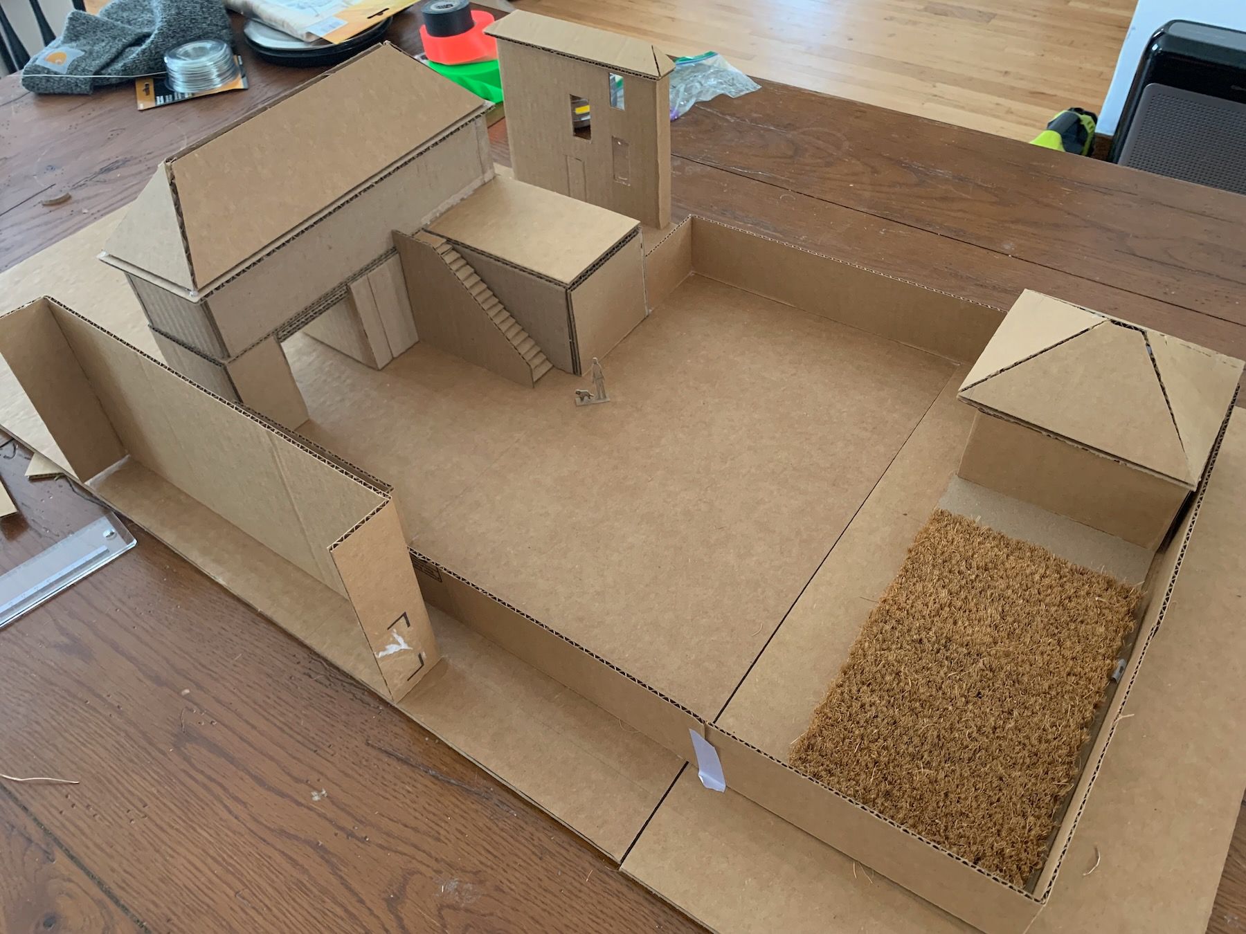
Speaking of honing in, seeing the breezeway in this larger model got me worried that it would read too much like someone could drive a car through it, when it’s meant for people and bikes. I was also trying to squeeze a little more usable floor space out of the site, particularly for the upstairs kitchen. So I went back to the site with my partner and tried to figure out how small I could make the breezeway opening while still maintaining the view and feeling:
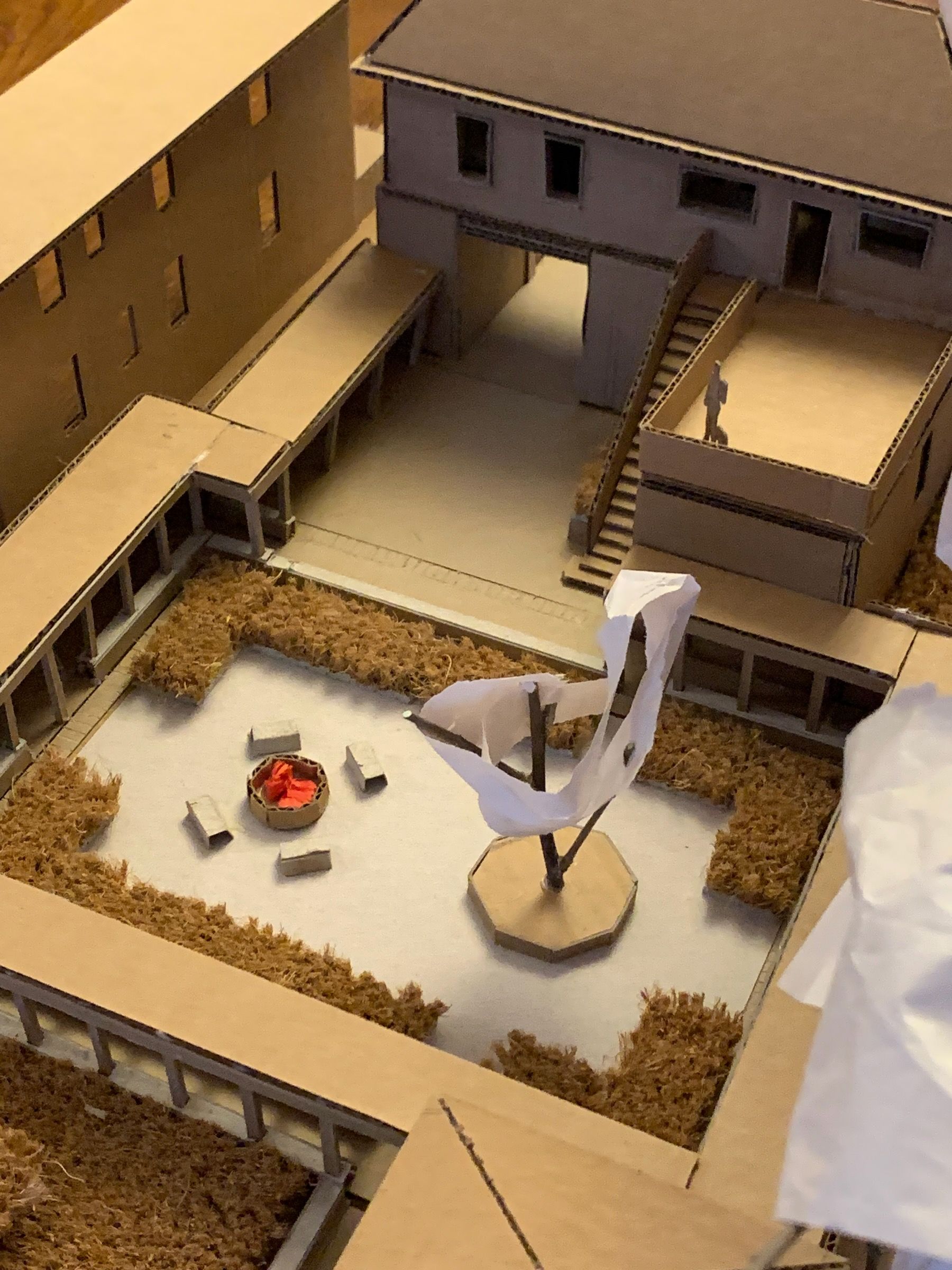
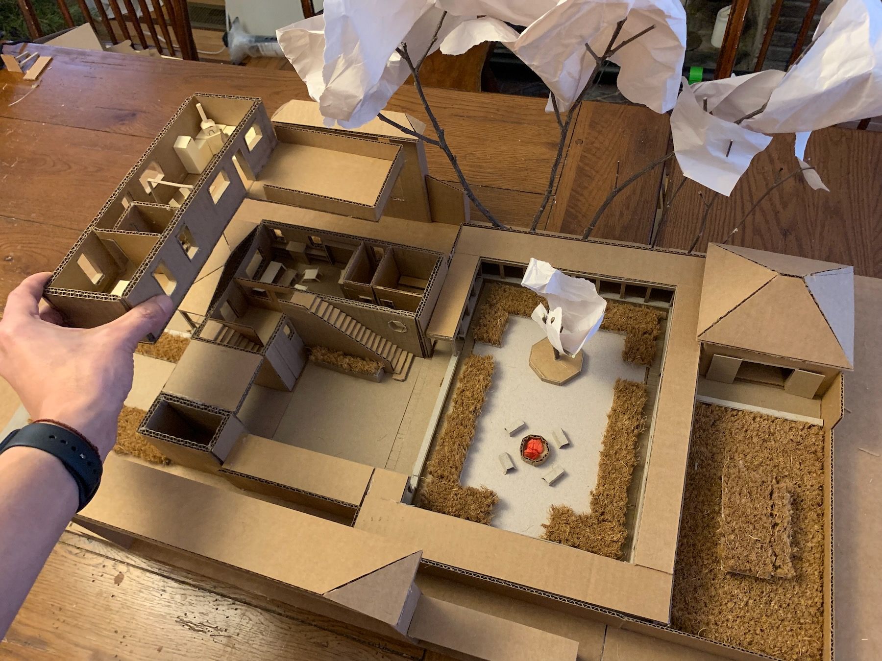
I built the colonnade, then added a tree per my smaller model. That created a latent area in the other half of the courtyard.
It seemed like a good place for a fire pit!
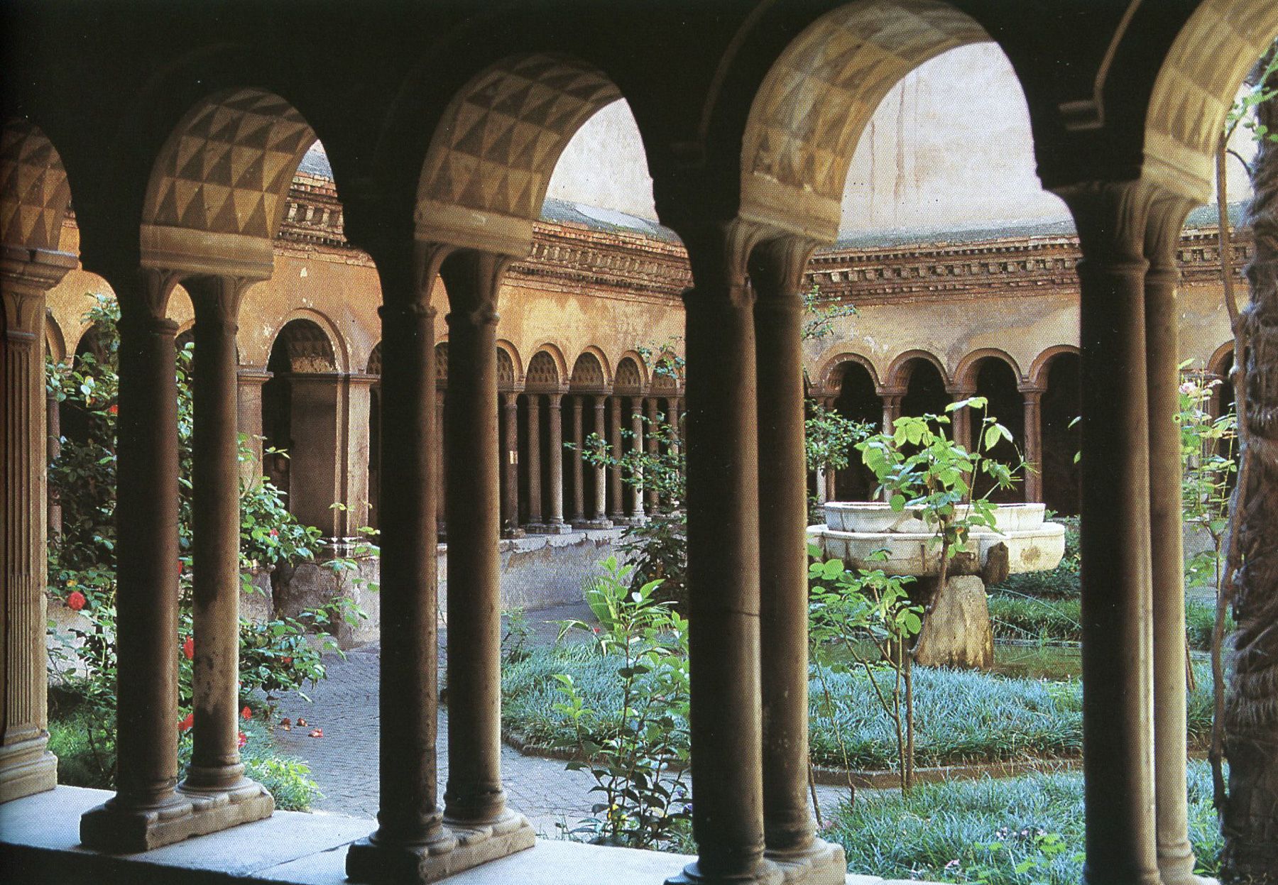
This was feeling better, but the courtyard was still a bit plain. I got somewhat stuck here and started looking at references for cloisters and courtyards for inspiration. The ones I found most appealing tended to have paths and plants in them:
Maybe, I thought, if cut in some paths across for circulation, it would reveal more of those “latent centers” – areas where I could put plants. You can see my start here, with lines marked in pencil for other possible paths:
When I showed the above photo in class, my instructor made me backtrack. My choice to cut the paths here was one those low-hanging-fruit decisions. I was prioritizing circulation over the actual spaces.
The priority of circulation is another of those modern, convenience-mindset things. We run freeways through cities, carving up existing communities – structure-destroying transformations, per the Alexandrian coinage. We think about car access before thinking about making beautiful public spaces.
With this alternative process, it’s not that you ignore pathways and hallways altogether, just that you focus on the existing centers and the life in them first, rather than the other way around. The spaces we inhabit should not come as an afterthought, should not be a byproduct of our movements. We want to make places that are worth being in – that are so beautiful that you wouldn’t mind going a little out of your way to get to.
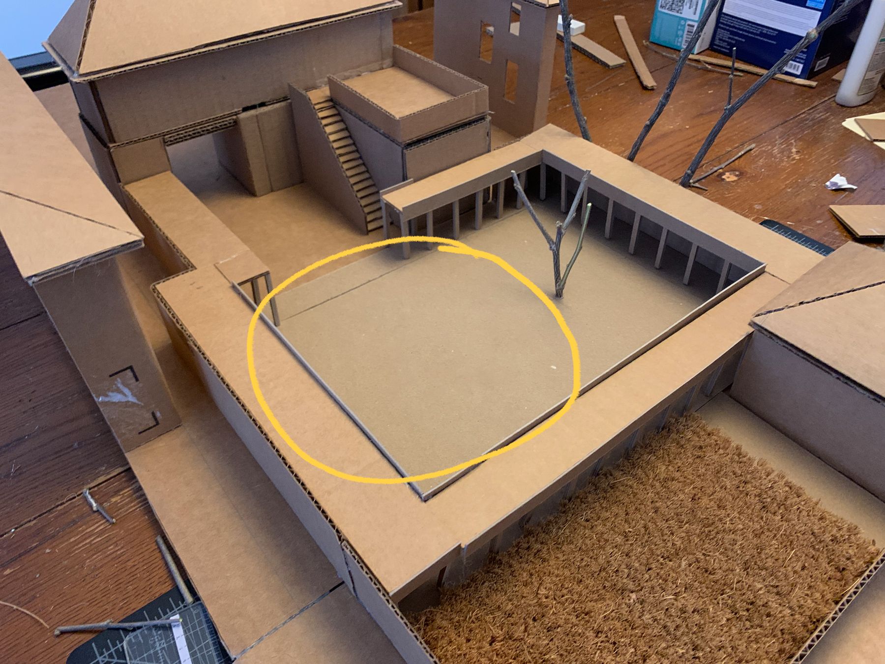
Another takeaway I had was that stuckness in the design process could be a sign that I’d made a misstep somewhere along the way, that I’d done something in the wrong order. In my case, I jumped straight to adding the tree, a literal low-hanging-fruit decision. To go back to the centers diagrams, I saw two halves to the courtyard space and did this:
But the largest center wasn’t just the half of the courtyard void that related to the buildings but the whole void itself. That void could have been strengthened a different way, by adding another boundary, maybe through some change in ground cover:
It’s subtle, but it made all the difference in terms of getting me unstuck. I went back to my 1:200 model to test out different sizes and treatments. Green paper here is grass/plants, pink is brick or cobblestone pavers (similar to what I’d imagined for the front entry paths) and blue is some other form of hardscaping:
I liked the green inner boundary the best, and I took this to the larger model to play with the size. Note the overlapping strips of construction paper, which made it easy to test different widths:
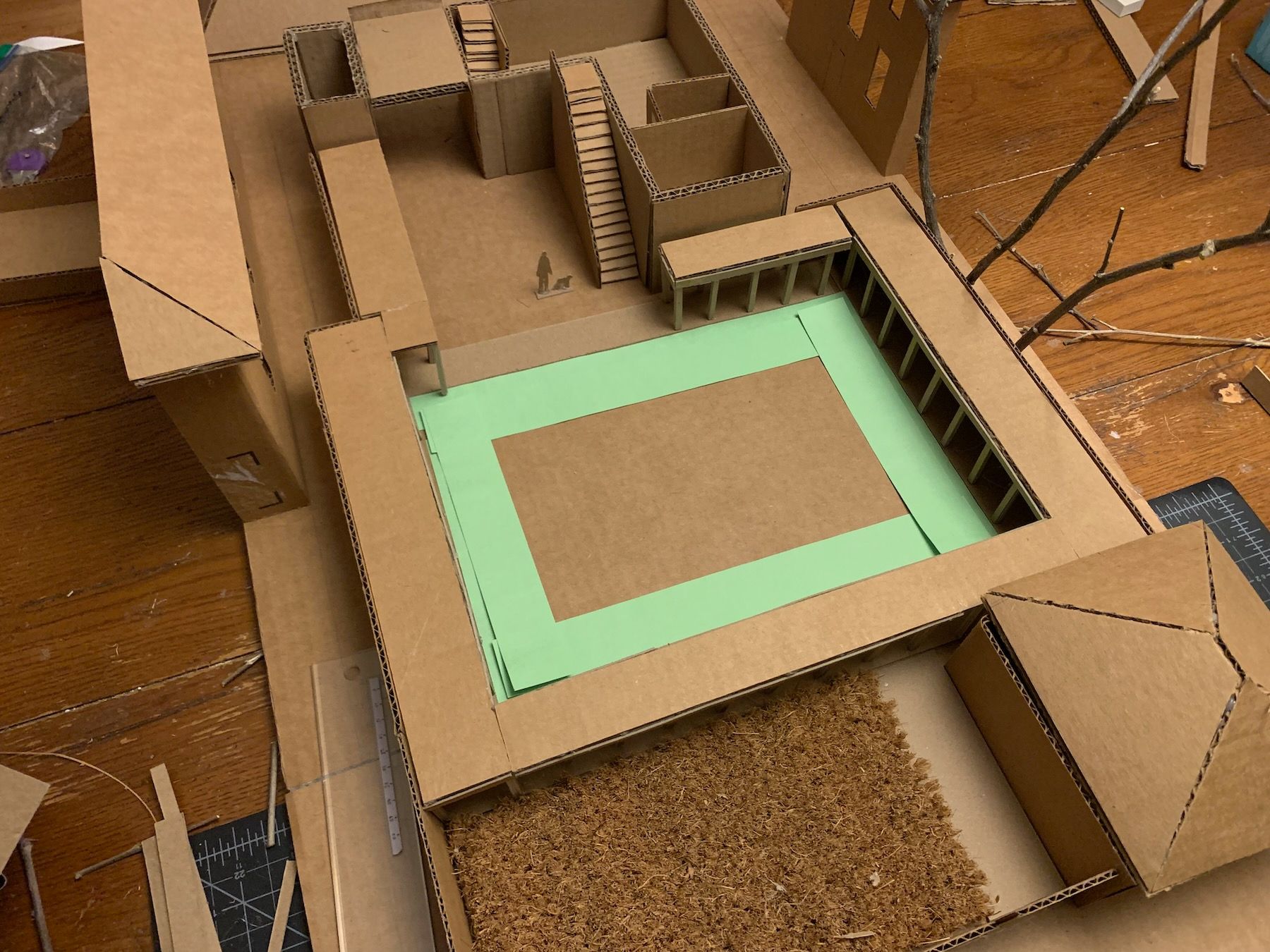
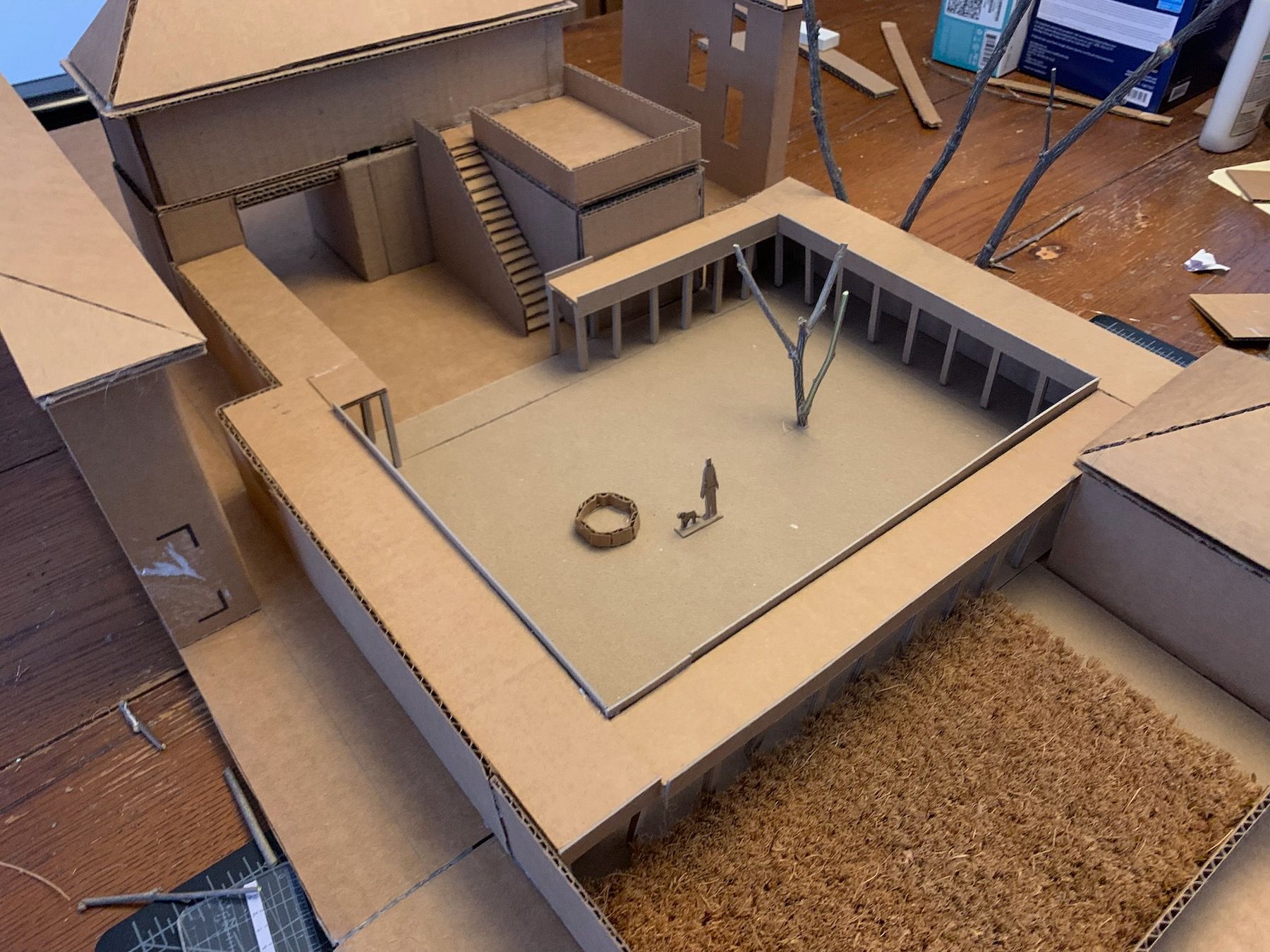
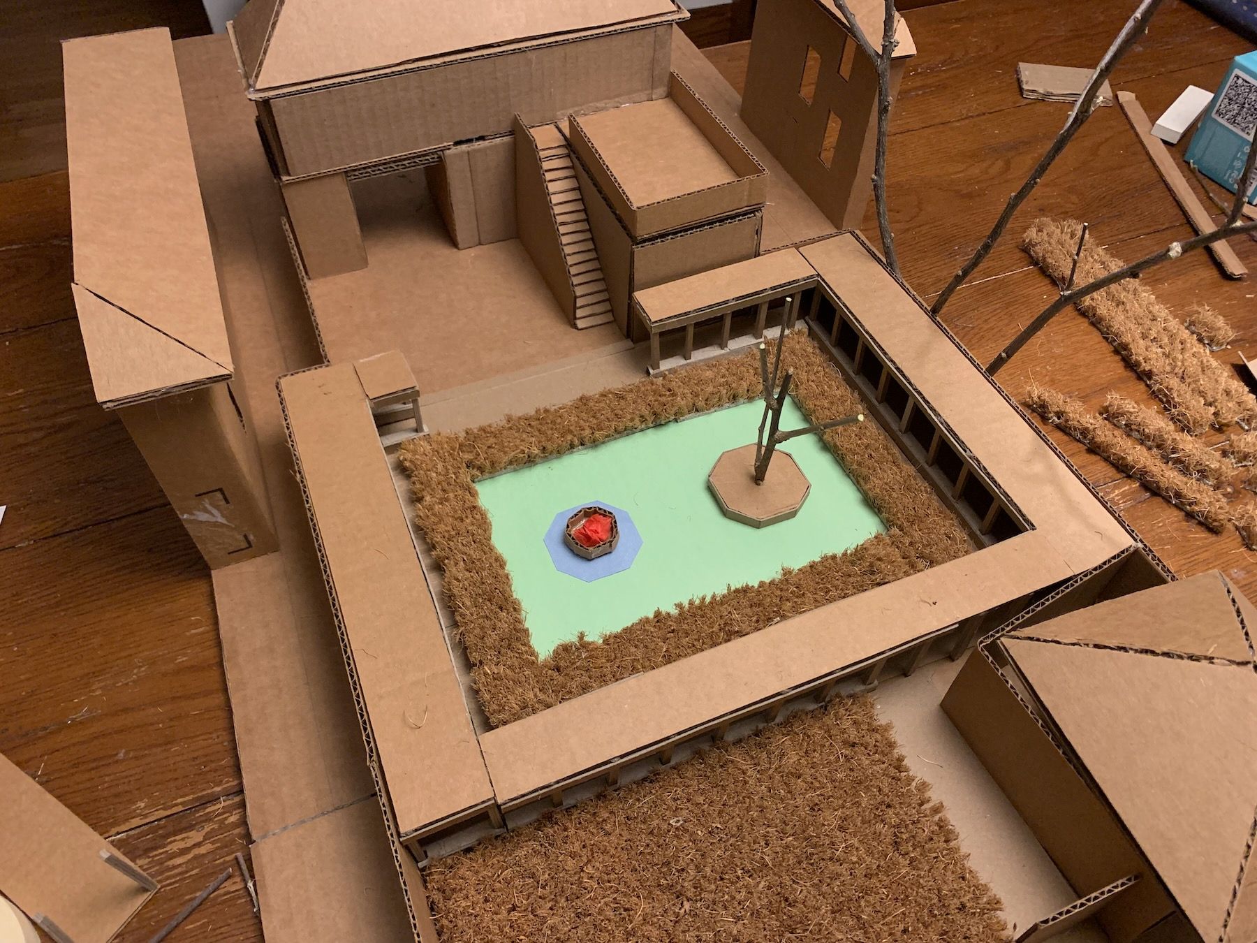
Once I was satisfied with the size, I placed the tree and fire pit again, also thinking about how to make each of them more of a place. I added a low sitting wall all around the colonnade – another boundary of sorts – as I’d pictured being able to sit along it looking into the courtyard:
I wondered if taller plantings would feel better than grass, or if the middle should be grass too (while trying not to care about circulation yet). If they were taller plantings, there needed to be a thinner margin between them and the low wall so that you could still without trampling over the plants:
I found myself thinking of all the Anatolian rugs that appear in The Nature of Order, boundaries upon boundaries:

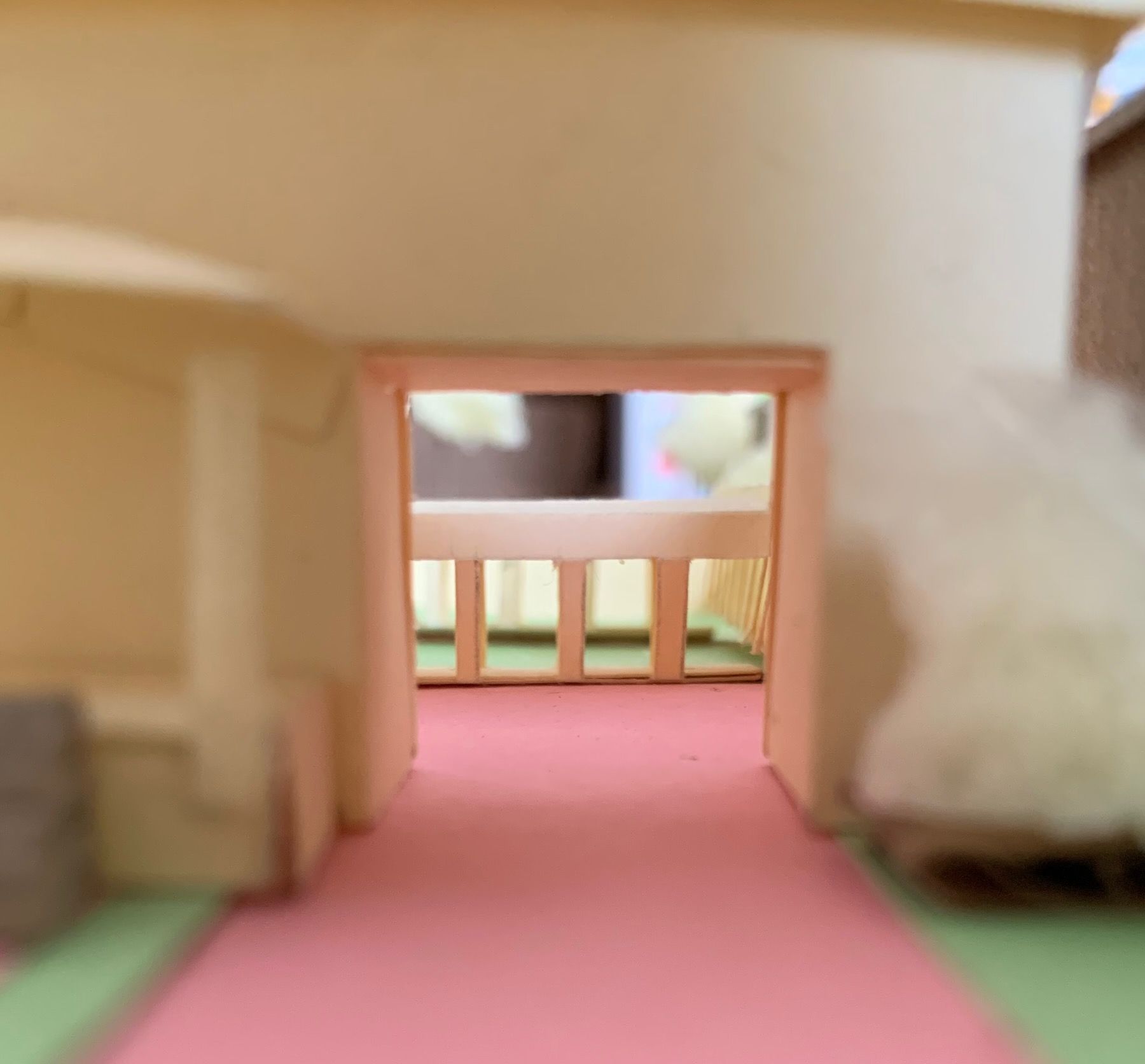
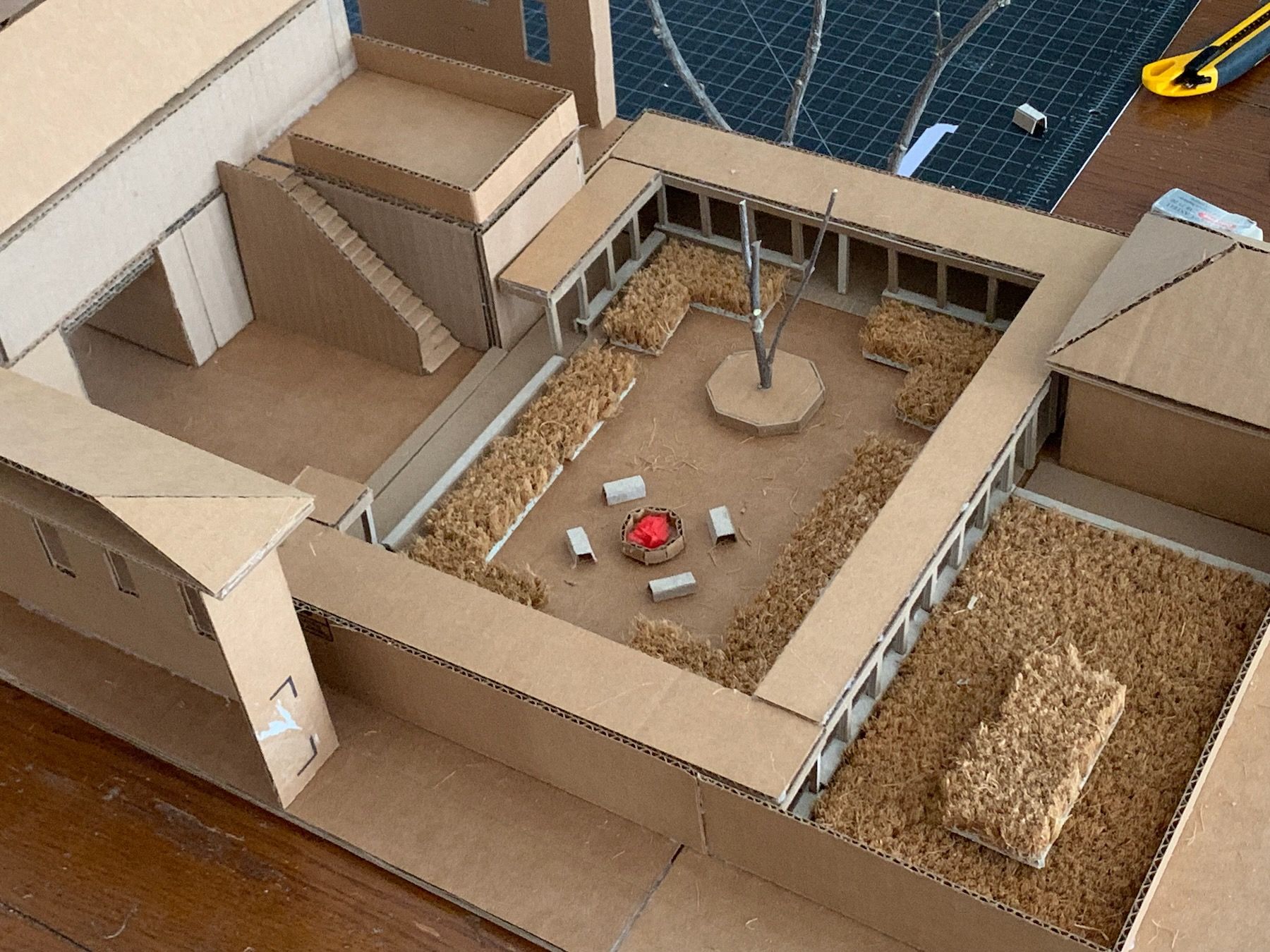
Only when I settled on the size of the courtyard boundaries did I finally cut in openings for circulation. In the process I also discovered that if I extended the low sitting wall all the way across the gap in the colonnade closest to the breezeway, it made for a neat, indirect – but still visible – entry into the courtyard near the outdoor stairs:
Would I have arrived at something like this had I gone about it my original way and placed the tree and circulation before that planted inner boundary? Maybe. But I can’t help but think that there would have been a lot more fumbling in the dark.
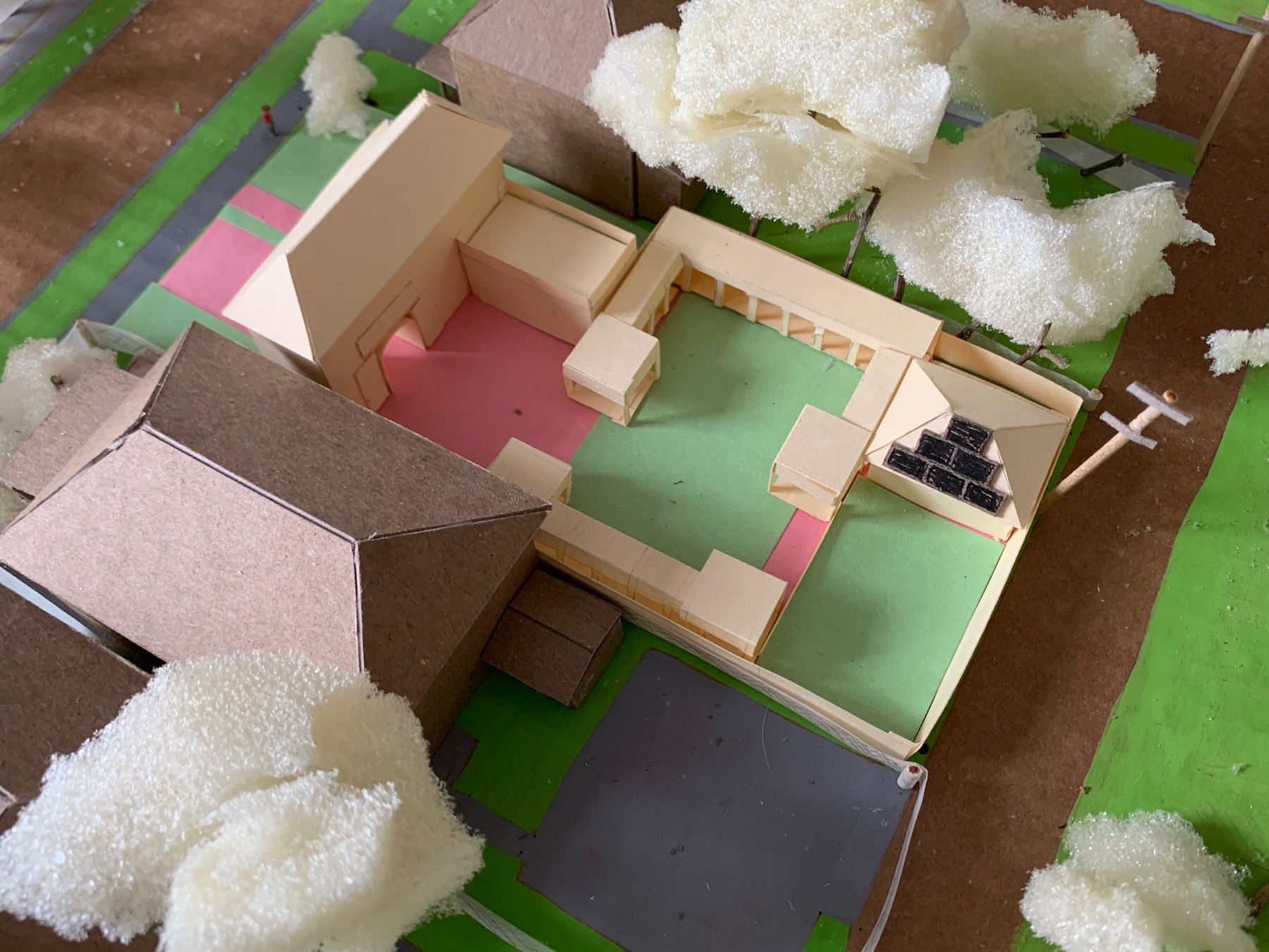
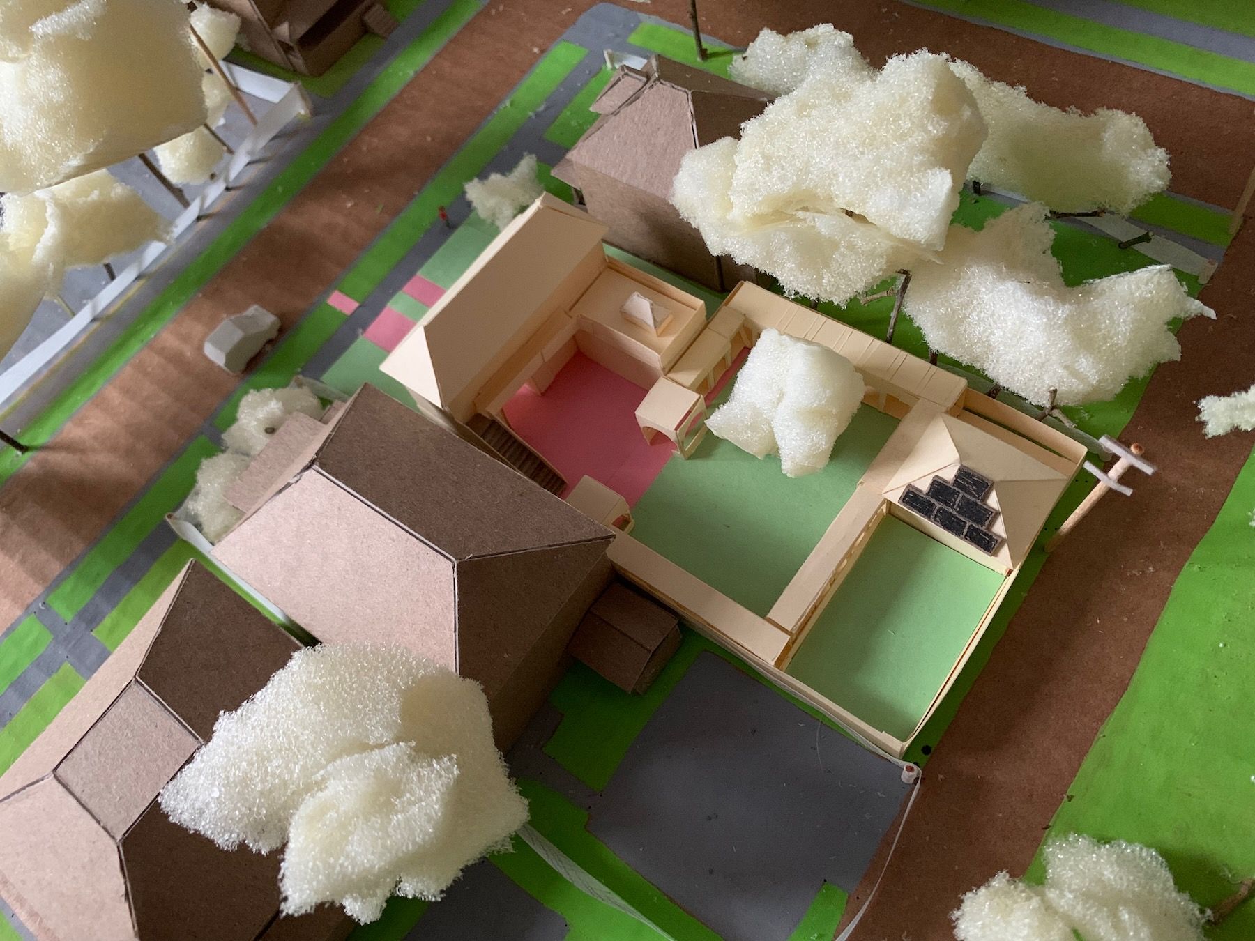
8. Results
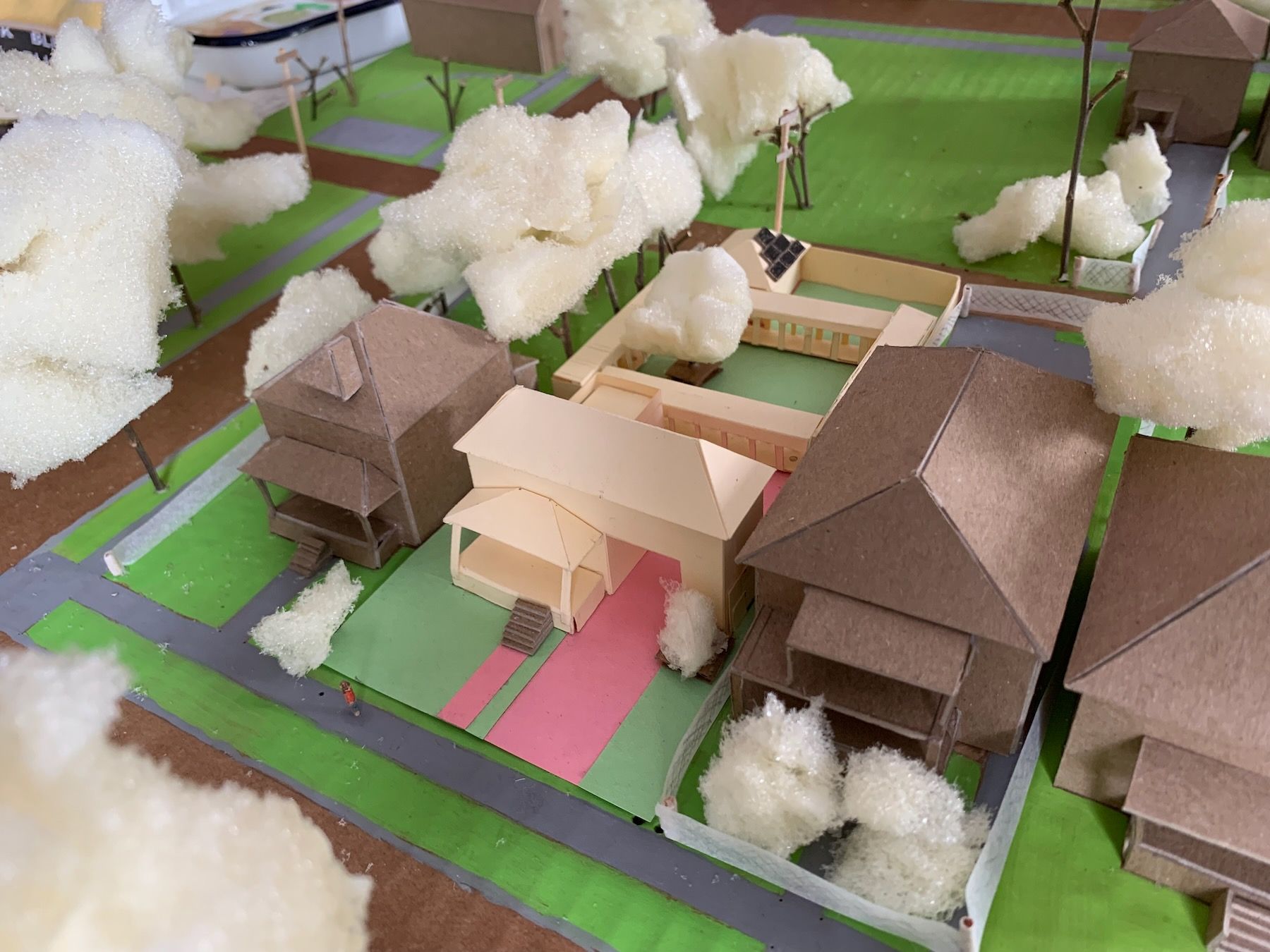
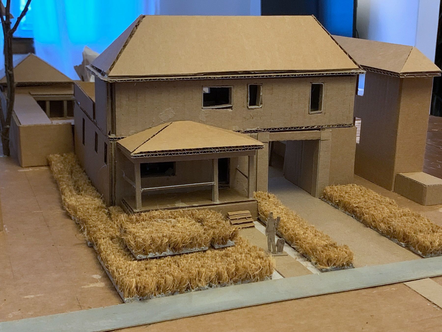
We had a total of six weeks for this project. I was short on time by the end, so I focused on getting the outdoor space and important jewels far along enough to present in class. Here’s the front of the house.
And the back:
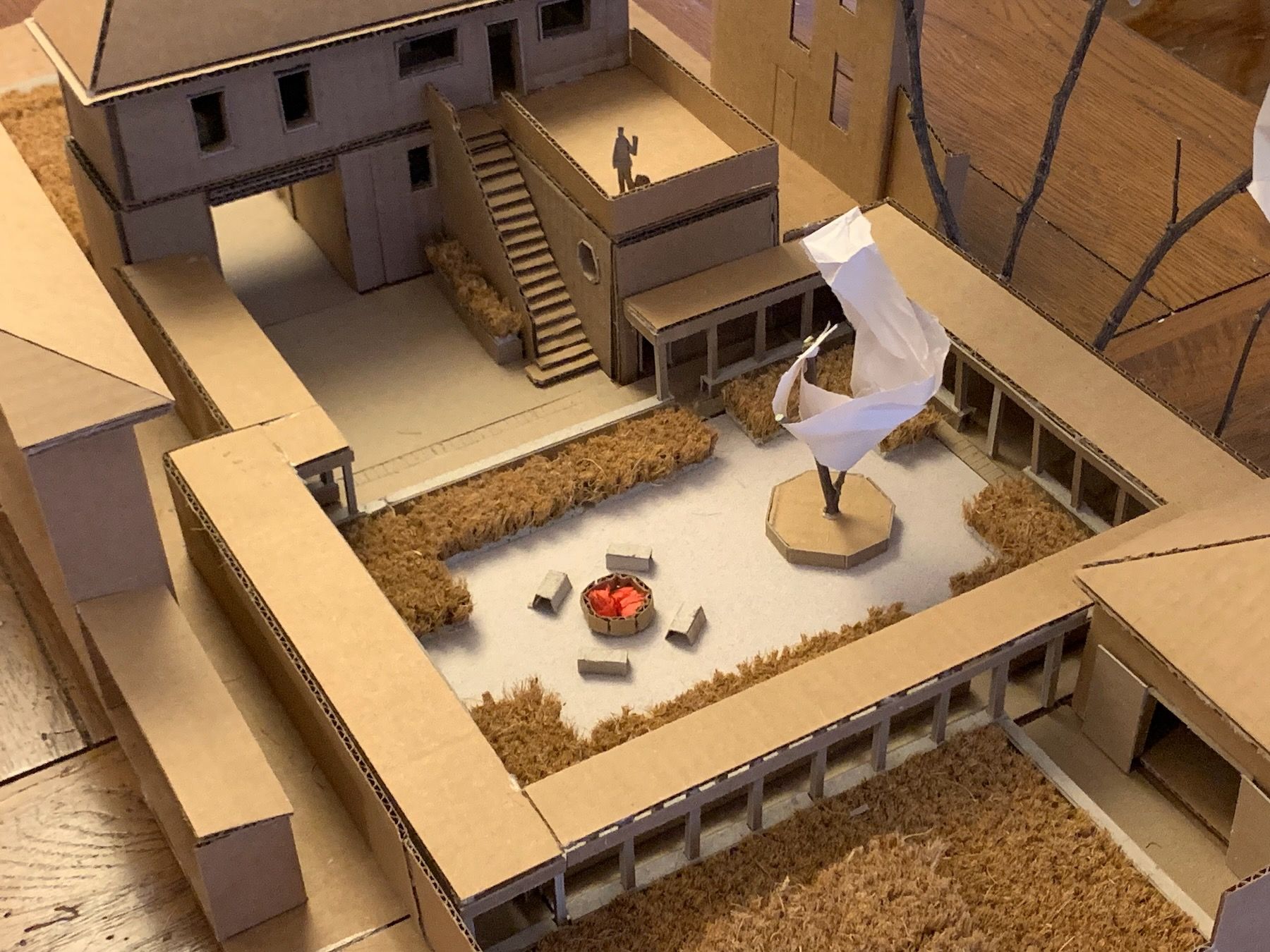
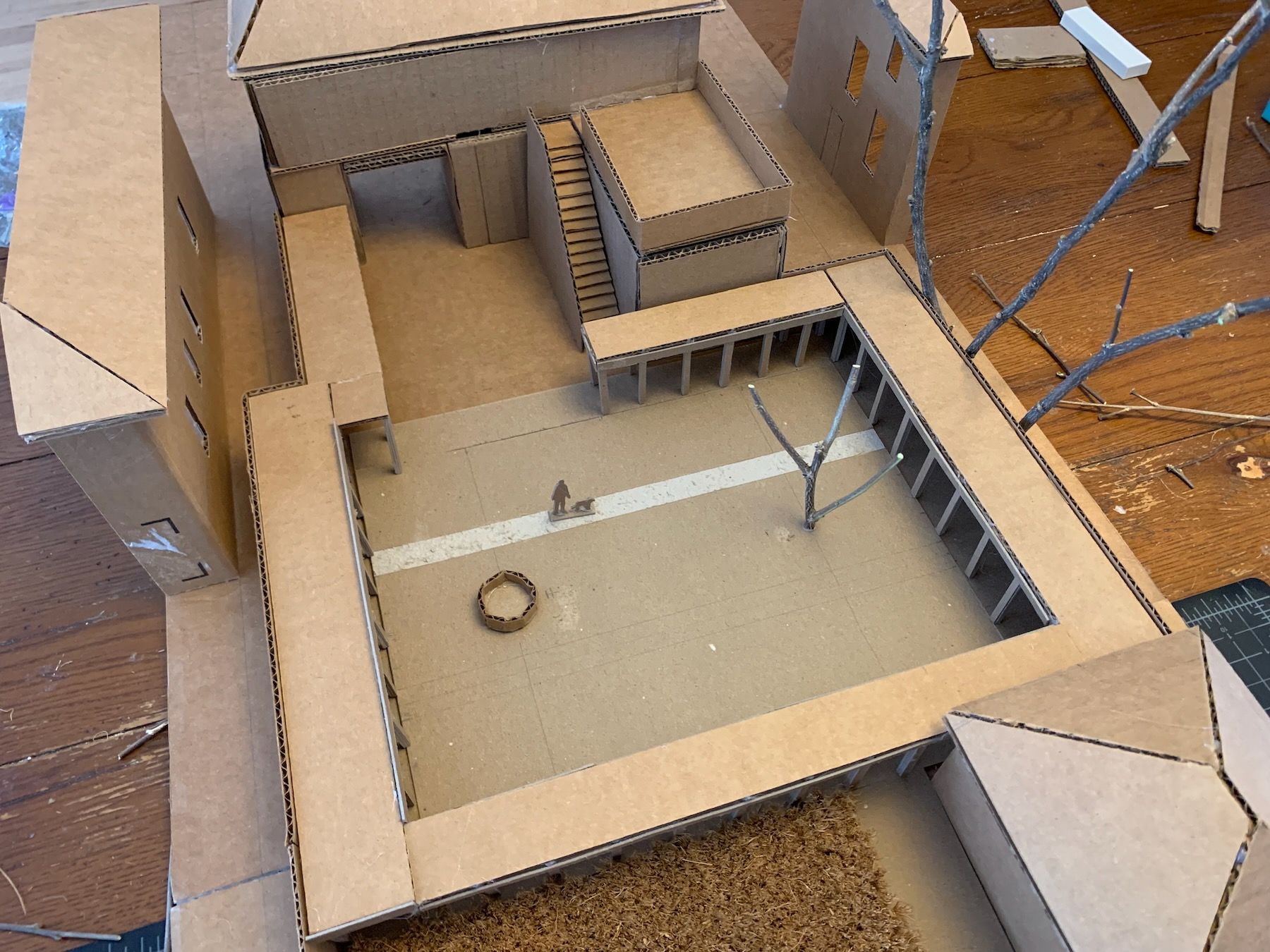
Here’s another angle. The area to the left of the breezeway is for storage, garbage and recycling bins, a potting table or shed, etc. I imagined, in spring through fall, rolling in through on my bike, parking it to the left, then walking up the outdoor stairs directly into the kitchen:
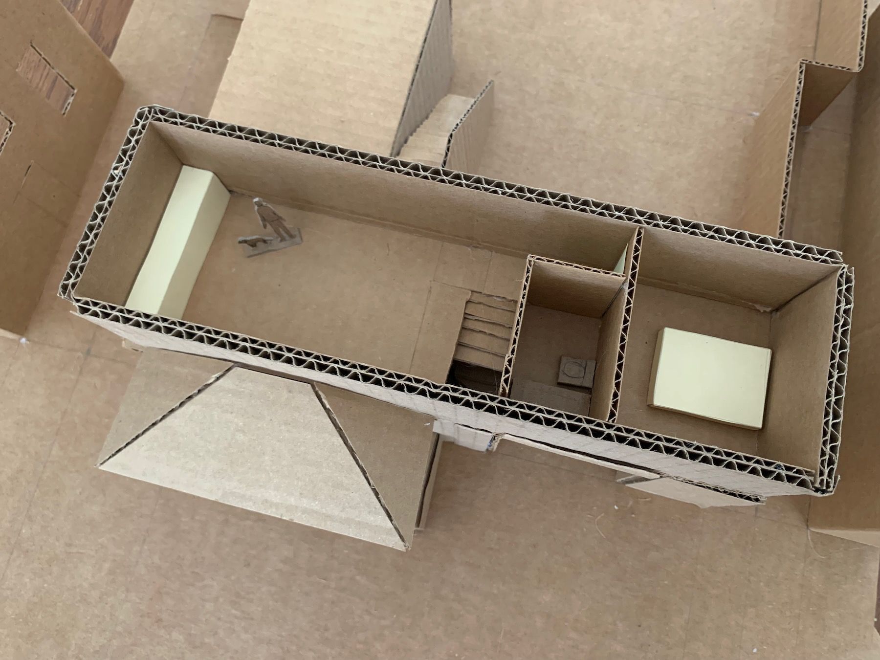
Here’s the upper level, with food prep overlooking the terrace, which can be a place for yoga or outdoor meals. I sized and cut the doors and windows after figuring out the layout of the rooms, taking into account the light and views:
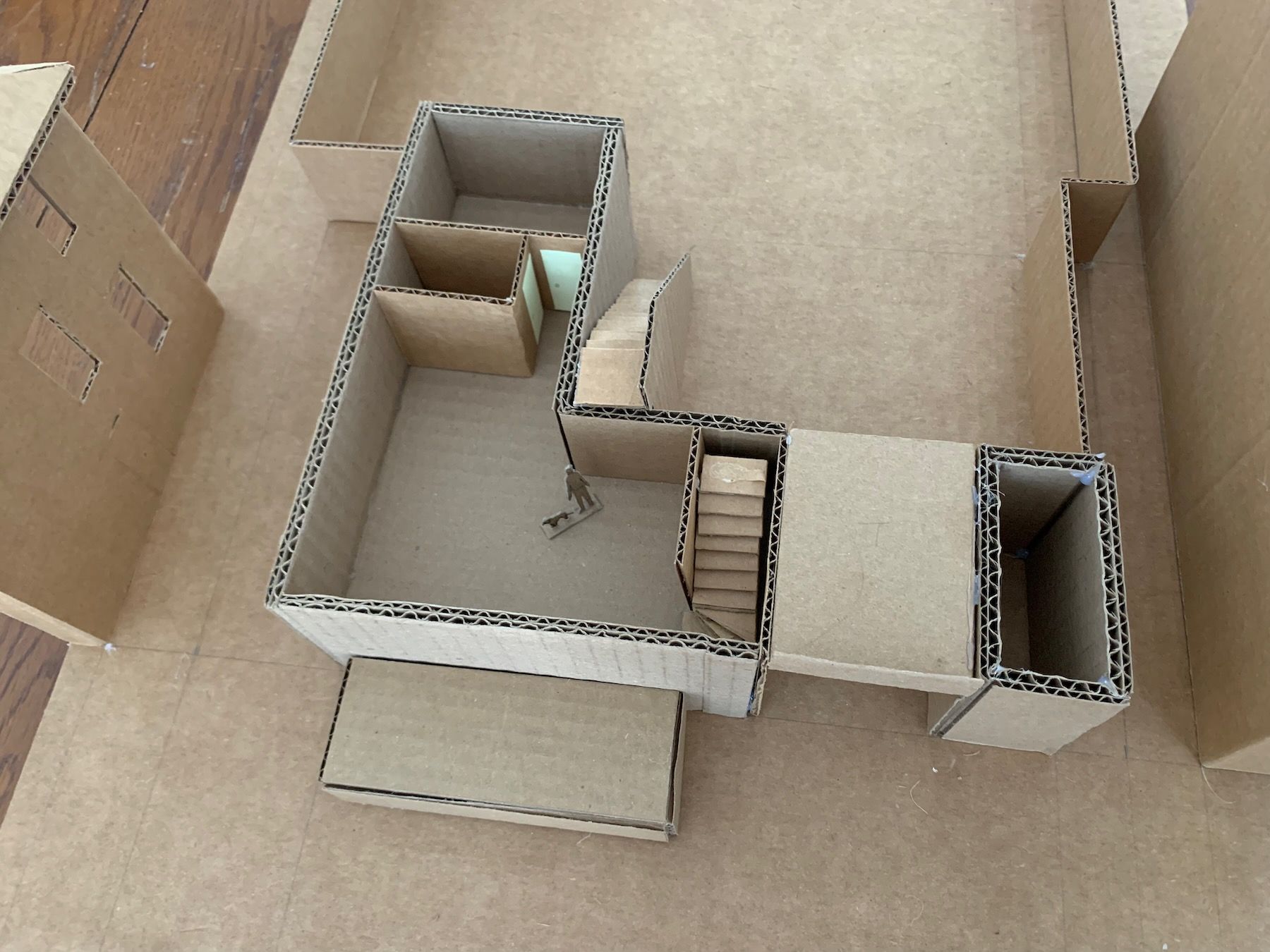
The lower level, with entry area, a sitting room by a fireplace, and a tall bookshelf and reading chair:
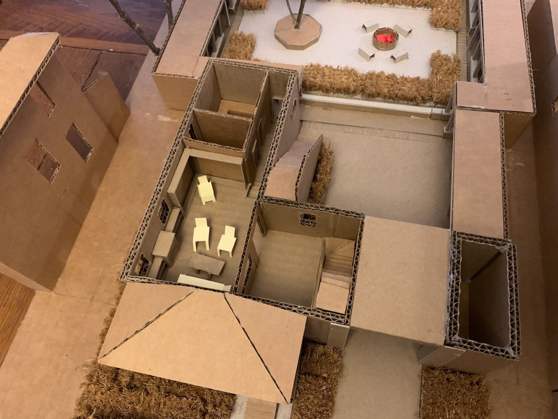
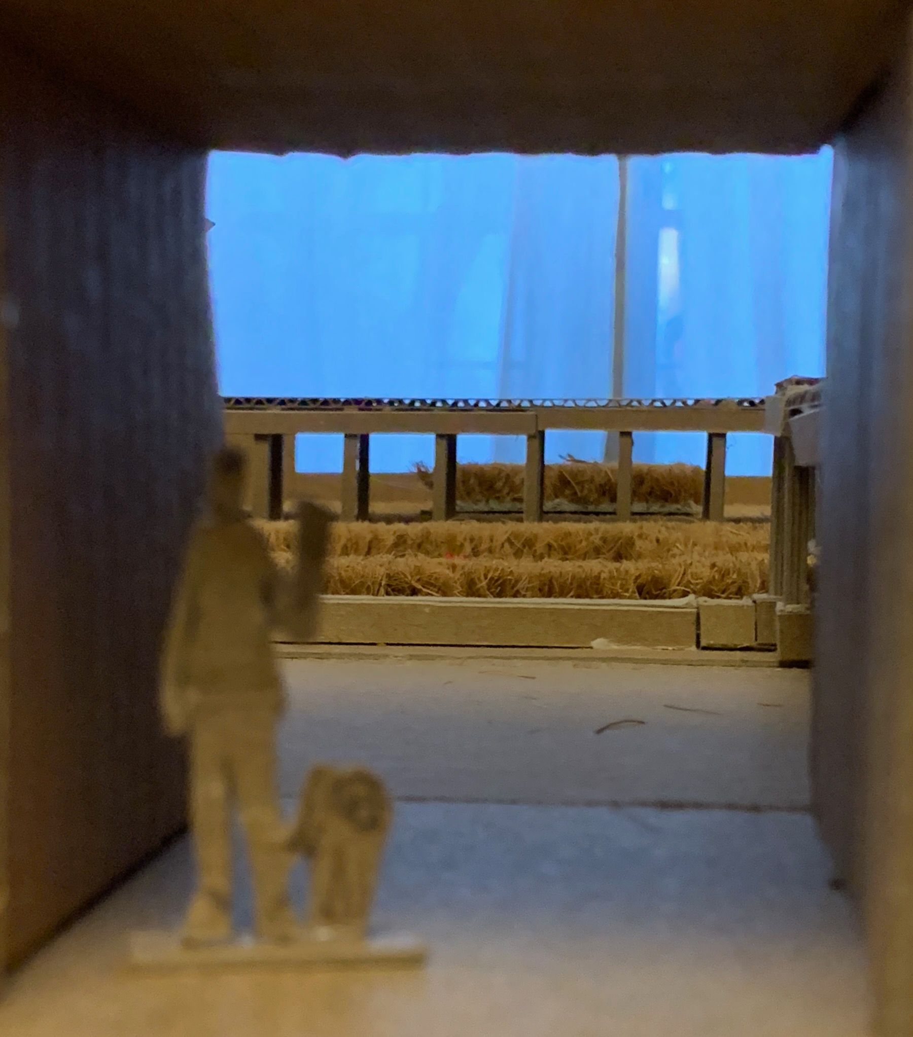
Another view, showing the sauna and a small bathroom with shower. The back door takes you directly into the courtyard if, say, in winter you want to roll around in the snow between sweats.
An exploded, wider view, with the existing fenceline trees and (optionally) open-air workshop:
9. Lessons and Next Steps
This is the first house I’ve ever designed – if you don’t count goofing around in Minecraft. My hunch is it won’t be the last. The total area of conditioned space, excluding the workshop, came out to about 900 square feet. Over the 600 square feet we were shooting for in the assignment, but I think I made it count.
A couple of reviewers at my final presentation helped me see that I did make a few other “obvious”-at-the-time decisions that had huge implications on the design:
- I had wanted to preserve the view of the tall buildings, but in reality I could have spent more time deliberating whether I wanted that to be the case for residents and passers-by. Even without the breezeway, you would still have the same view from within the house and in the backyard. There didn’t necessarily have to be a breezeway, and that choice majorly influenced my whole design.
- I arbitrarily decided that I would have two floors stacked on top of one another when, given the exterior staircase interplay between public and private space, there could have even been a third, intermediate level that let me vary the heights of different rooms. I could have put a jog in the staircase so there was another, smaller terrace between the ground level and the main terrace. I’d been thinking mostly in 2D overhead plan view when laying out my jewels, versus in three dimensions.
- I’d also thought that placing the front entry was obvious, but I could have made the front entry part of the breezeway, maybe with some kind of beautiful wrought-iron gate to make it slightly more private while still preserving the view.
Given more time, I’d experiment with these things, and with window positions in the kitchen, particularly toward the south wall (front of the house). I’d put in some finer details like window muntins, and trim out the breezeway to make it feel more like an otherworldly portal. As I mentioned above, I could get a start on these smaller details in the model but I’d only really be able to finalize them through full-scale mockups on the actual building site, which is beyond the scope of this specific project.
My biggest takeaway, the lesson I found (and find) myself having to learn and relearn, is that sequence matters. That always thinking about the larger contexts and their existing centers, and how to support and strengthen these centers with your next move – as opposed to just reaching for low-hanging fruit (or circulation!) – can help you unfold your design in a more organic way.
It takes some practice to even get in the habit of seeing these centers, these often-invisible fields of space. Of seeing the wholeness already there. But that’s a big reason I’m taking this class.
Thanks for reading. For my final, semester-long spring project, I’ll be designing – and actually building! – something in my neighborhood in Detroit.