In Part 1, I talked about how my neighborhood interviews raised the question, “What can I do on my own property to take a step toward the collective vision?” I’d decided as a result to focus on my front yard, and came up with a smaller set of patterns for that with my partner, consisting of:
SENSUOUS ENTRANCE TRANSITION
WELCOMING SIDEWALK GATEWAY
DEEP, COVERED SITTING PORCH
MULTI-PURPOSE OUTDOOR ROOM
COLORFUL QUILT OF NATIVE PLANTS
COMMUNITY CORNER
5. Stakeouts and 1:200 Model Designs
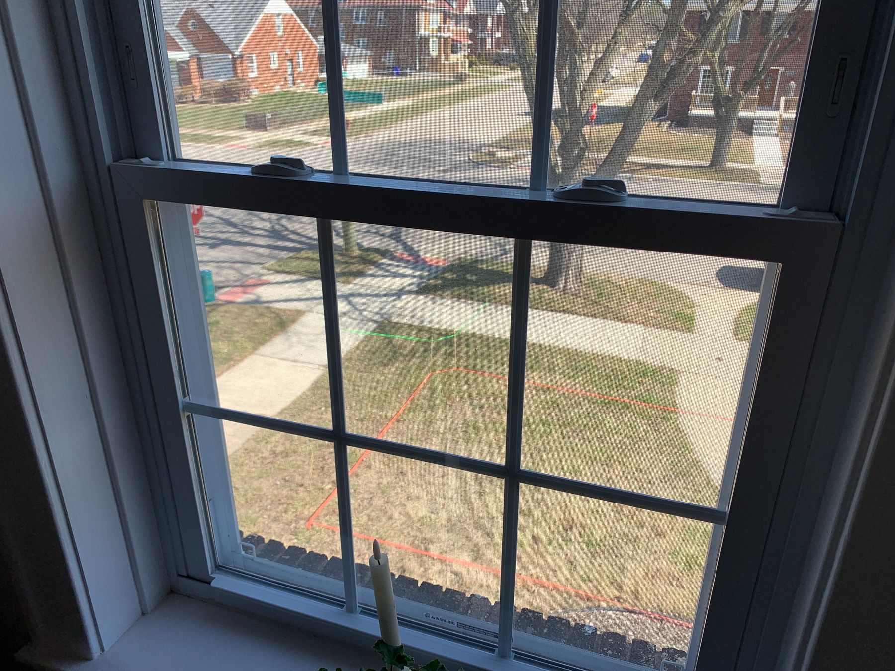
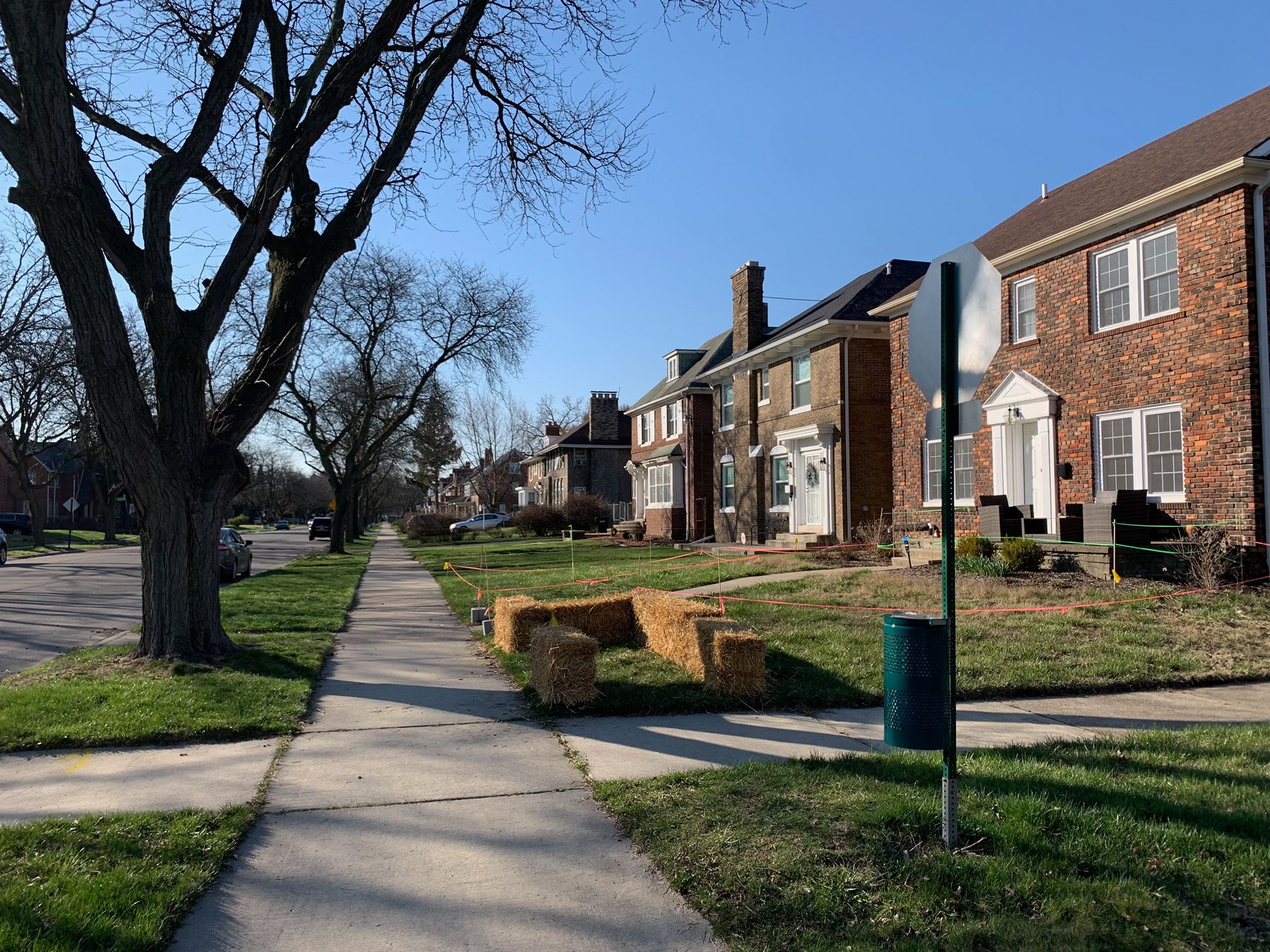
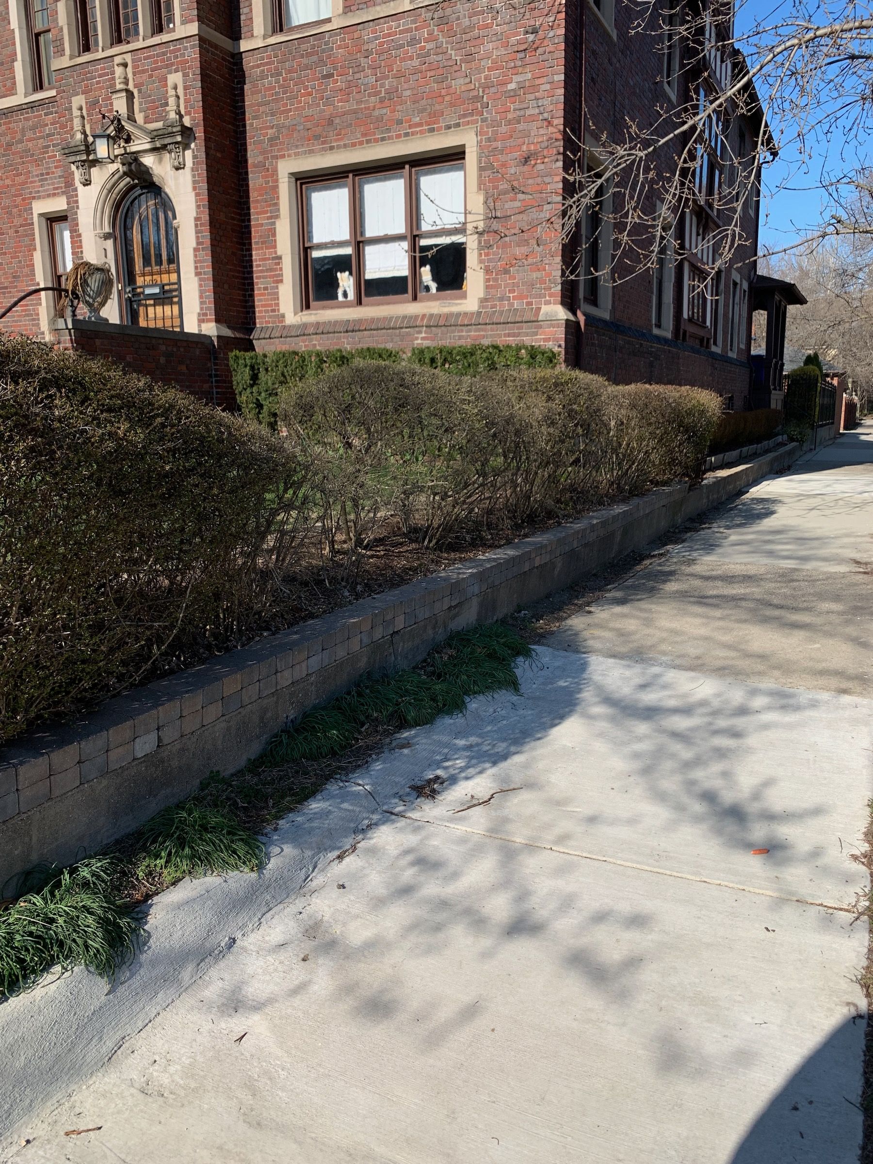
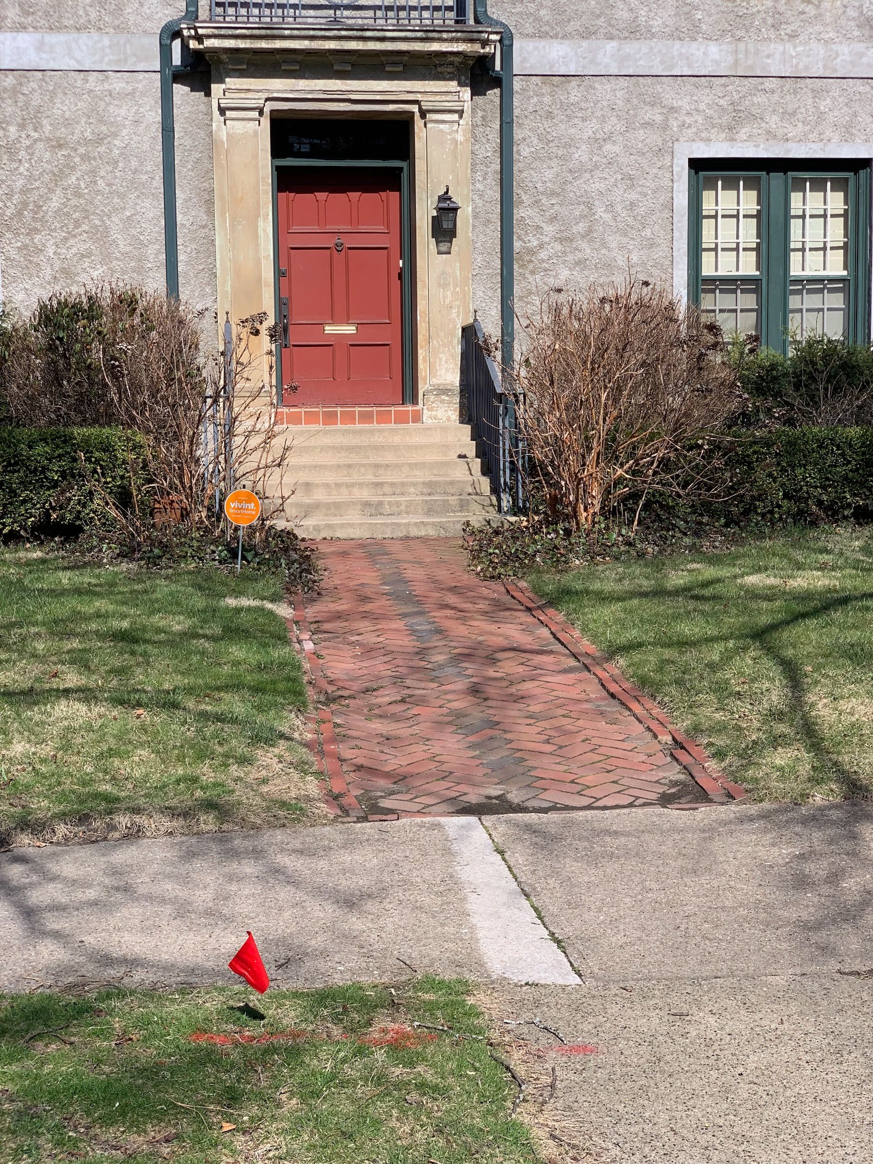
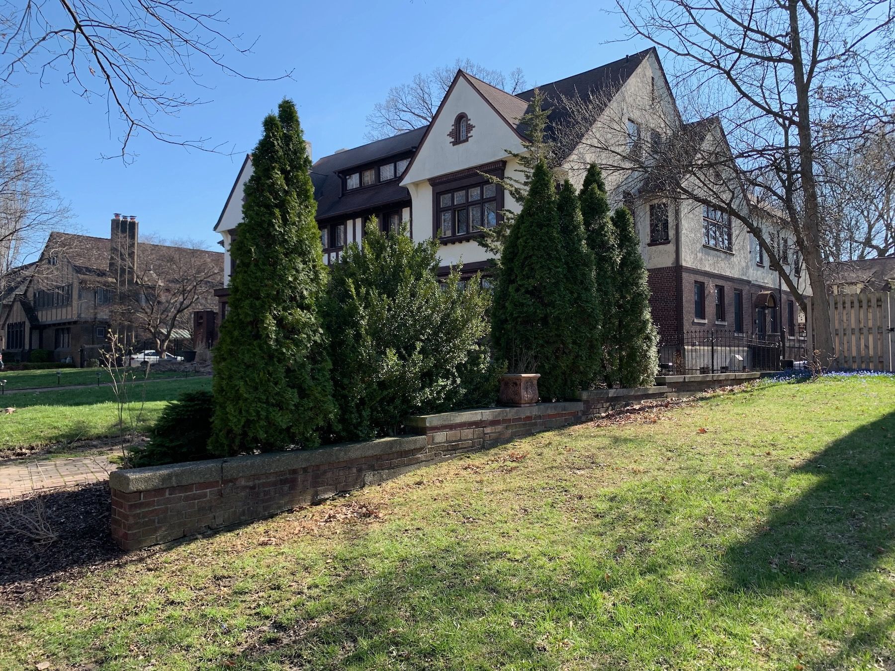
Here are some photos of our home, and the front yard space in question, from diffferent angles.
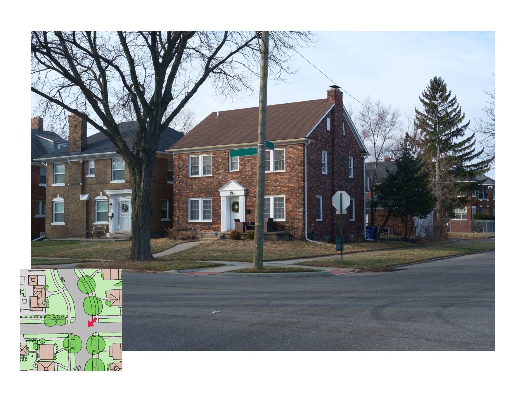
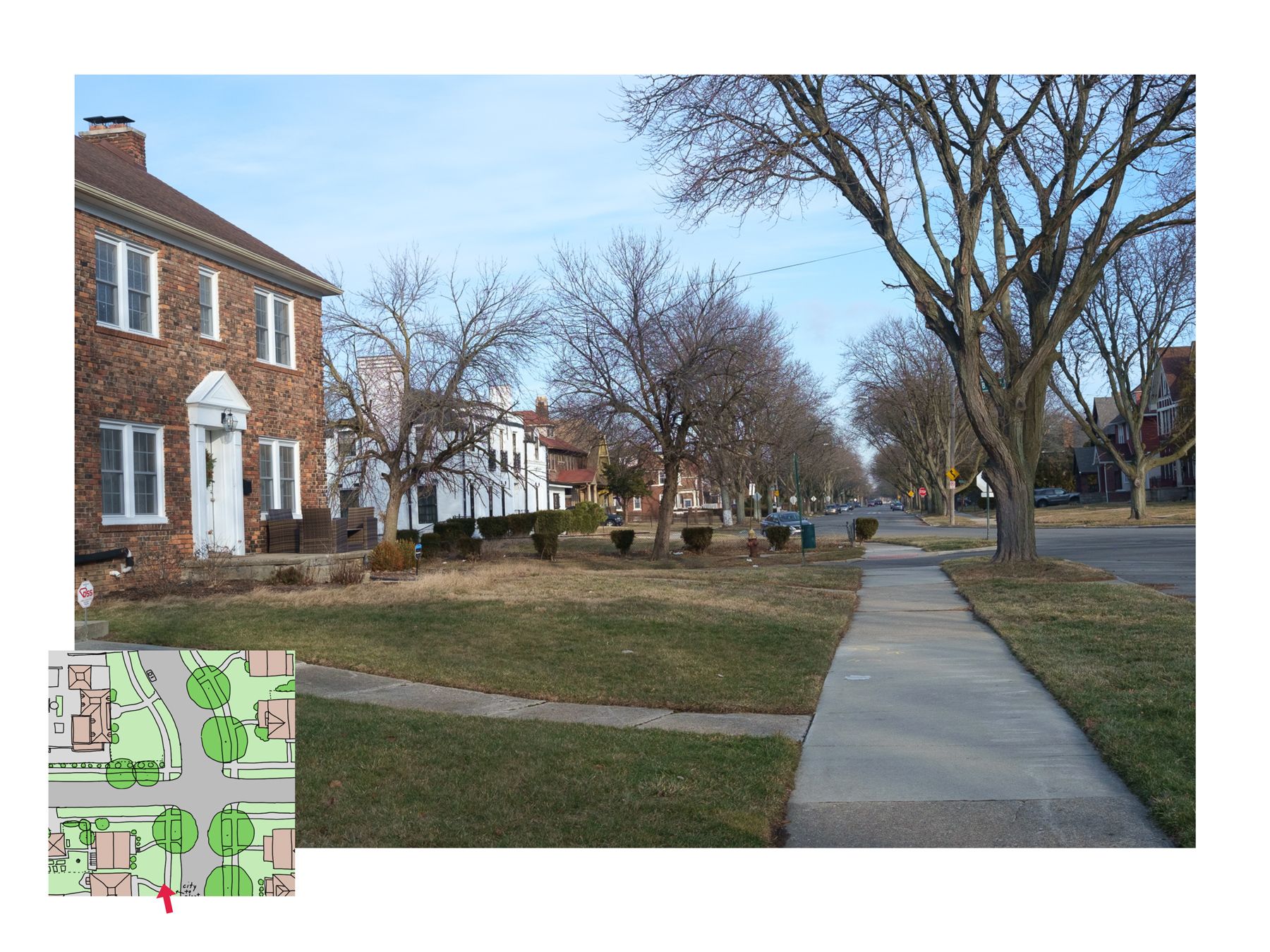
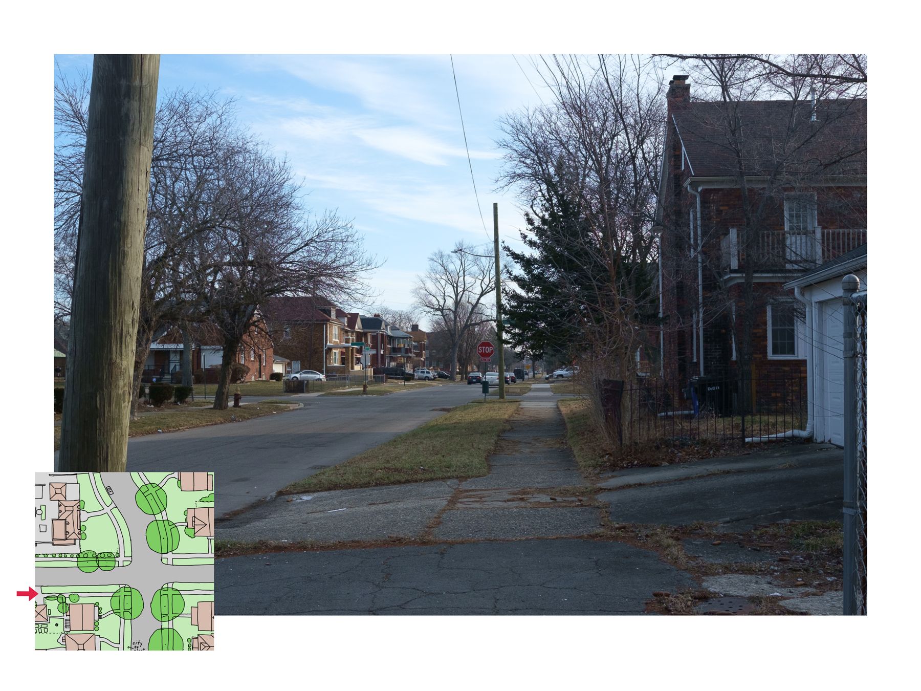
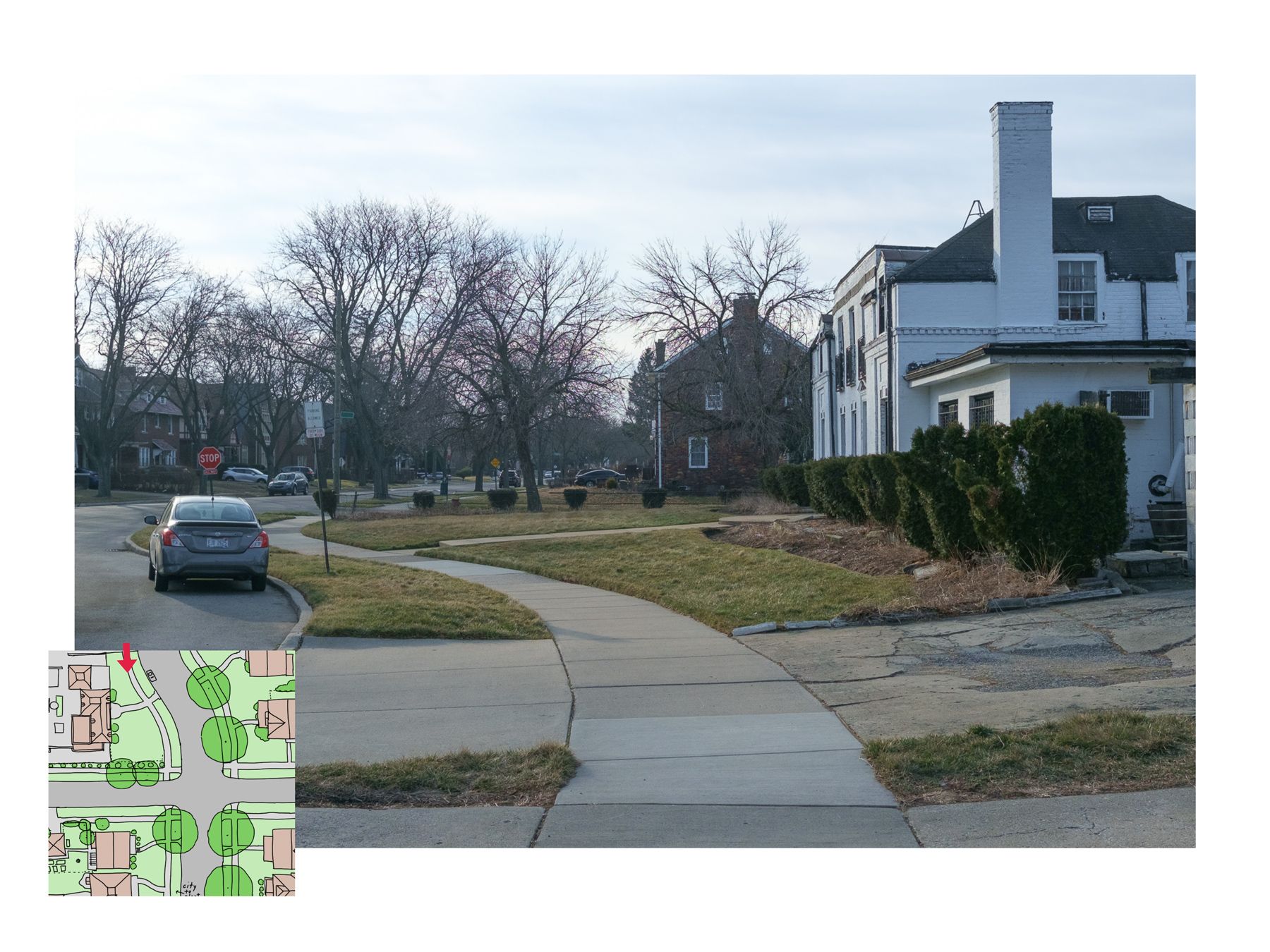
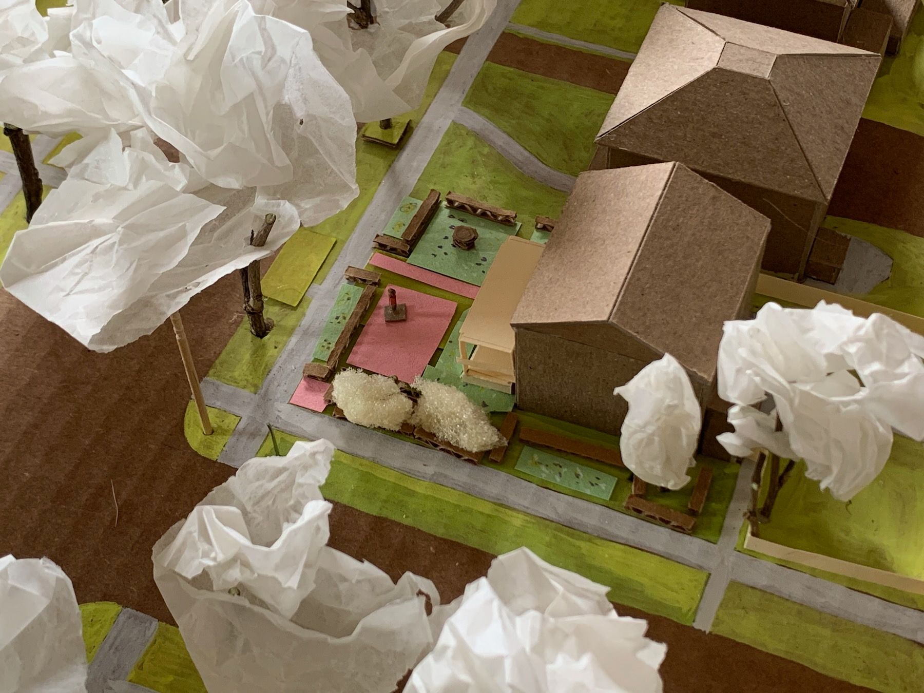
As you can see, our lot sits on an especially visible corner, at a bend in the main street. After the patterning exercise for our front yard, I went back to the 1:200 scale model I built of the surrounding block:
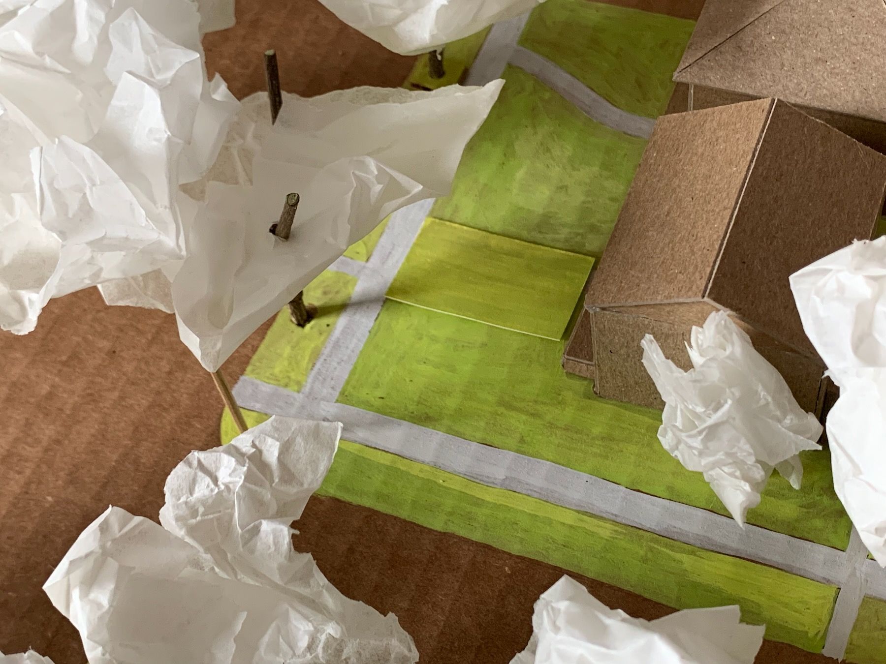
And tried out a few more designs using cardboard and construction paper:
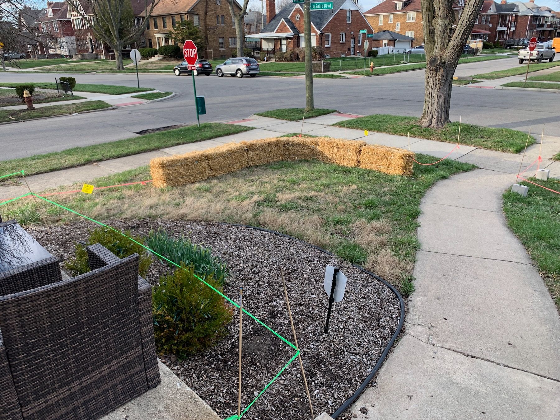
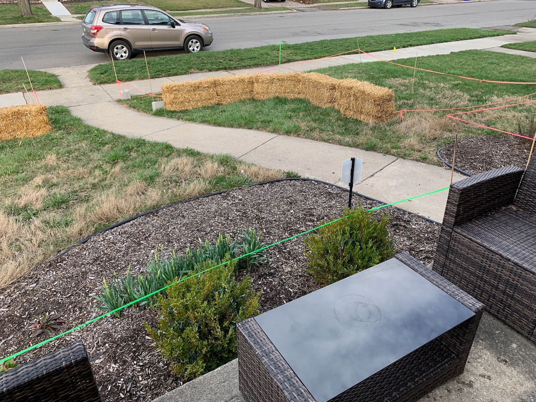
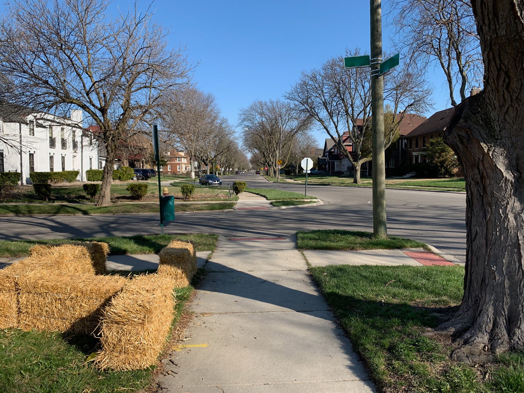
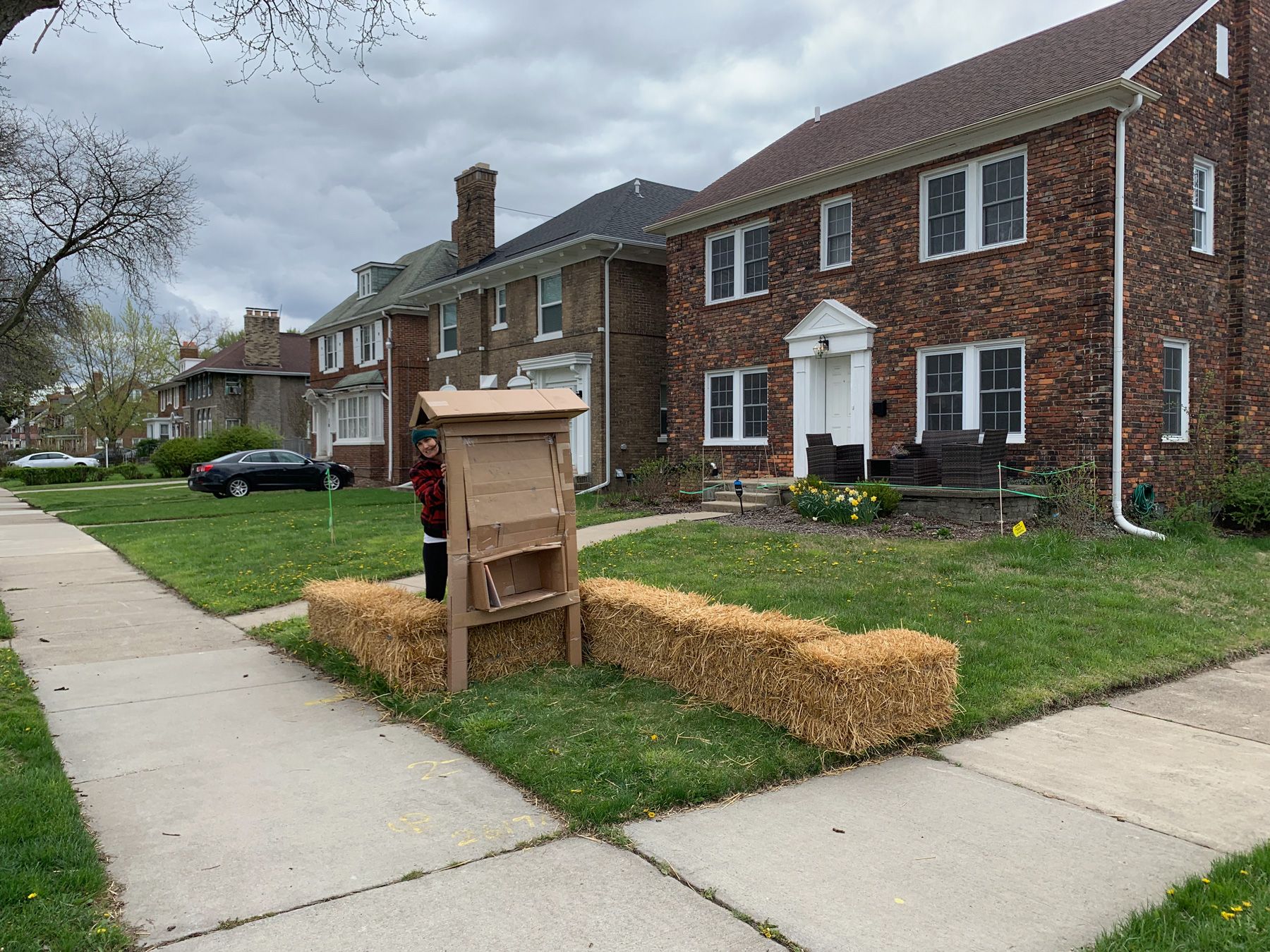
Progress! But nothing beats actually working with the real site instead of a model. As with the House for Oneself project, I staked out these areas of the front yard with wooden dowels and surveyor’s tape:
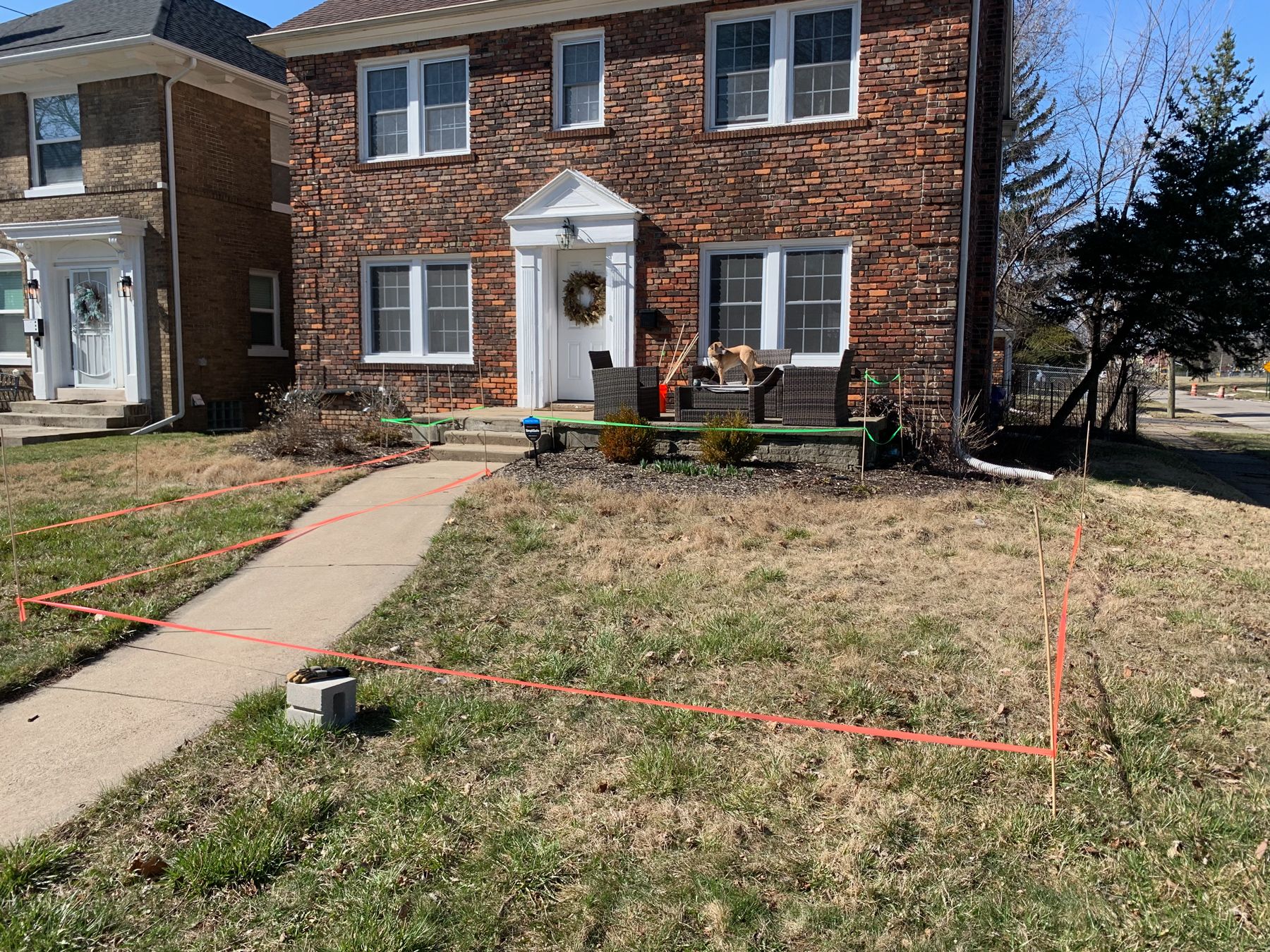
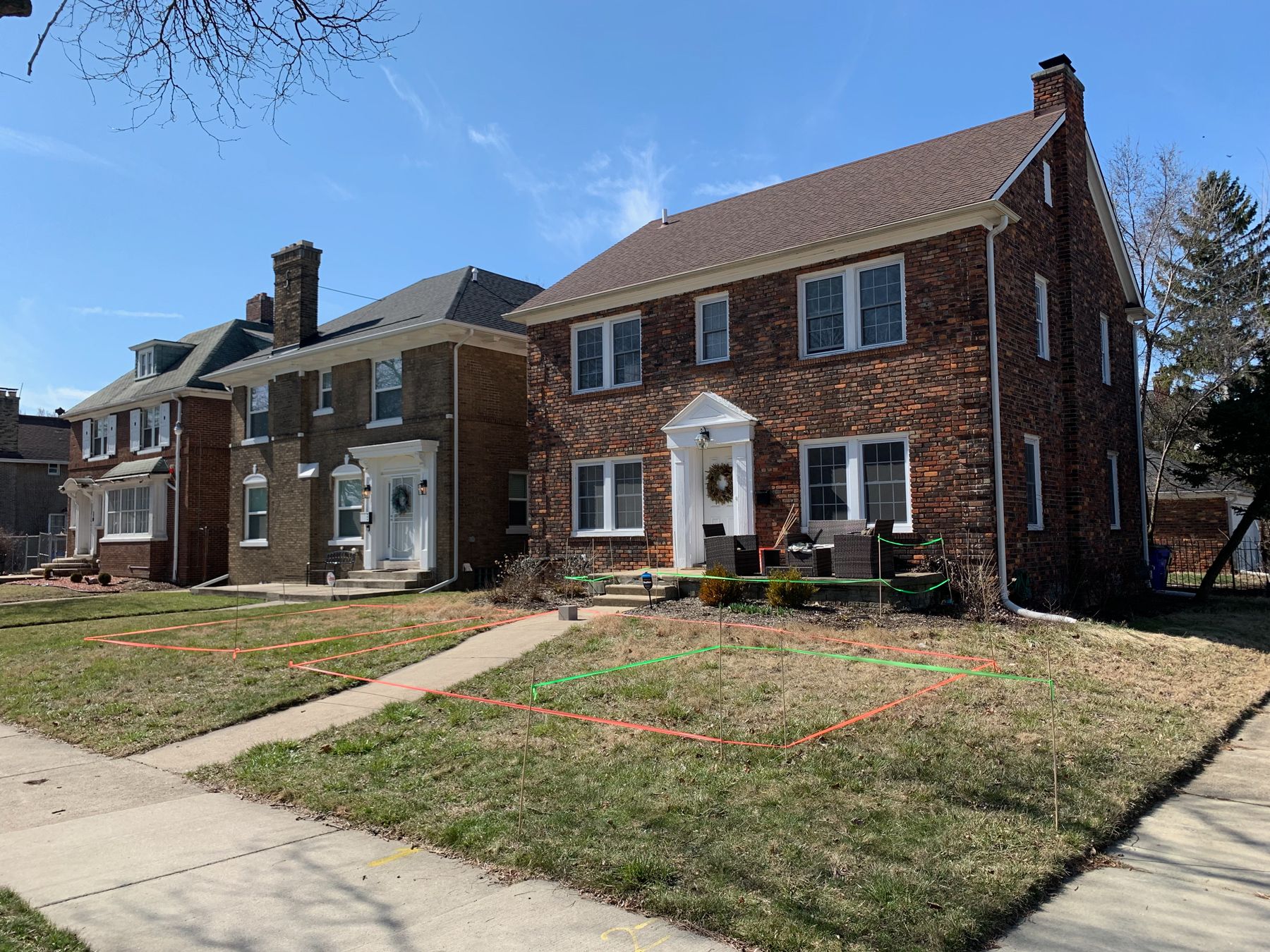
The green taped areas here are the extended front porch and the community corner, and the pink rectangle you see in the last photo shows the edges of the Multipurpose Outdoor Room, defined like so:
MULTIPURPOSE OUTDOOR ROOM
An outdoor room with brick pavers or some other form of hardscaping affords a variety of uses. Kids can ride tricycles while the adults are on the porch; there is seating for occasional events like poetry slams or porch concerts; and the space can host pop-up food carts, block party grill-outs, and brunches that spill into the front yard.
Why are the boundaries set at those distances from the sidewalks instead of right against them per my model? Because that’s how far we needed to be from the public sidewalks to feel like we were in a semi-private space. The “room” also needed to be small enough to be comfortable as a room – I pictured people sitting along one edge and having a conversation with someone on the porch without needing to shout.
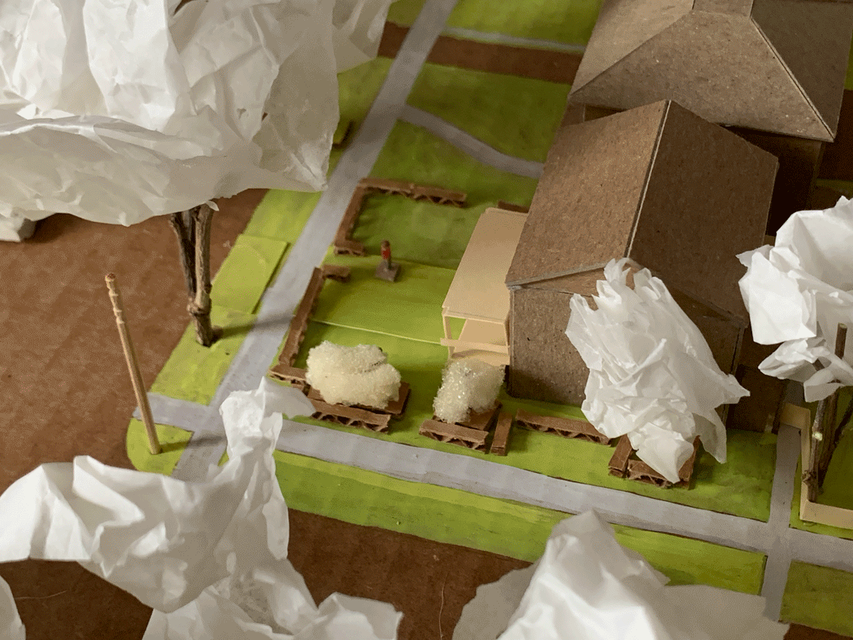
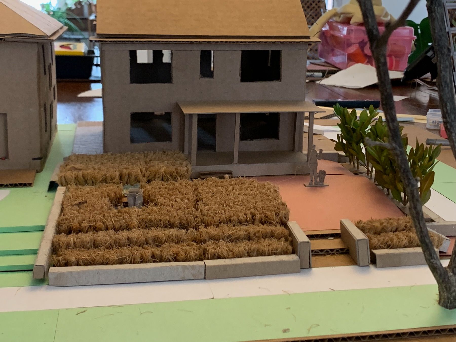
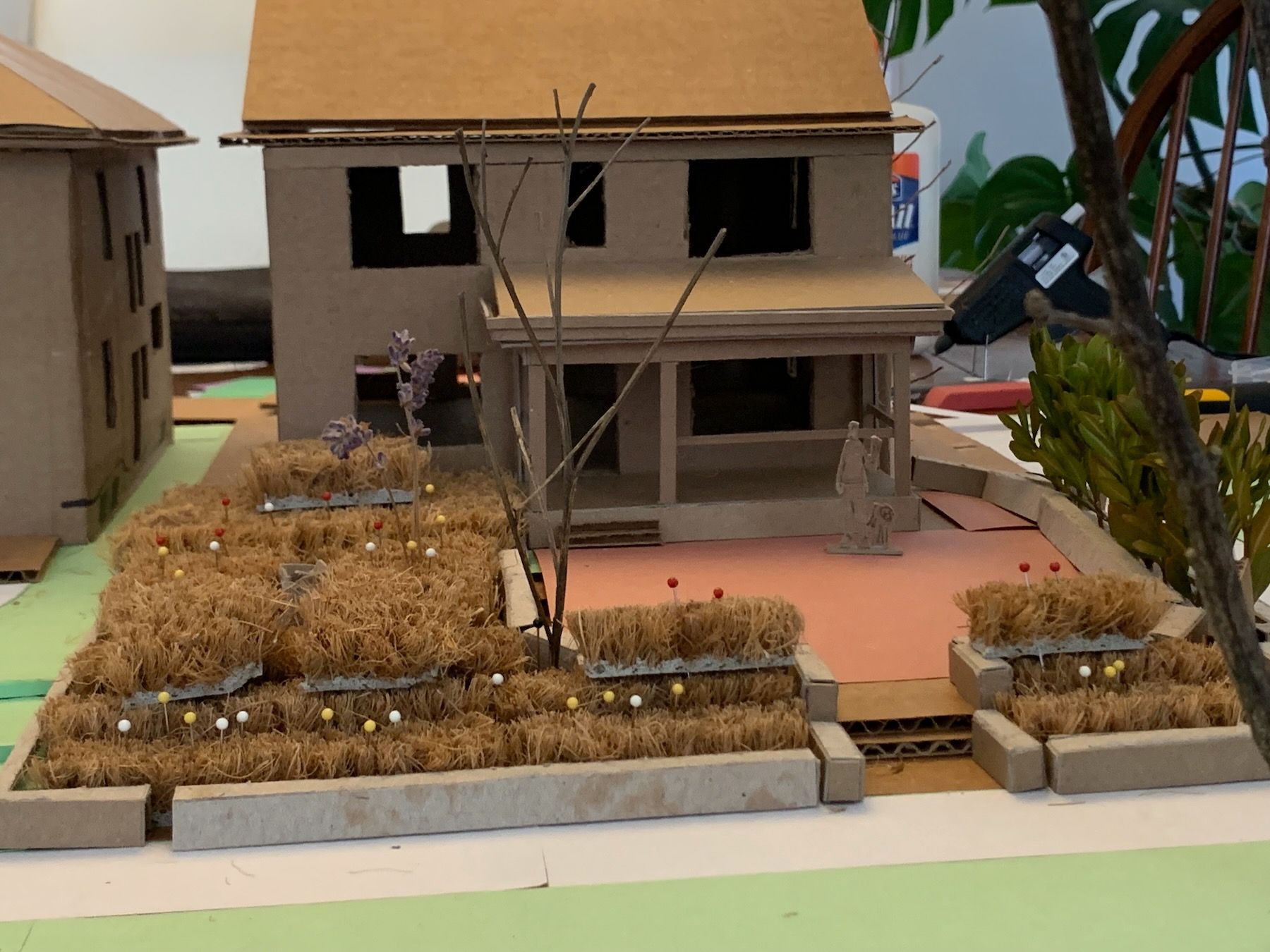
I updated the 1:200 model with the new dimensions, and filled the boundaries with more plants:
That’s a small birdbath or fountain in the middle of the native plant space above the walkway and barely visible to the right an informal, mowed path from our neighbor’s for the times we might pick up each others’ out-of-town mail. At this point, it was I was getting frustrated working on such a small model – I was using tweezers! – so I moved to a larger, 1:50 scale one.
6. The 1:50 Scale Model
Again, like the Dream House project, I used cardboard, chipboard, and construction paper, along with twigs and cuttings from trees and bushes around the house. The coconut coir welcome mat represents shorter plantings like forbs and ornamental grasses:
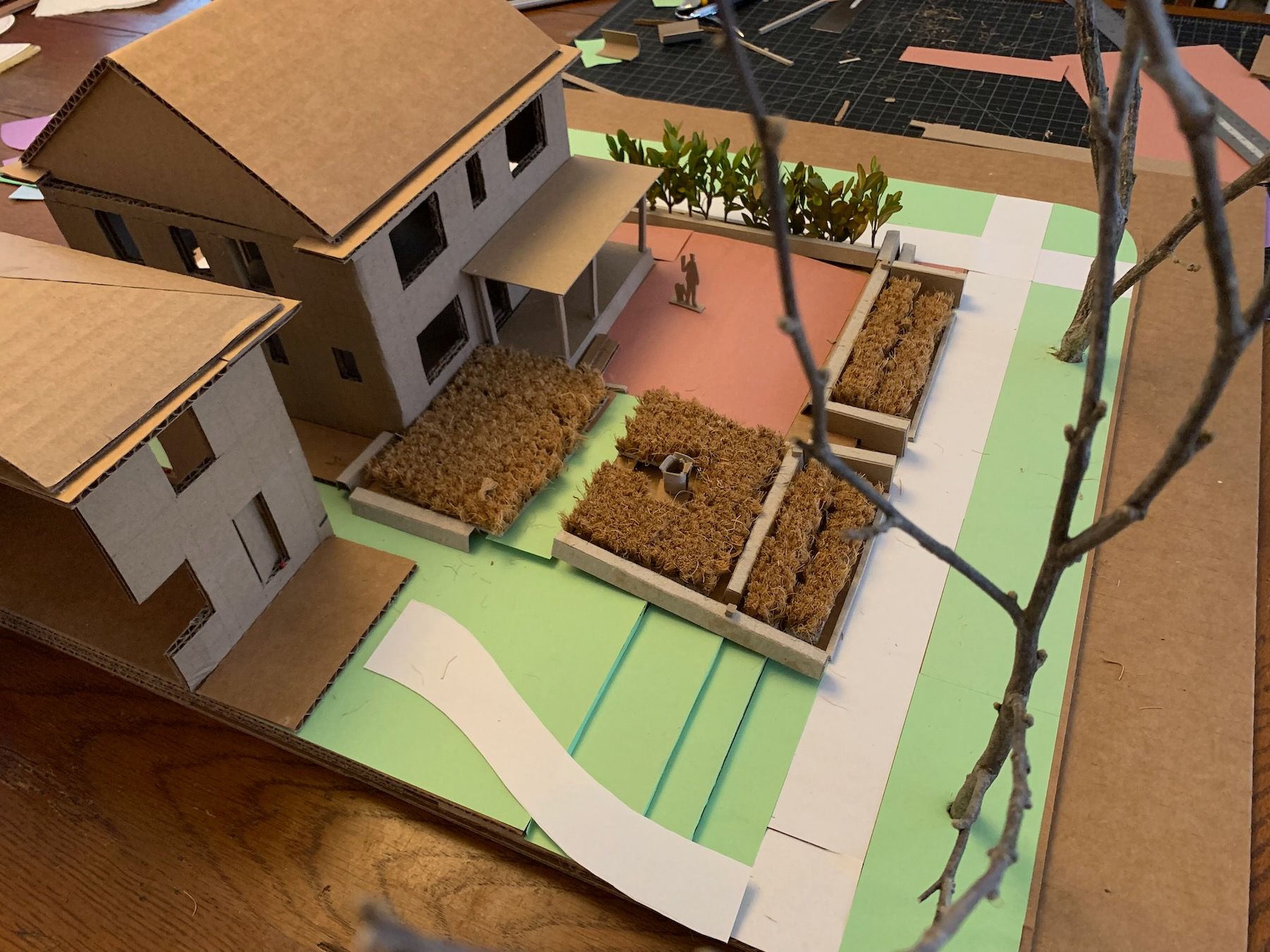
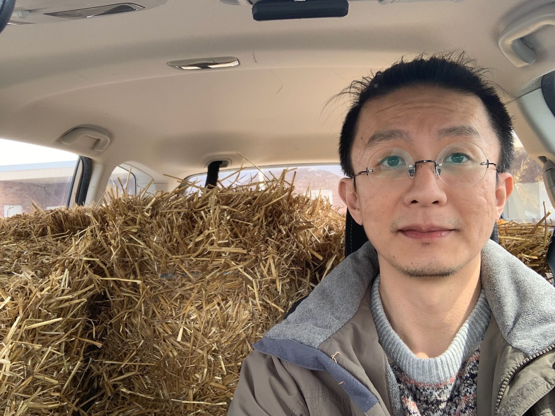
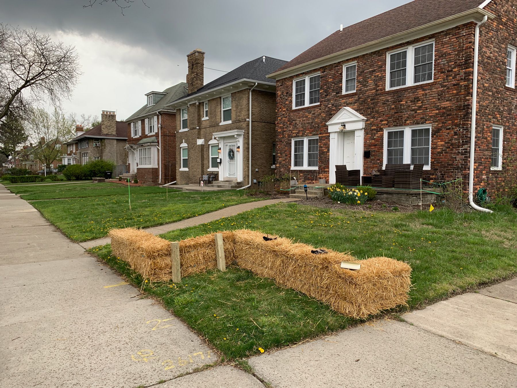
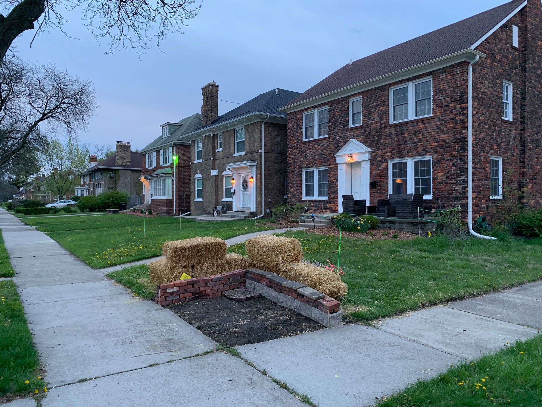
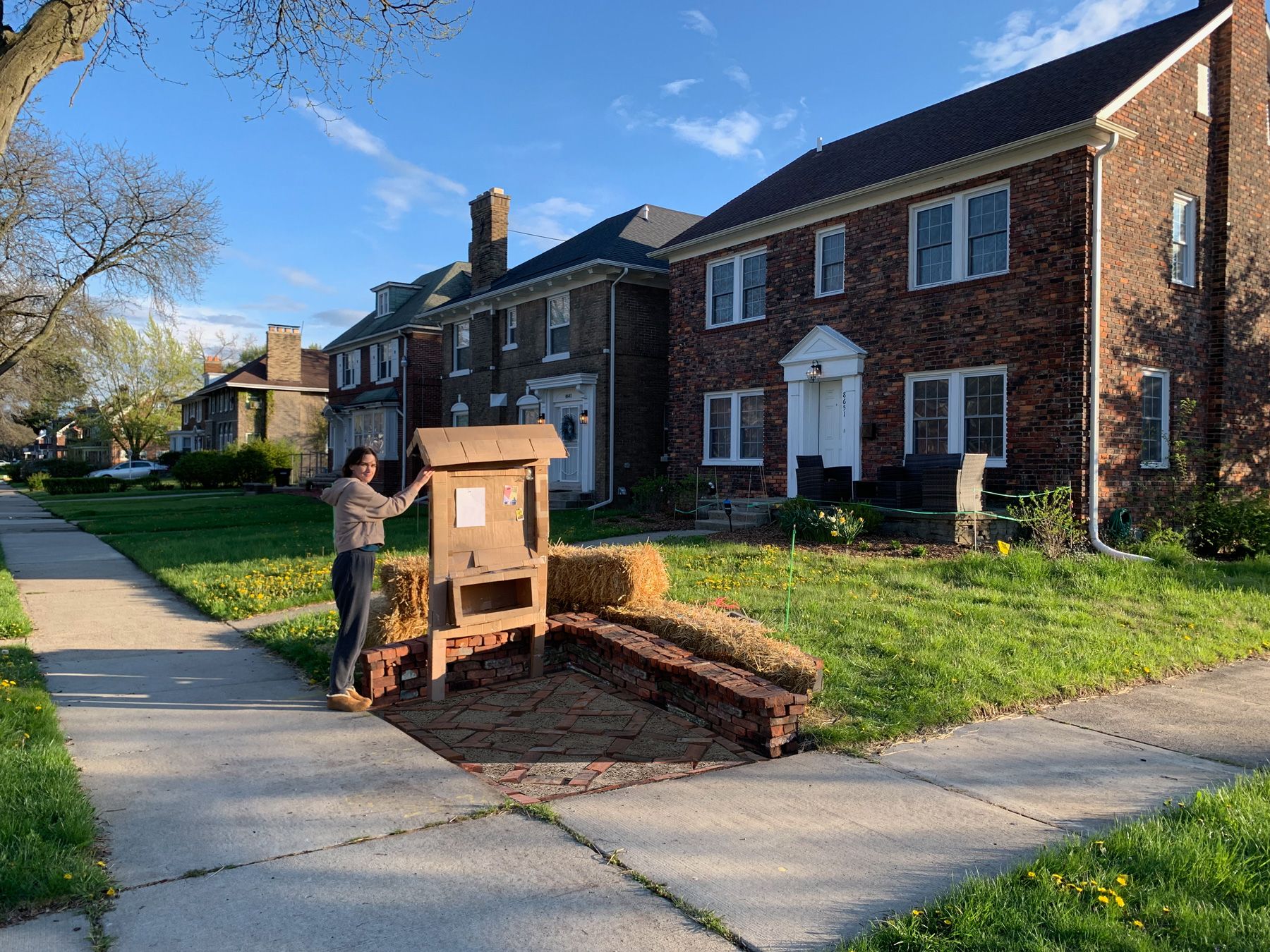
Something that was maybe less evident in the 1:200 model but much clearer in this one is the need for greater variation in height, particularly in the native plant area. It looks okay from directly above, but it’s still very flat. At this time, I also found a local church on Facebook Marketplace that was selling straw bales left over from the previous fall (this was early April) and I loaded as many as would fit into our compact SUV:
I used them to mock up the low sitting walls I’d imagined throughout:
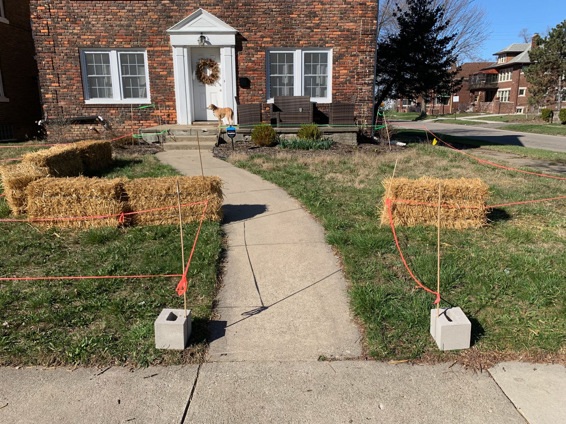
In my models, I had a very direct path from the sidewalk to the house, but that didn’t go as well with the Sensuous Entrance Transition pattern, which spoke to something slightly more meandering. Another pattern, Welcoming Sidewalk Gateway, I described like so:
WELCOMING SIDEWALK GATEWAY
Entry from the sidewalk is well-defined but not overly formal. Neighbors walking by are comfortable stepping into the front yard for an impromptu conversation with those on the sitting porch or in other parts of the garden.
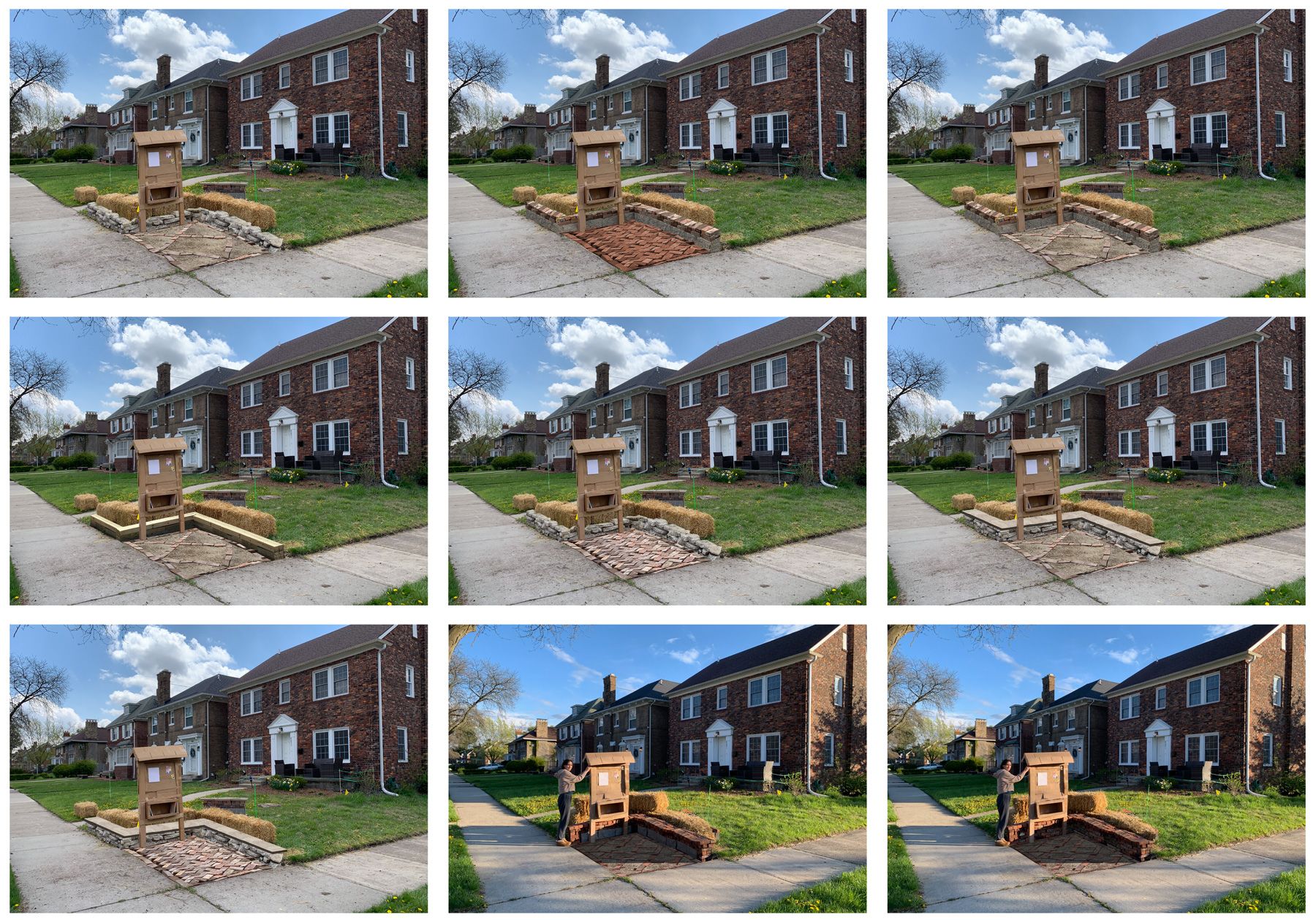
One way to do this was to widen the entrance and nudge it closer to the street corner than the existing one. I moved these concrete blocks around until I found a good width and position:
Here’s a quick video that better shows how all these different patterns/centers relate to each other:
And here they are reflected in the model, with the added trees and shrubs for height:
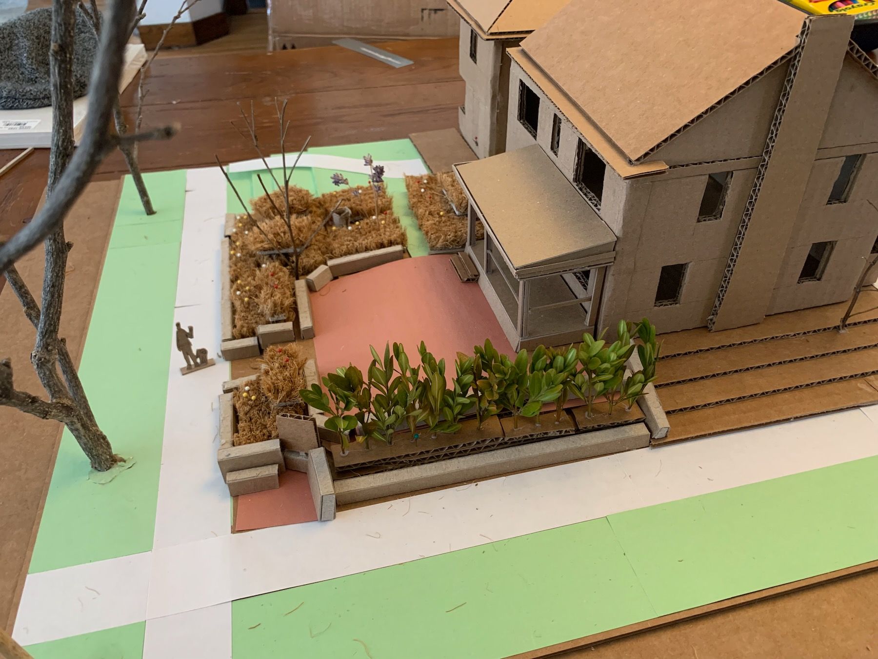
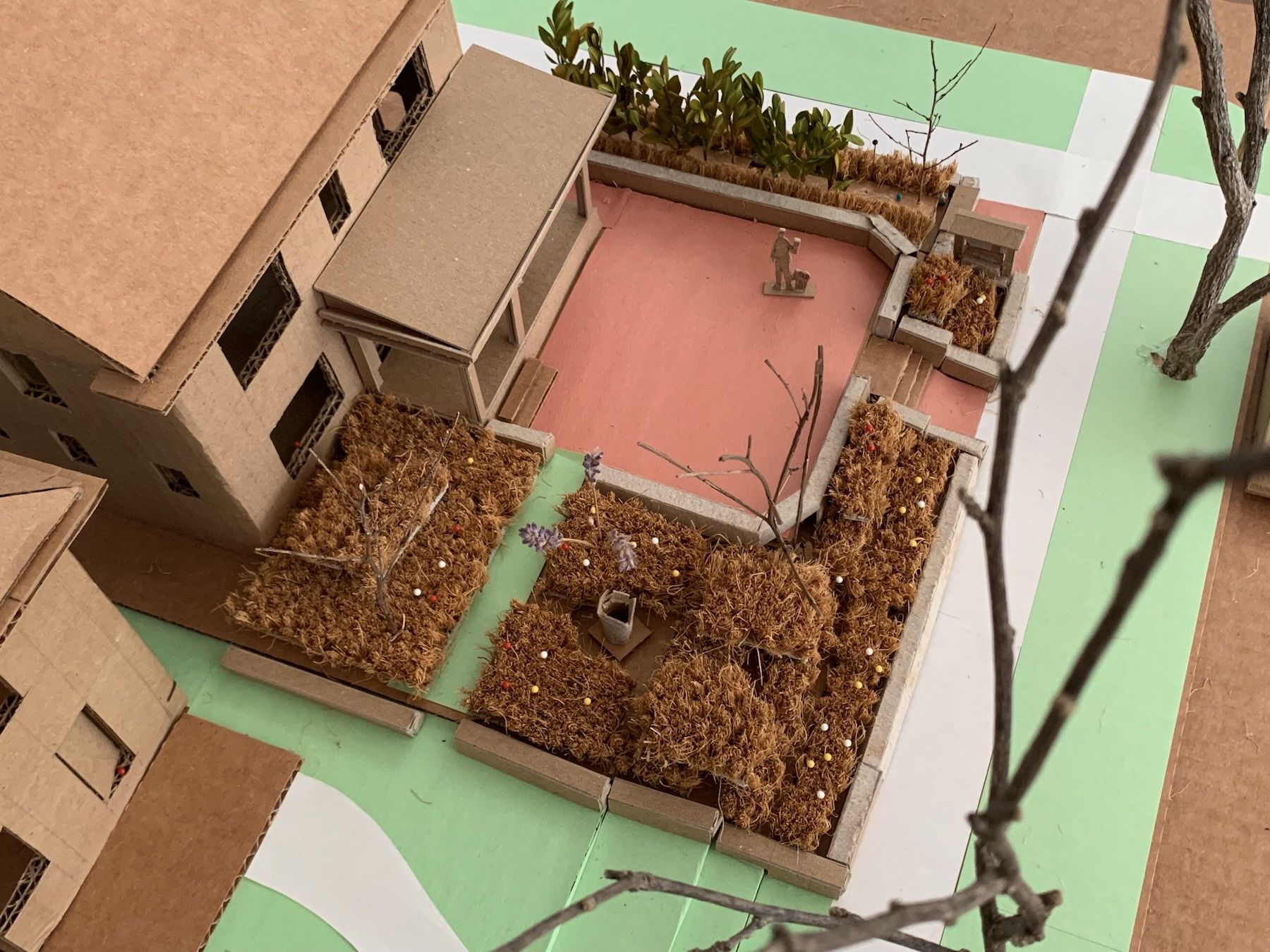
You also can see, in these last images, a couple of iterations on the design of the Community Corner, which became the main focus of the rest of my work in class. We had to choose a portion of our design to actually build out, and I opted to do the corner because it incorporated part of the low sitting wall, and had hardscaping underfoot that I might want to replicate for the Multipurpose Outdoor Room. I’d also imagined a bulletin board made of wood, and its small roof would be a version of what I’d eventually want to put over the currently-unroofed porch. In short: The Community Corner was a microcosm of the whole project.
7. Designing the Corner
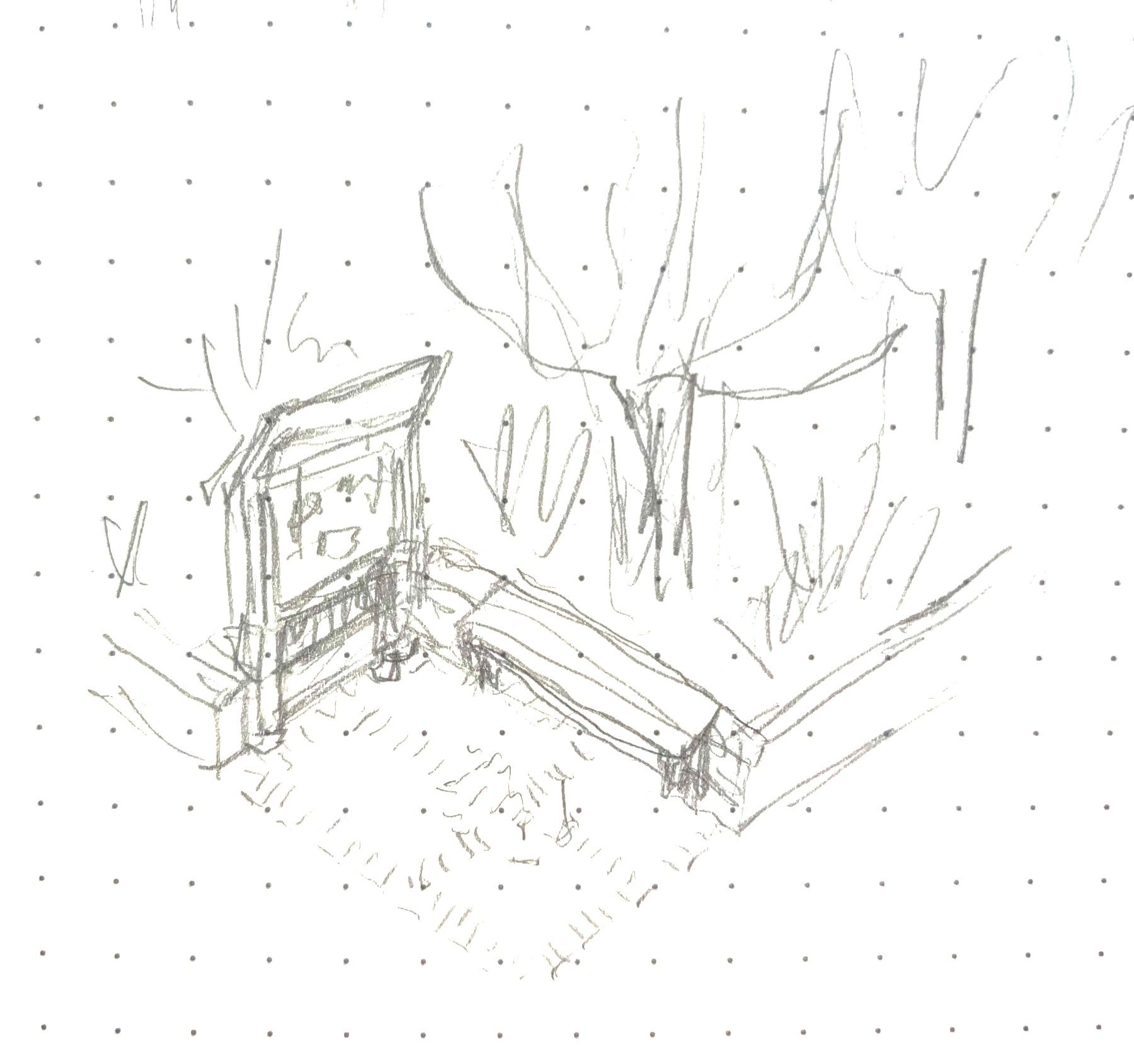
From the stakeouts, I had rough dimensions for the corner but still needed to finalize its size. Someone walking by had to feel comfortable stopping in to scope out the little free library, read the notice board postings, or sit on the bench and tie their shoe. I went back to my sketchbook, and modeled and mocked up the more-promising ideas:
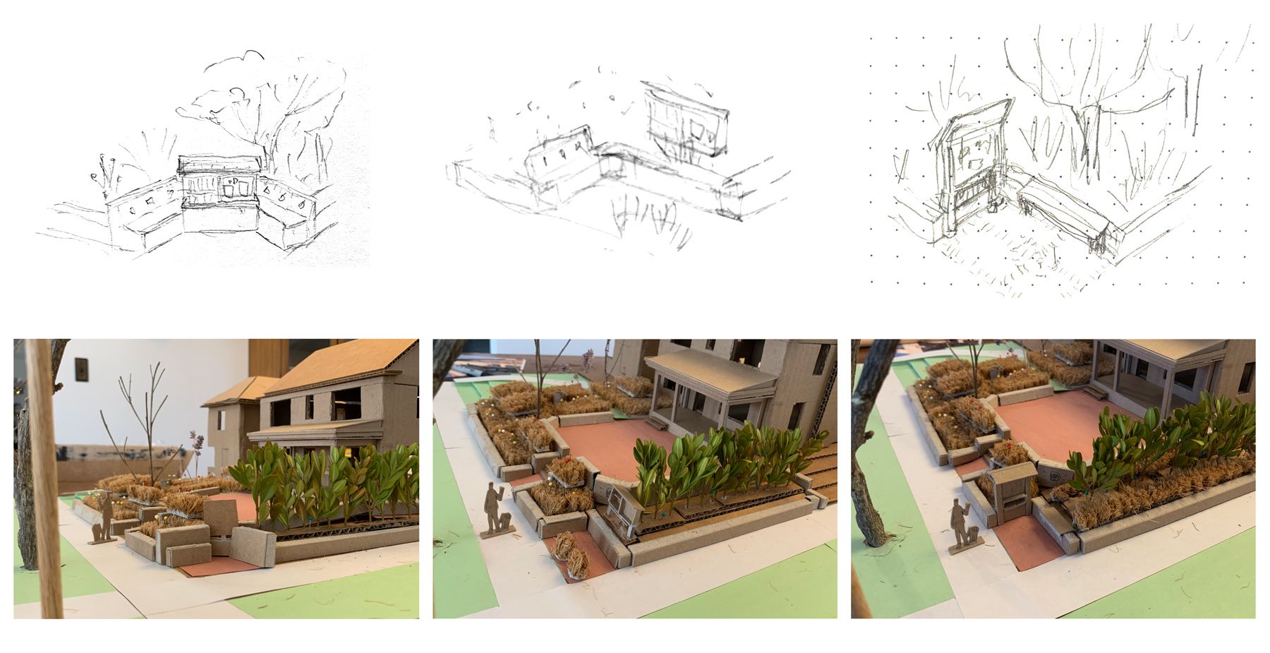
The straw bales, representing the low sitting wall, really helped me figure out which directions the bench and notice board should face. Once I settled on those, and the overall dimensions, I made a neat discovery: the walls seemed to also frame a small rectangular “room” at the intersection, the room’s other corners defined by the stop sign, lamppost, and locust tree:
It’s a good example of the way this process inverts present-day architectural practice: If I were designing this space in software, with an overhead floor plan view, I might have naturally aligned it with the other three reference points, yes. But I might also have picked some different, totally arbitrary reference points and sized the corner with those, and only later on, well into the construction process, discovered that I’d designed too big or small or long or awkward of a space.
The difference with this process is you start with the feeling, on the actual site, and then, if you happen on alignments or coincidences like these, you take them more as confirmations you’re onto something. Then you might align more precisely to see if you get something that feel better than your intuitive placements. The main point is that these kinds of rules and snap-to-grid alignments should serve your intuitive, in-person feelings, rather than be a substitute for them.
I find a similar process writing fiction: I start by trying to tell a good story, and if in later drafts I discover themes emerging, I might nudge the story in a direction so as to reinforce the themes. But it’s all in the support of making the story better.
Here’s a zoomed in view of one of my sketches from above, that gelled most with my mockup experiments:
Now I needed to get more precise with everything within the corner space – the designs of the notice board, bench, and wall, and the materials I’d use to build them.
8. More Mockups and Material Tests
… which involved more mockups. Every part of this process, I’ve learned, is geared toward figuring out the next most important decision you have to make, and then using the form of representation best suited for helping you make that decision.
At this point, I knew the height of the low walls and the area of the floor. I still needed to figure out the exact width and height of the notice board, and the width of the bench. So I moved around a couple of timbers representing the board posts, and used my work gloves to mark the length of the bench, and sat and walked by and looked from different angles.
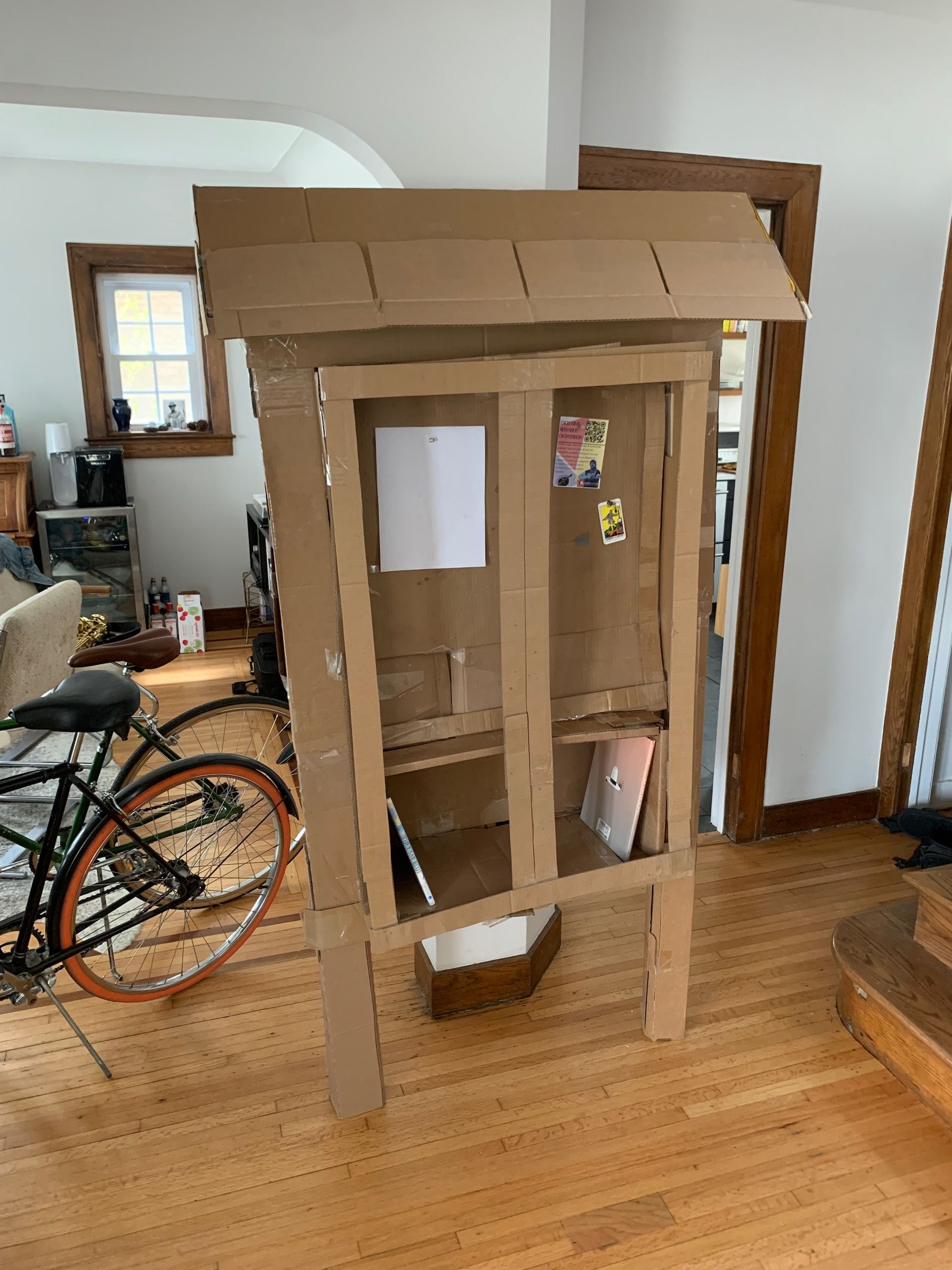
Once I had that information, I built a full-scale cardboard mockup of the bulletin board (a la our Furniture project). I ripped it apart and tried other designs, like these:
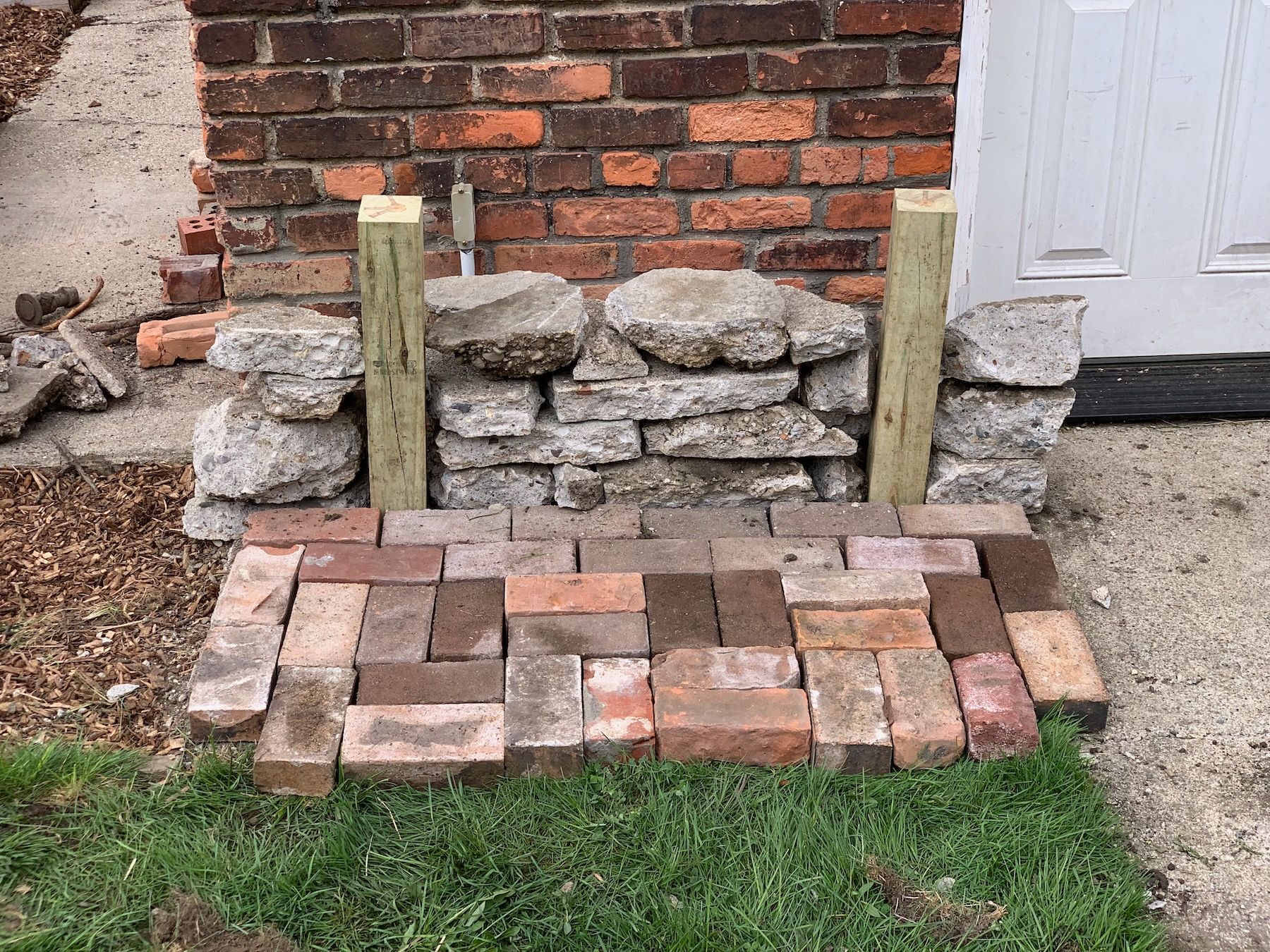
Meanwhile I was looking at materials, too. I used some bricks I had on hand, picked up a few split-face concrete blocks from a home store, and a bag of decomposed granite from a landscape supply shop to set up some tests:
I also tested landscape timbers and urbanite – an architectural name for repurposed chunks of concrete (of which I would have plenty if I were to bust up the existing concrete walkway). When I didn’t have enough material to mock up the full area (most of the time I didn’t) I made some rough composites in Photoshop:
But you don’t need Photoshop, really. You can work with actual material samples in proportion, ideally on the actual site. But here’s an urbanite and paver test I did early on:
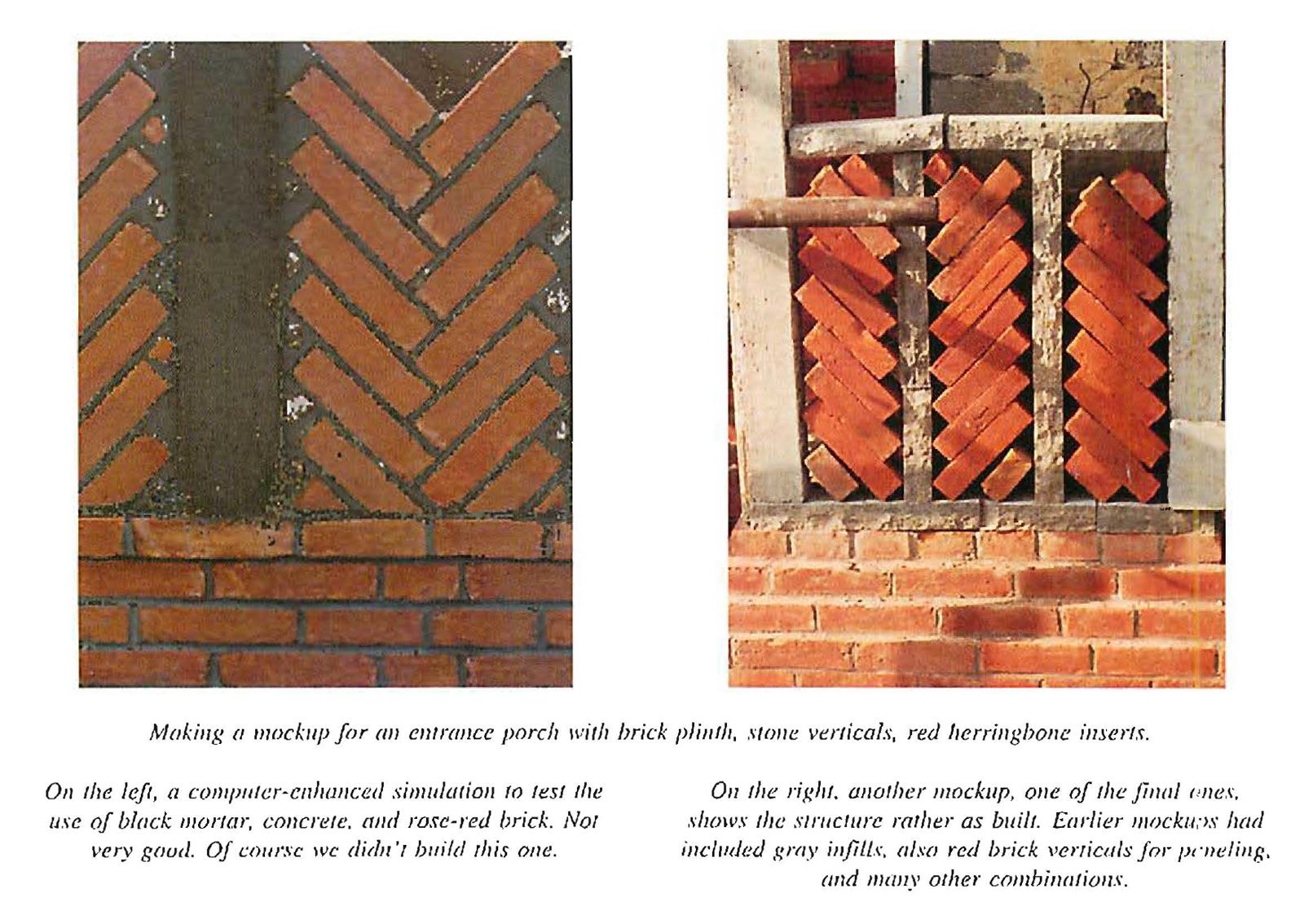
Alexander and his team at the Center for Environmental Structure did these constantly. They built mockups upon mockups, tested different materials in combination with each other:
I ended up preferring a brick-wall variant, and managed to get more clay brick free from a demolition site based on a tip from a friend. Here’s my final mockup – at least for this stage – with only very light Photoshopping:
8b. Designing the Notice Board (and a Detour on Inspiration)
At this point, the biggest things still left to figure out was 1) what kind of bench seat to put on top of the wall, and 2) how I was actually going to build the bulletin board.
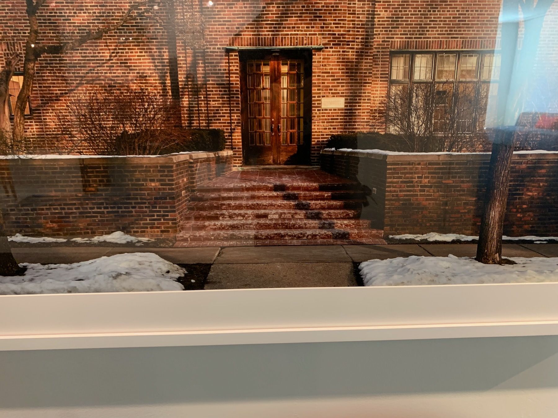
But first, a quick detour regarding visual inspiration. Throughout the process of making models and doing material tests, I walked and biked around in both my own neighborhood (and near my former neighborhood, where I knew to be some homes with low retaining walls and nice landscaping):
Low walls and pavers, brick, concrete, and stone (these houses are a lot bigger than ours)
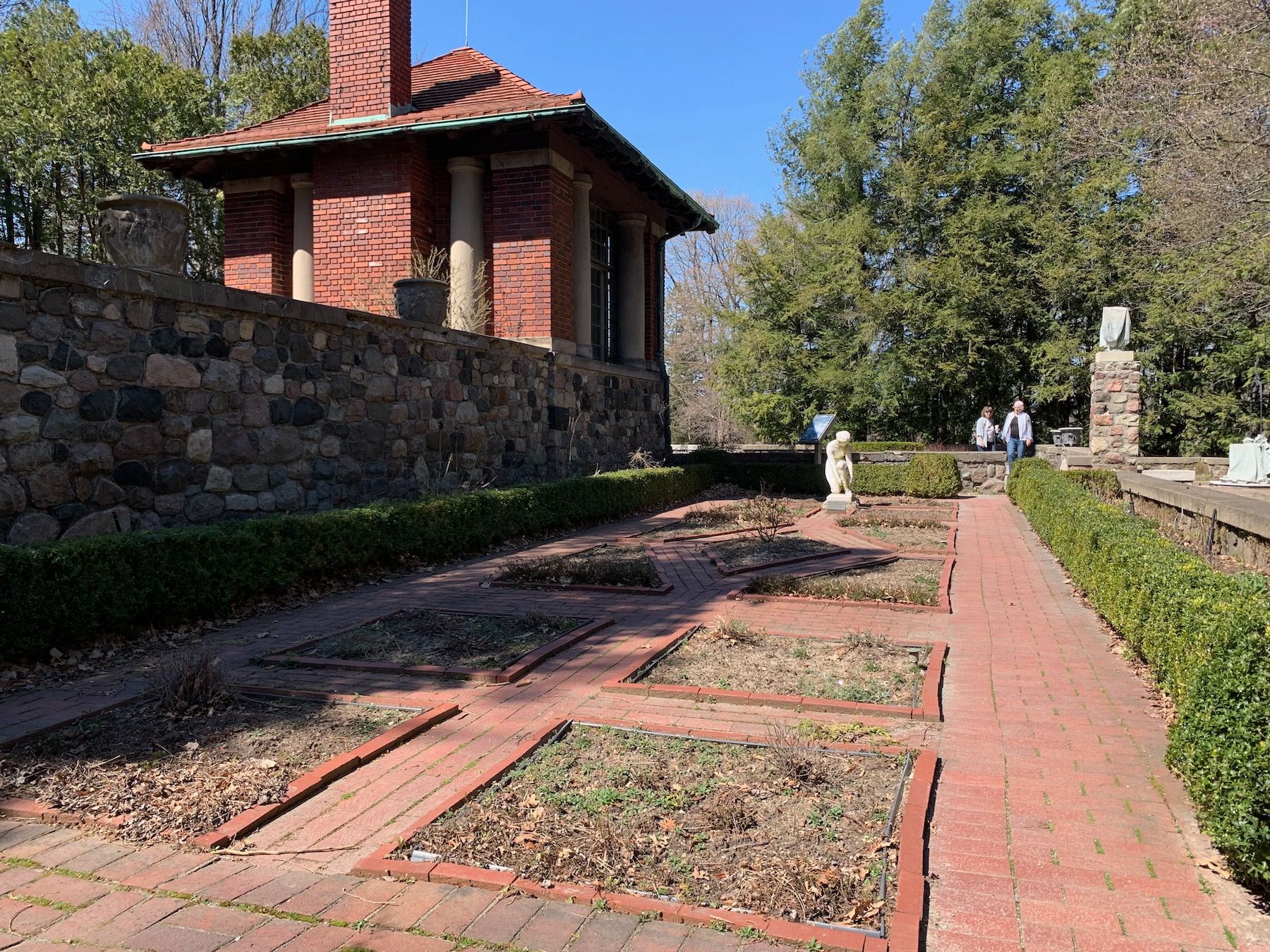
I also visited the Cranbrook House, a 30 minute drive away:
And caught photos of notice boards and kiosks on hikes:

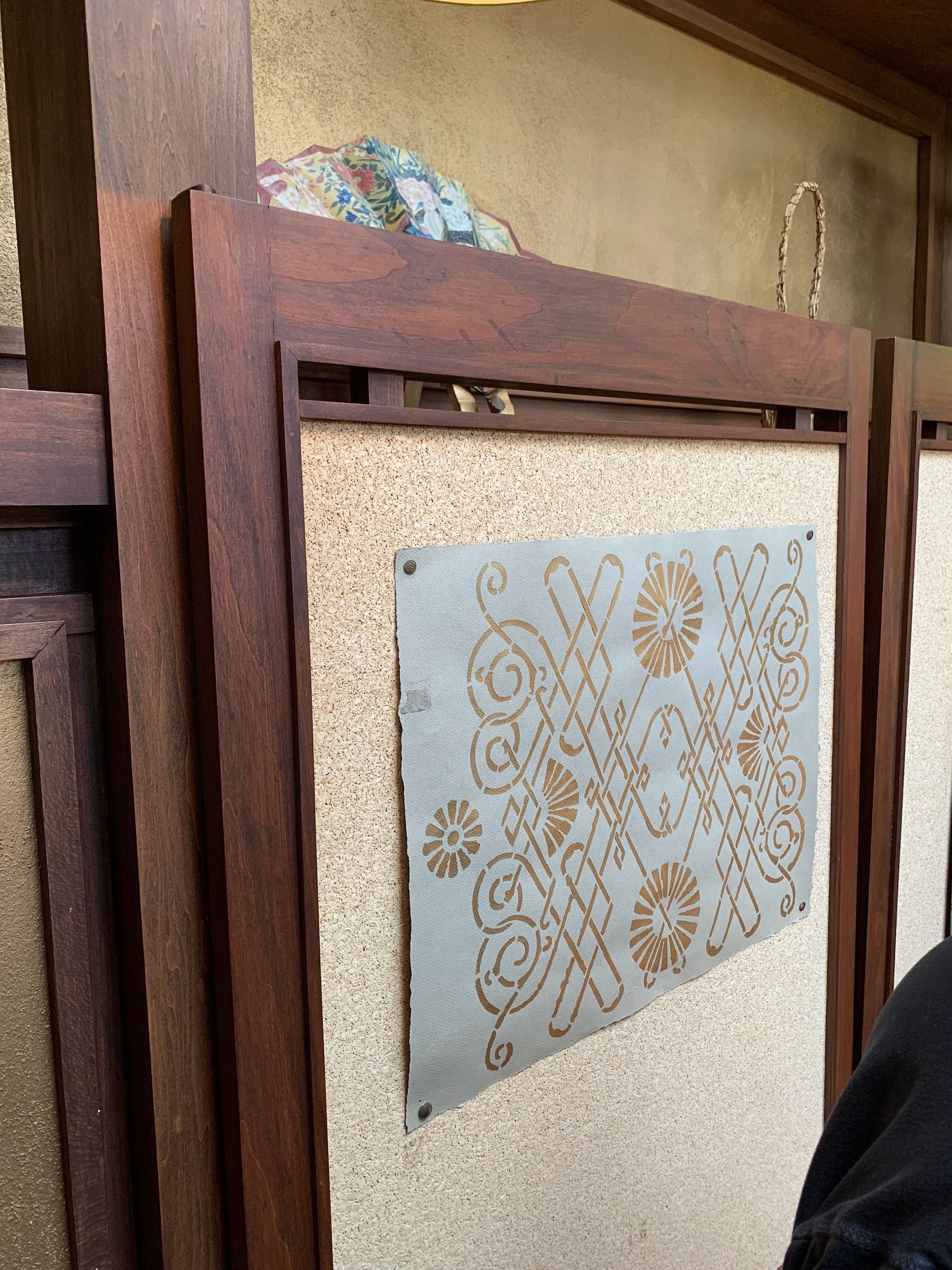
When my partner and I were in Chicago for a weekend, we toured the Frank Lloyd Wright house, and I was the goofball taking pictures of the corkboard inlay on these doors in his studio:
I did do some research online, and in books, but found more examples just walking and biking around – and these examples were actually in the vernacular of what was around me. For instance, I really love the beauty and woodwork of Shinto shrines throughout Japan:
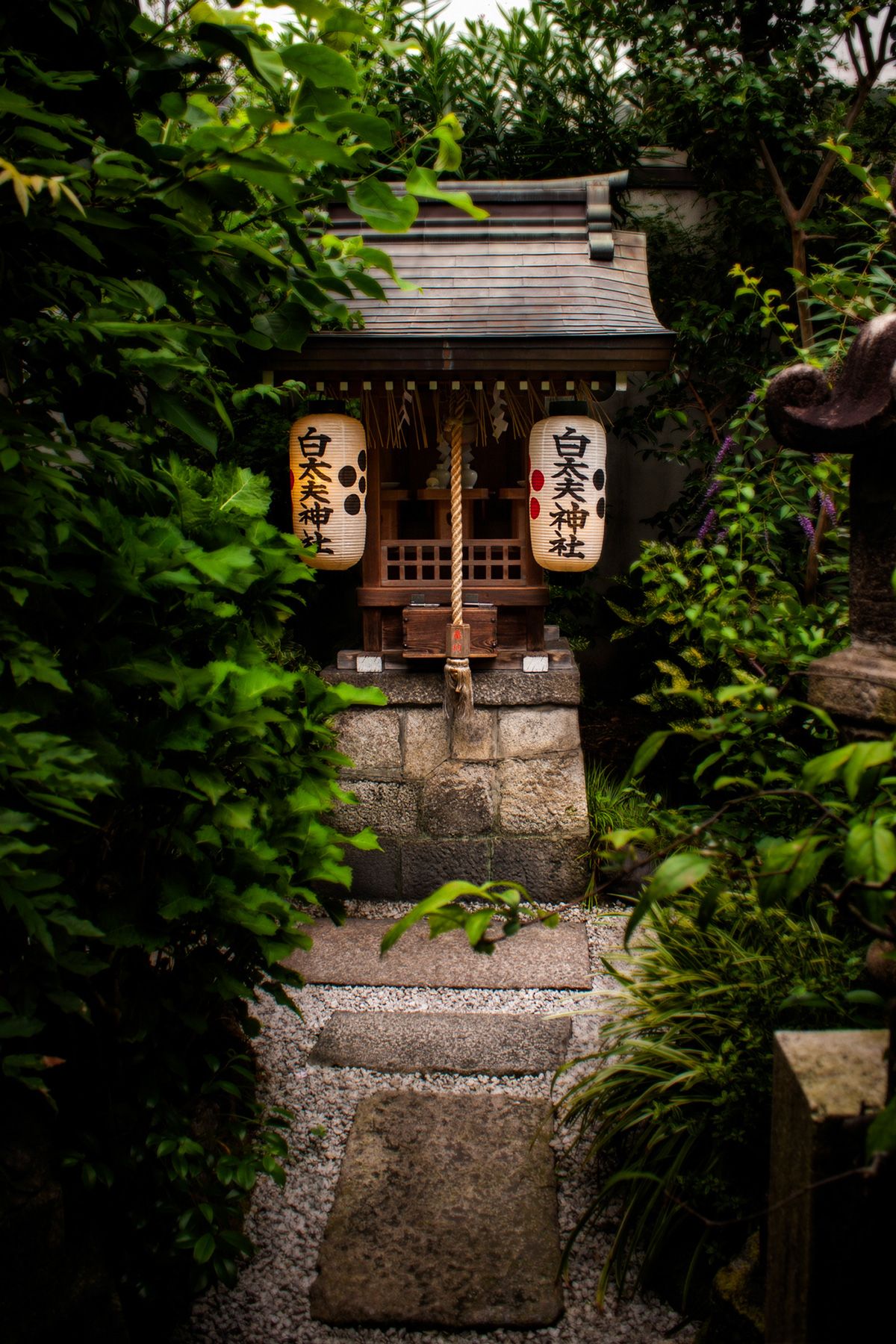
Hokora Shrines (via Sky i)
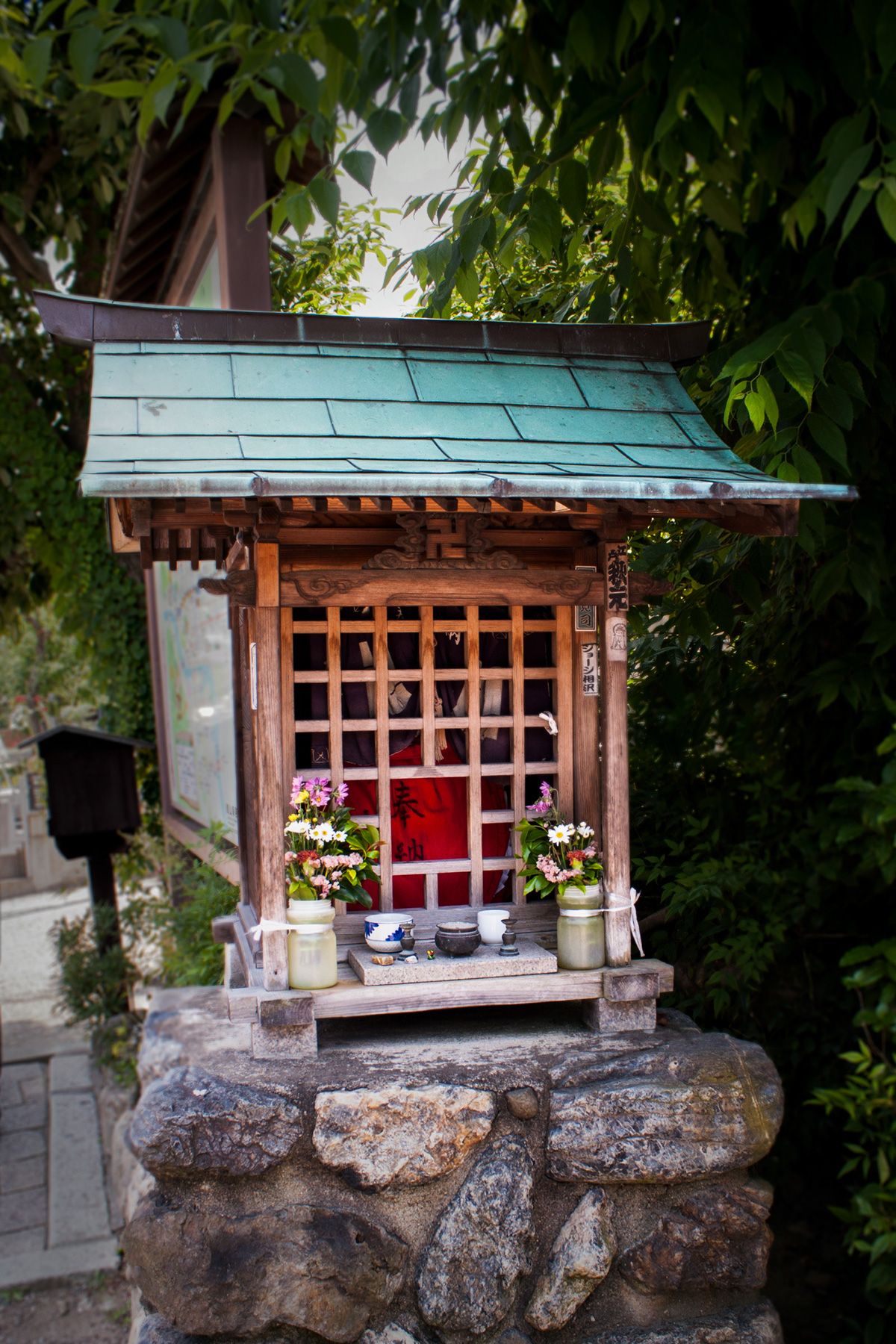
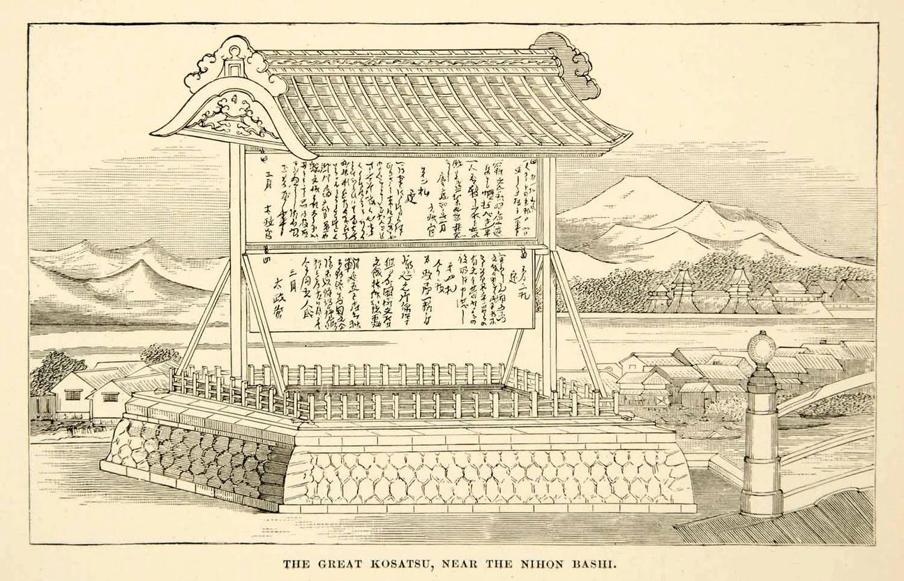
And I found a couple of images of kosatsuba – traditional public notice boards:
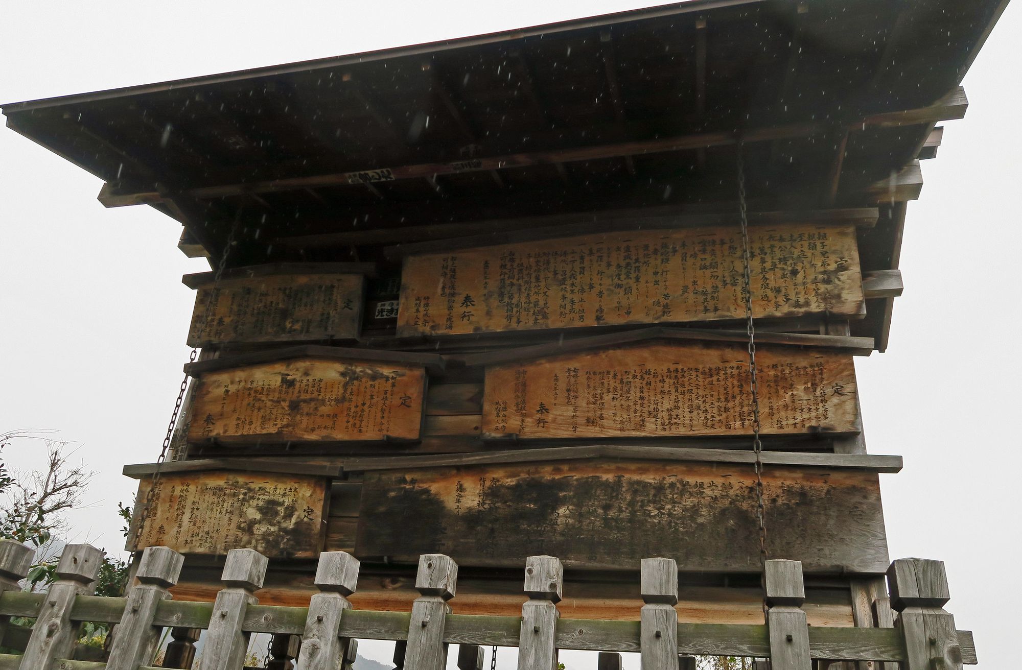
Visual and material inspiration like this came in handy because I already had an idea about the main aspects of my design – I knew there would be low walls and a notice board. The inspiration gave me new ideas about materials and details. But it’s a mistake, I think, to jump to quickly into looking up inspiration before you’ve figure out what the needs are for your specific site and context. You might end up with a circular garden when your space calls for something rectangular. You might end up with a wall that’s too high, or a bench that doesn’t weather well in your own climate.
You can be insensitive to context even when you already know what you want. In the last image, the engraving of the kosatsu, the design, the shape of the roof, very much echoes the mountains in the background. It references other shapes and motifs in Japanese vernacular architecture. And as much as I like for it to be different, there are no mountains here in Detroit; such a design would feel totally out of place in front of my house.
This is an extreme example, but it happens all the time when it comes to visual inspiration. It’s all to easy to get attached to the image of something rather than its essence, its relationship to its own particular context. The challenge, after looking at all that inspiration, was to try to carry over some of the essence – the wholeness – of those shrines and notice boards, but do it in a way that suited my little corner of Detroit, Michigan.
Here’s where I landed with the notice board:
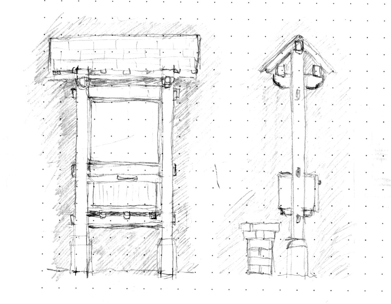
Do the way the horizontal beams stick out still feel a little too Japanese? Maybe. But that’s something I can try in a model.
9. (Another) Scale Model
To further work out how to build the notice board, I made a miniature version of it at 1:25 scale using popsicle sticks:
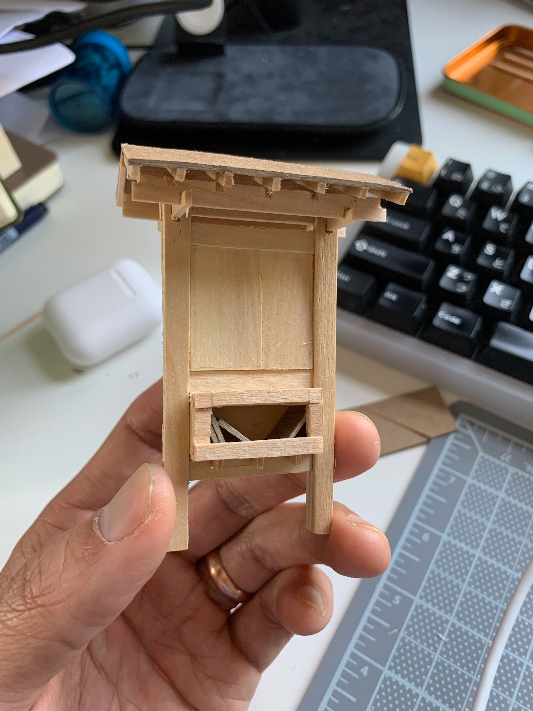
And recreated the corner itself at the same scale:
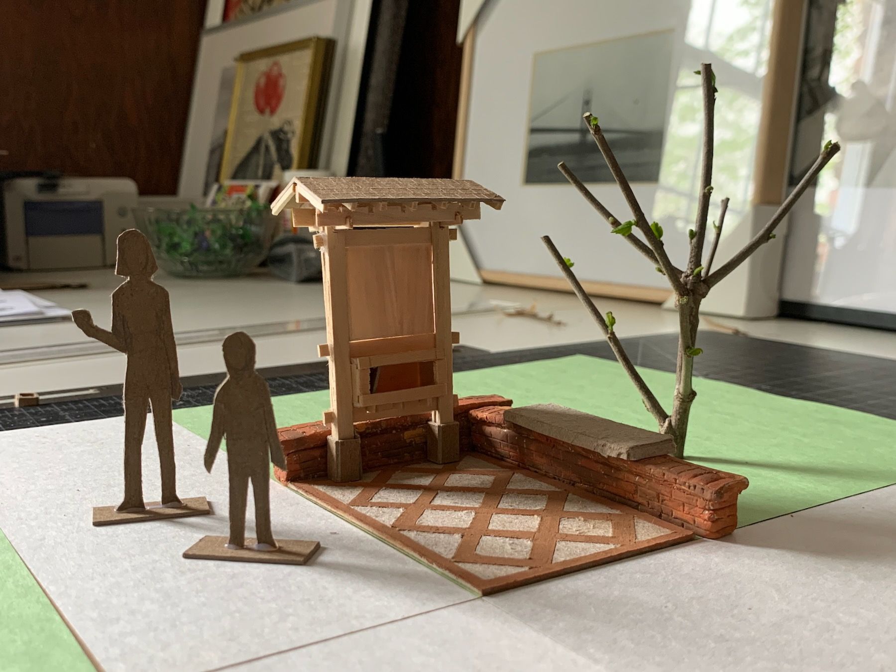
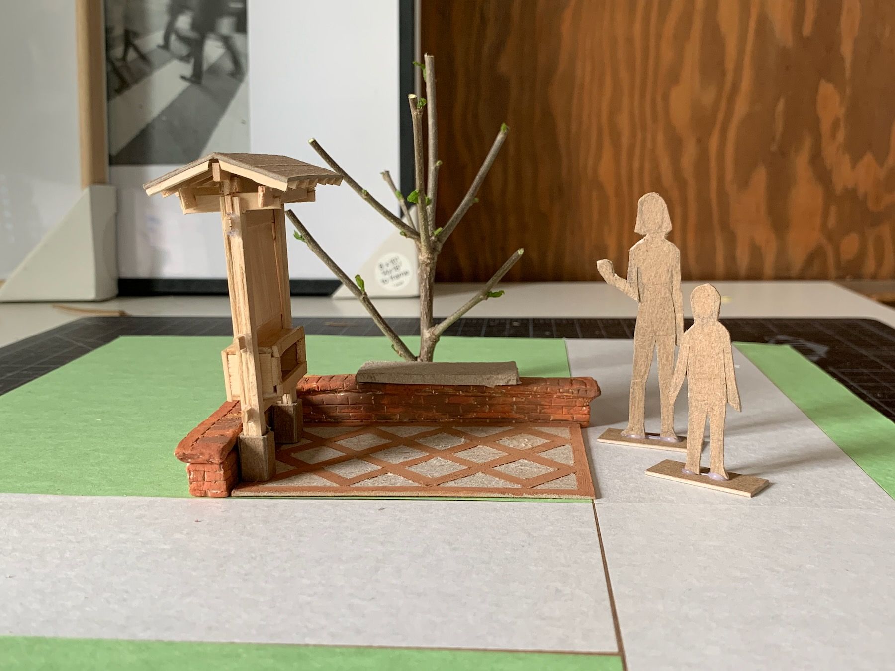
The walls were made out of tempera-painted air-dry clay I had left over from our first studio project. But presenting this class, the main feedback I got was that the board and bench didn’t feel integrated enough – the bench, especially, felt like an afterthought. I got out some more clay and finally ended up with this:
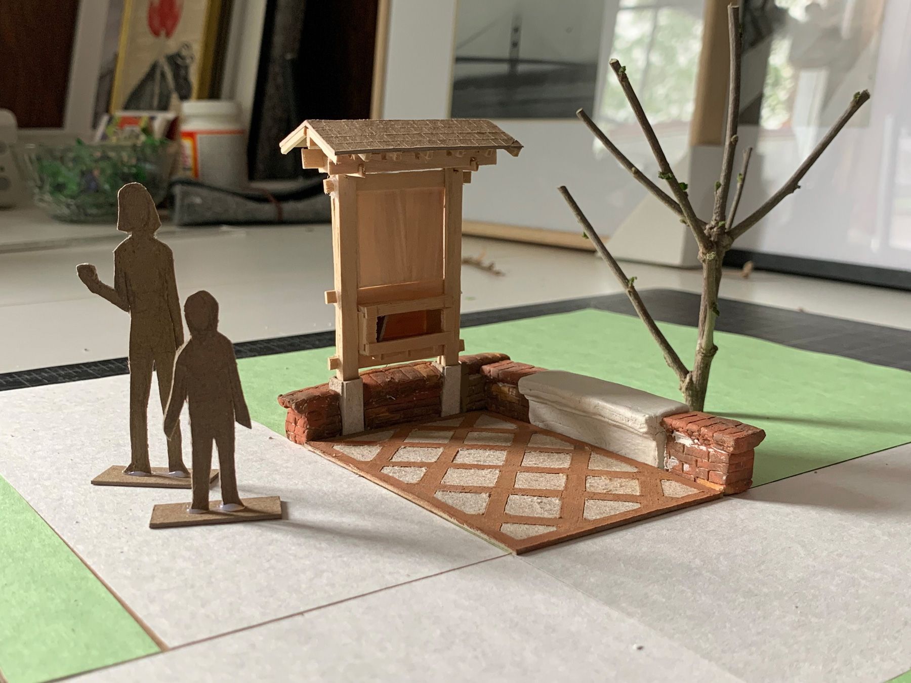
Both the bench and board footings here are intended to be concrete. There would still be some refinements to be made, and the concrete, depending on the mixture, would have a different color and texture, but those refinements could come during the construction phase.
At this point, I had enough of the design set to start digging for the footprint:
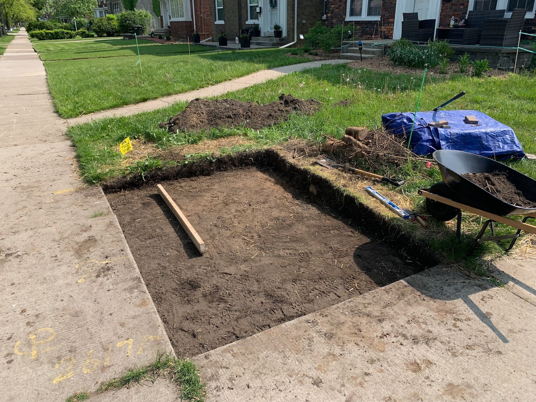
… and of course that’s when I ran out of time class-wise. So I presented what I had at the end of the semester in May and slowly continued the construction through the summer and early fall. More on that to come … in Part 3.